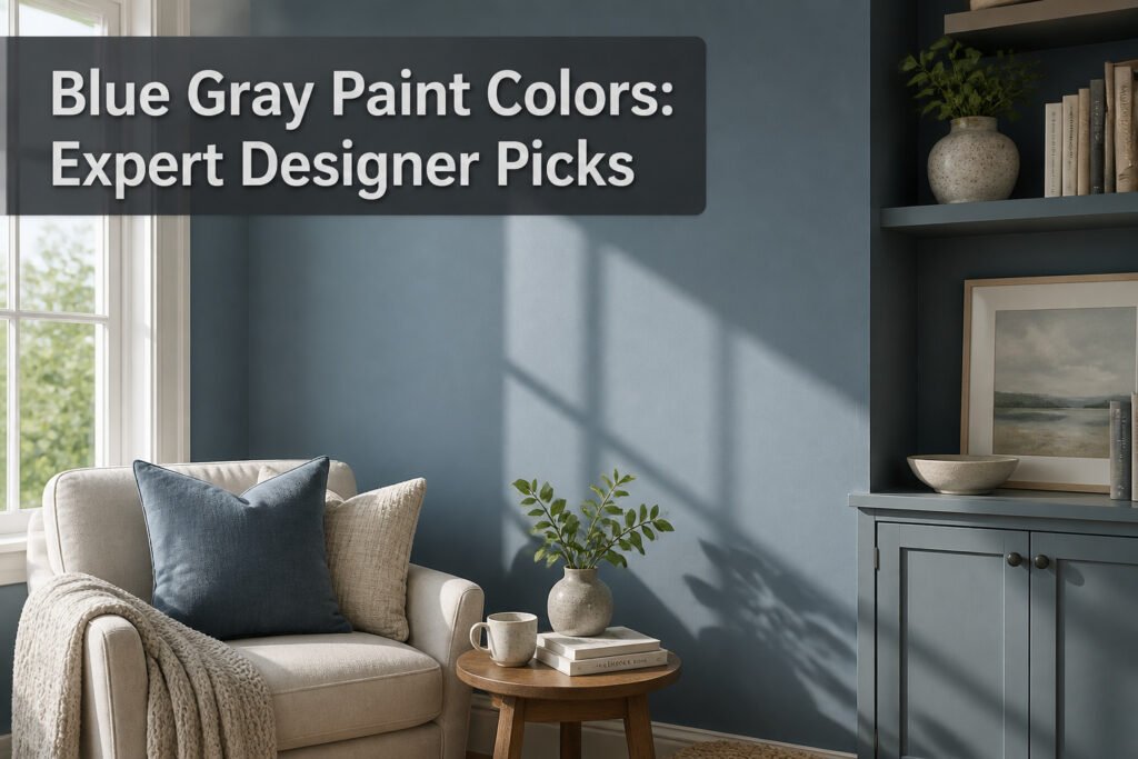
Gray blue paint is a blue-gray hybrid that shifts between the two colors depending on your light, and that shift is exactly what makes it tricky to choose. A shade that reads as dignified navy in morning sun can turn near-black by afternoon or wash out to something brighter than you planned. Naval SW 6244, Sherwin-Williams’ 2020 Color of the Year, stays workable because its gray base keeps it from going electric when straight blues would.
1. Naval

Naval SW 6244 reads as a true navy first, but the gray in its base keeps it from tipping into something brighter or more coastal. Sherwin-Williams named it their 2020 Color of the Year, and the color has stuck around because it anchors a room without flattening it the way a pure black-navy can.
The gray undertone matters most in afternoon light, when a straight blue would go electric and Naval instead settles into something quieter. I’ve seen it hold up on built-in bookcases where the shelves catch shadow and the face frames catch lamp light; the color reads almost black in the recesses and softens to a dignified blue-gray where the bulbs hit. That range is what makes it workable for an entire room, not just an accent wall.
Outerspace SW 6251 sits on the same strip, a step darker and grayer than Naval. If Naval feels too saturated for your space, that neighbor is the logical fallback. For a classic look that still registers as gray-blue rather than navy-blue, Naval wins; if you need something that reads closer to charcoal with a blue whisper, step down the strip.
2. Storm Cloud
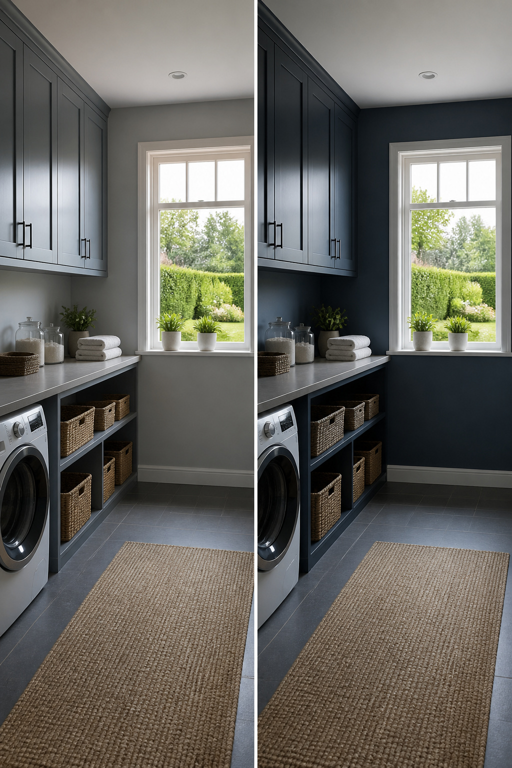
Storm Cloud SW 6249 earns its name most clearly in the hours after sunrise, when the color sits somewhere between slate and a held breath, still deciding which way to lean. By late afternoon it gathers weight and the blue deepens; come evening, the gray drops back and the whole room turns more formal than it felt at breakfast. That chameleon quality makes it one of the more versatile dark blue-grays, though the shift from morning to evening is dramatic enough that you should live with a sample through a full day before committing the walls. Laundry room cabinets in this shade have become common for good reason: the color handles artificial light with the same composure it brings to a windowed space, and it reads as intentional rather than merely safe.
3. Misty
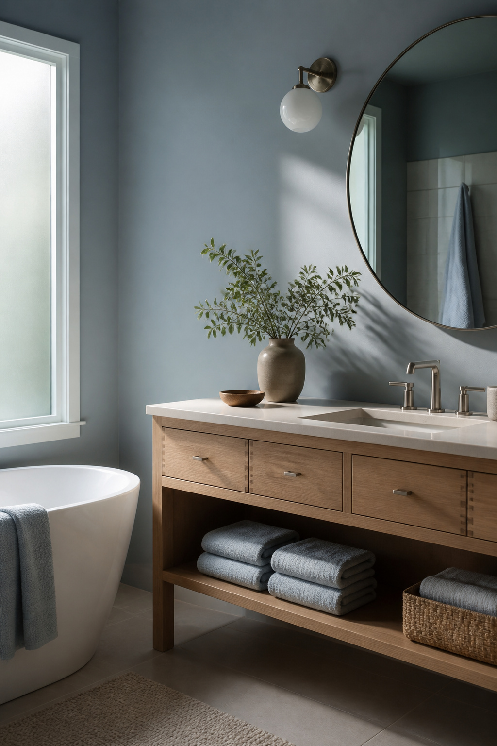
Sherwin-Williams Misty SW 6232 sits at the pale end of gray blue paint, soft enough to read as a neutral until daylight pulls the blue forward. That restraint makes it useful in rooms where you want calm without the coolness of a straight gray. Bedrooms and baths are the obvious fit, though it also works as a unifying backdrop in open plans where stronger colors would fight each other.
The gray in the base does the practical work. It keeps the tone from going nursery-sweet, and it helps the color recede visually so walls feel farther away than they are. In a small room, that depth is worth more than any mirror trick. Pair it with warm woods or creamy whites and the blue stays quiet; pair it with crisp black or charcoal and it sharpens up without losing its softness.
I have seen this color read almost white in south-facing light and turn distinctly blue-gray on a cloudy afternoon, so the sample tests matter more here than with mid-tone shades. The shift is the point, not the problem, but you will want to live with it through a full day before committing.
4. North Star
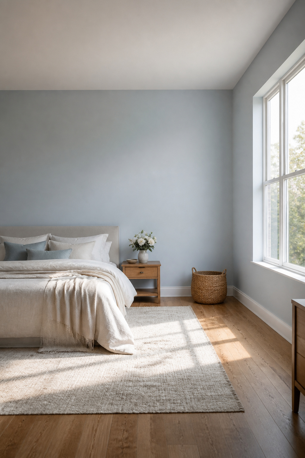
North Star SW 6246 sits at that edge where color nearly dissolves into atmosphere. The pale blue reads as a hint of fog on a cloudy morning, not a statement but a whisper against the wall. Most gray blue paint colors announce themselves; this one retreats, which makes it useful in rooms where you want quiet rather than character.
The barely-there quality means it shifts hard with light. Morning sun washes it to near-white; late afternoon brings the gray forward enough to cool the room without chilling it. That same subtlety makes it forgiving on imperfect walls, the kind of surface most of us actually have.
I would not pair it with crisp white trim, which fights the softness and makes the color look like a mistake. Something warmer and dirtier, a linen or a very pale greige, lets North Star do what it does, which is almost nothing, in the best way.
5. Adrift
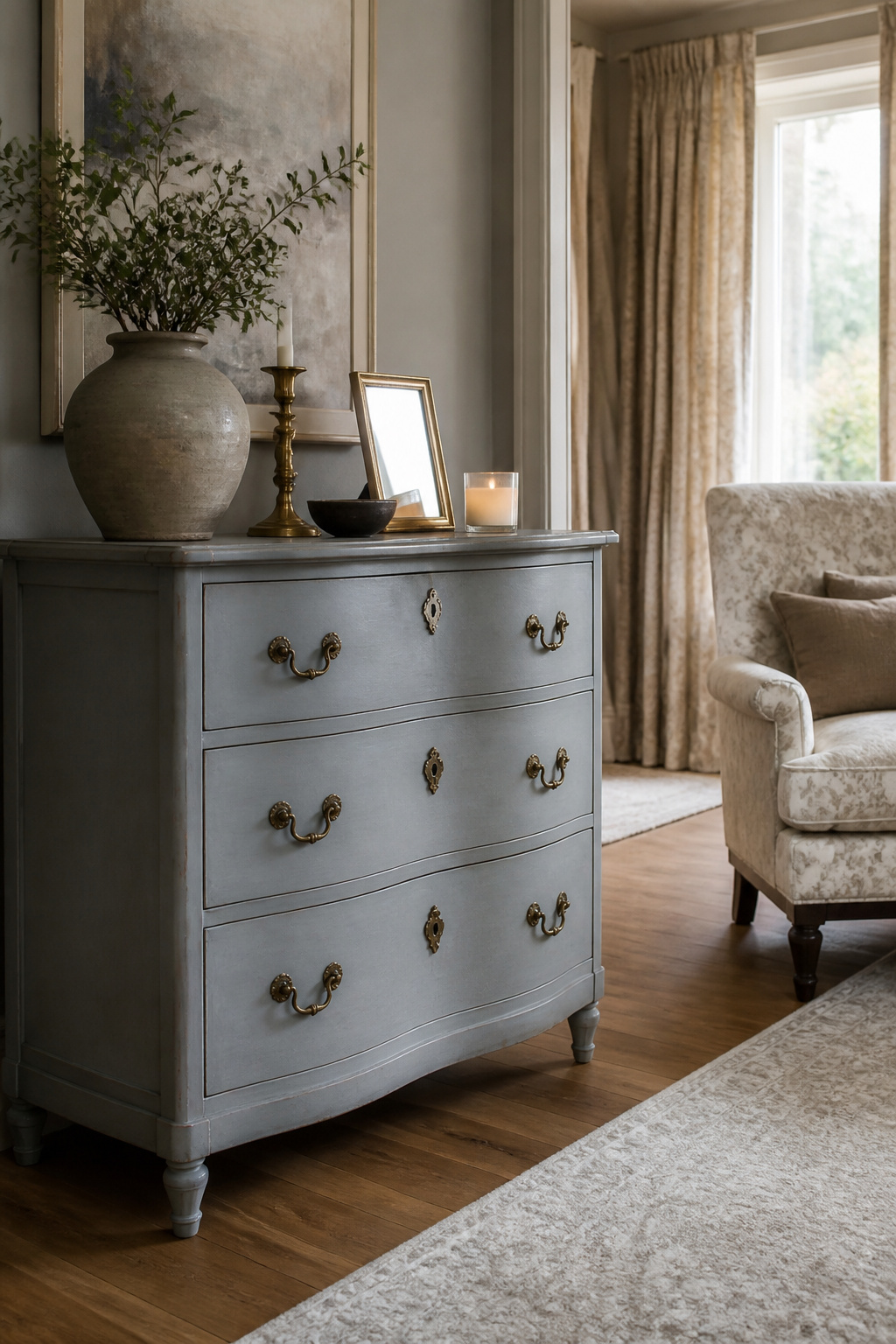
Adrift SW 7608 carries thatWedgwood quality, the kind of gray blue paint that reads as collected rather than decorated. I have seen it turn a basic dresser into something that looks inherited, not salvaged.
The color sits in a useful middle: soft enough to feel classic, gray enough to stay quiet. That restraint is exactly why it works better on furniture than on walls. Cover a whole room and the tone flattens into something moody and vague; on a cabinet or side table, the same color becomes the interesting object in an otherwise calm space.
For smaller pieces, the blue undertone shows up just enough to register against white trim or natural wood floors. A built-in pantry or bathroom vanity in Adrift gives you the gray blue paint look without the commitment of four walls closing in. The mistake is assuming scale does not matter with muted colors. This one needs boundaries to stay sharp.
6. Cloudy Sky
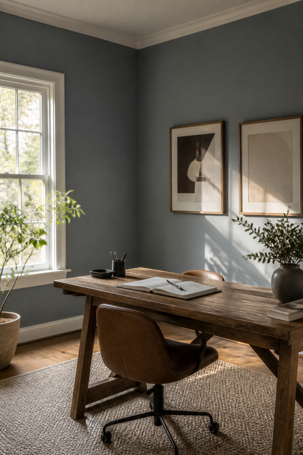
Benjamin Moore Cloudy Sky 2122-30 carries steely blue-green undertones that read moodier and more atmospheric than its name suggests. The color shifts hard with light: full sun washes it to a softer gray, while dim rooms pull out that velvety depth that resists easy labeling. It never quite commits to blue or gray, which is exactly what makes it useful.
Sherwin-Williams Sky High sits at the opposite end of the same idea. Where Cloudy Sky goes dark and romantic, Sky High stays light and airy with just enough gray to keep it from feeling like a nursery blue. Studio McGee has used it in spaces that need uplift without sweetness.
The choice between them comes down to how much drama the room can handle. Cloudy Sky demands some square footage or it will swallow the walls; Sky High reads as a neutral even in tighter spots. Both avoid that flat, battleship middle ground where too many gray blues stall out.
7. Boothbay Gray
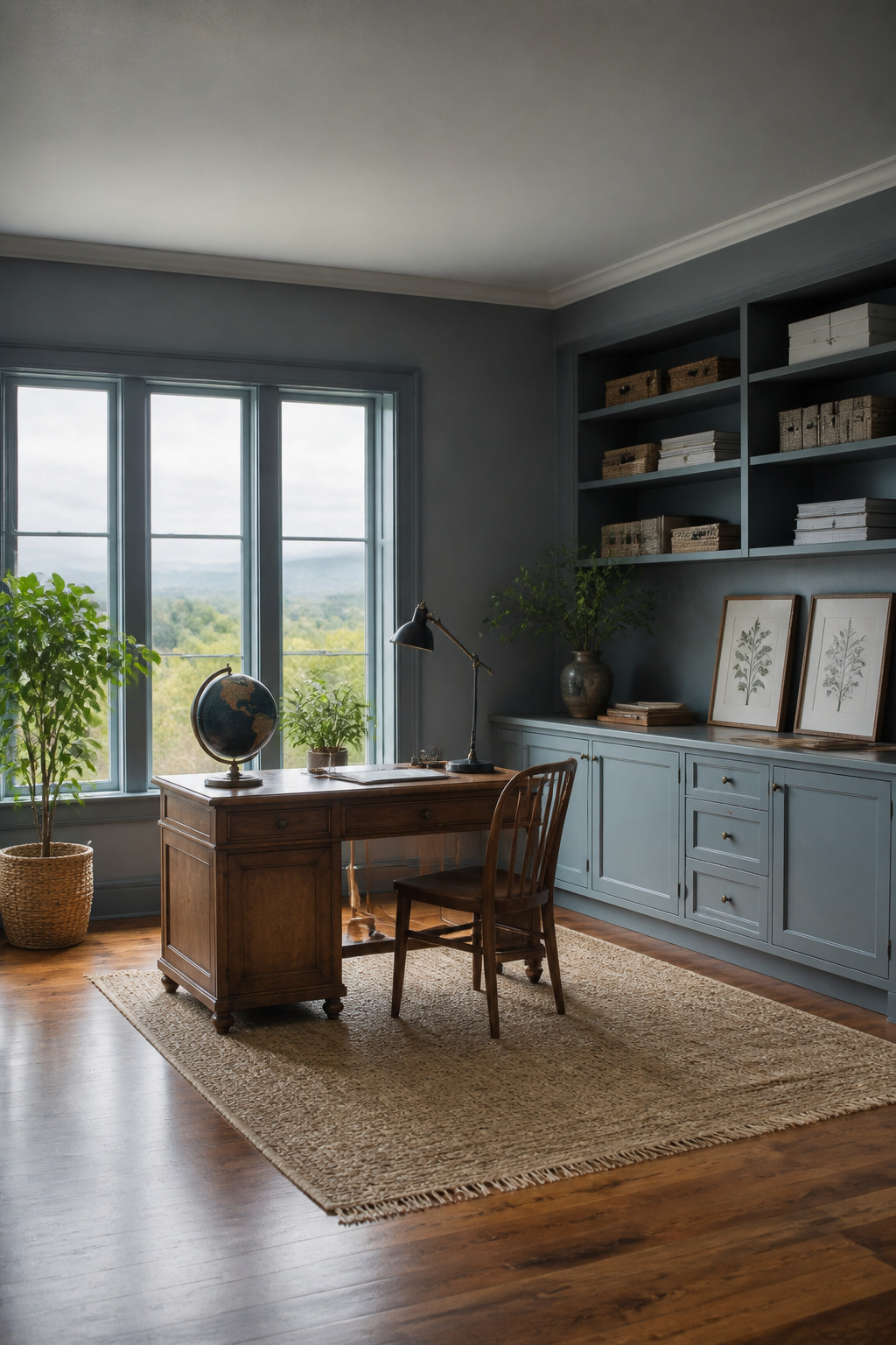
Boothbay Gray carries a coastal softness that feels pulled straight from a New England sky before the storm breaks. The blue undertones stay quiet rather than coastal-cottage obvious, which keeps it from reading too themed in a room that faces away from the water. Rachel Parcell favors it for home offices, and that makes sense: the gray base absorbs the visual noise of screens and paperwork while the cool undertone keeps the walls from going flat under artificial light. Mid-tone value means it holds up in both morning sun and lamplight without the jarring shift some lighter grays suffer. If you are after that gray blue paint that nods to the Atlantic without hanging a lobster trap on the wall, this is the one that manages the trick.
8. Pigeon
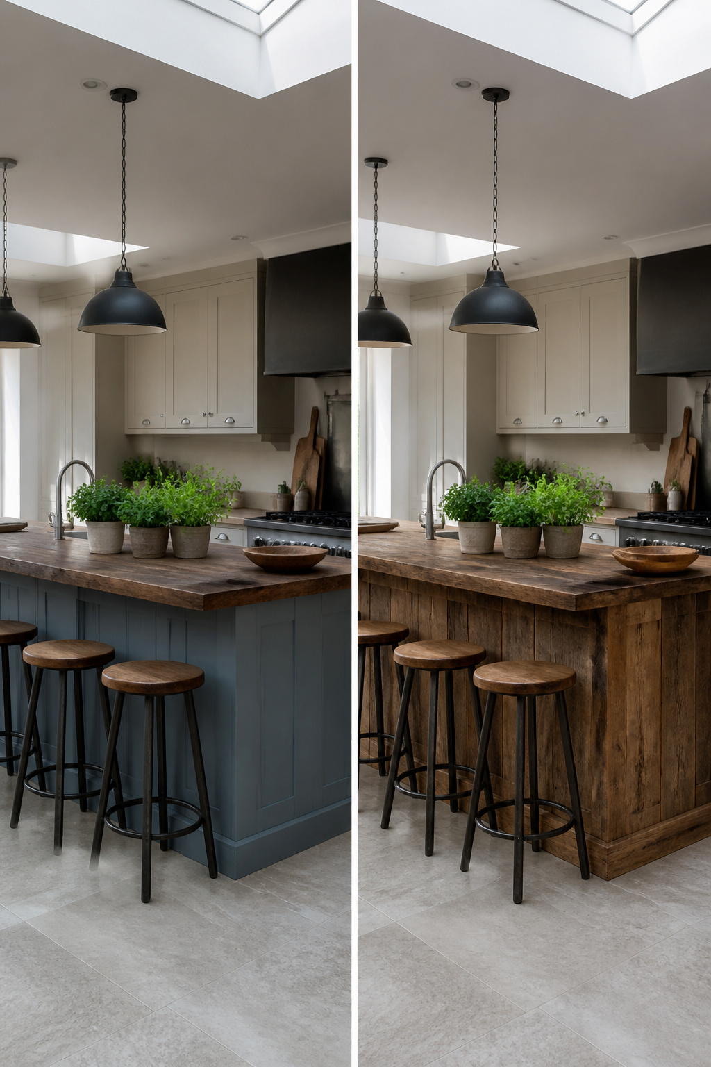
Pigeon by Farrow & Ball reads as three different colors in the same day. Morning light pulls out the gray; by afternoon the blue steps forward; after dark it turns moody and almost green. That shifting quality is what makes it feel expensive, and what makes it risky if you need a color to hold steady.
The name comes from the rock pigeons that colonized London, and the paint carries that same urban, slightly weathered character. Farrow & Ball positions it for boot rooms, studies, and paneled walls, spaces where the light is already limited and the color can do its chameleon act without fighting the room. In modern kitchens, it turns up on islands paired with Dimpse on the surrounding cabinets, a combination that keeps the gray-blue from overwhelming the space.
Sampling matters more here than with most colors. The same swatch that looked like a soft blue-gray in one photo read almost brown on my screen, and both were accurate to different moments of light. Order the real paint card, move it around the room, and watch it for a full day before committing.
9. Hague Blue
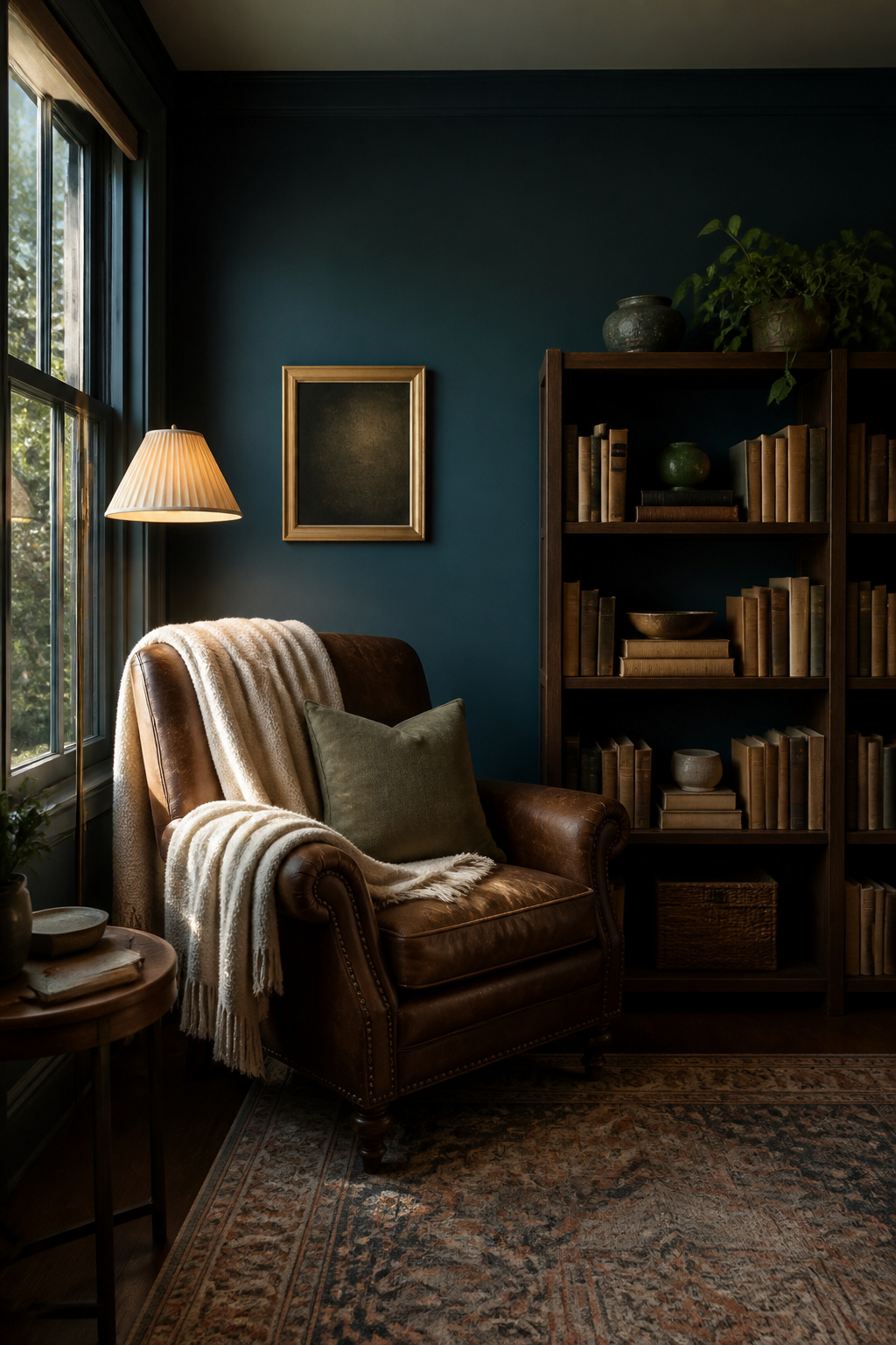
Hague Blue 30 by Farrow & Ball is the color that taught me to never trust a paint chip under fluorescent store lights. Under abundant natural light, this deep blue shifts toward a rich teal, almost blue-green, while the same wall after sunset reads as straight navy. The green undertones that create that shift are what make it feel moody rather than flat, though they also mean it will look greener on a north-facing wall than you planned.
I have seen it read as marine blue in bright rooms and as full teal in dimmer spaces, sometimes within the same open floor plan. That movement is the point, not a flaw; dark shades like this one gain life from the way they change with the day. The manufacturer notes it sits as happily outside as in small dark rooms, which squares with what I have watched it do on exterior trim, where daylight pulls out every nuance of the green undertone. If you want a gray blue paint that holds still and behaves, this is not it. If you want one that earns its keep by looking different at 8 a.m. than at 6 p.m., sample it on every wall you intend to paint, not just one.
10. Eclipse
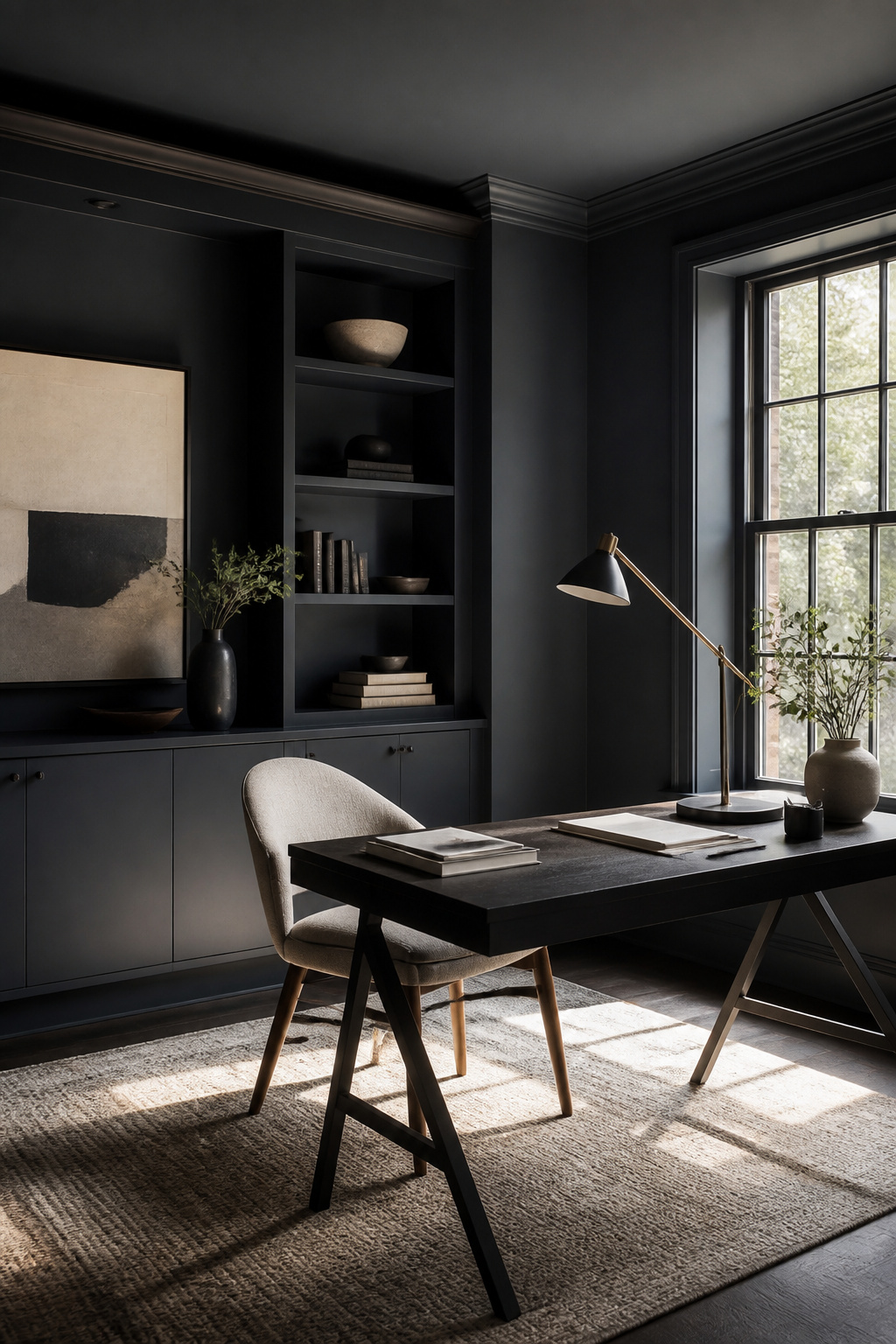
Eclipse sits at the darkest end of the gray-blue spectrum, and Benjamin Moore describes it exactly right: a dark, moody gray sharpened with a hint of blue. The LRV of 20.01 tells the story. Light Reflectance Value measures how much light a color bounces back, and at this depth, Eclipse absorbs most of what hits it. That is the point.
The blue undertone shifts with the hour. Morning light pulls the gray forward; late afternoon draws out the blue. Samples on your own wall matter here more than with lighter colors, because the room’s exposure rewrites the color. What reads as sophisticated depth in a south-facing study can turn to near-black in a north-facing hallway.
I have watched people fall for Eclipse in the store and wash it out at home, or vice versa. The sample period is not optional with this one. Move that peel-and-stick around through a full day before you commit. Mood is what you are buying with Eclipse, and mood changes with the light.
Color Undertones
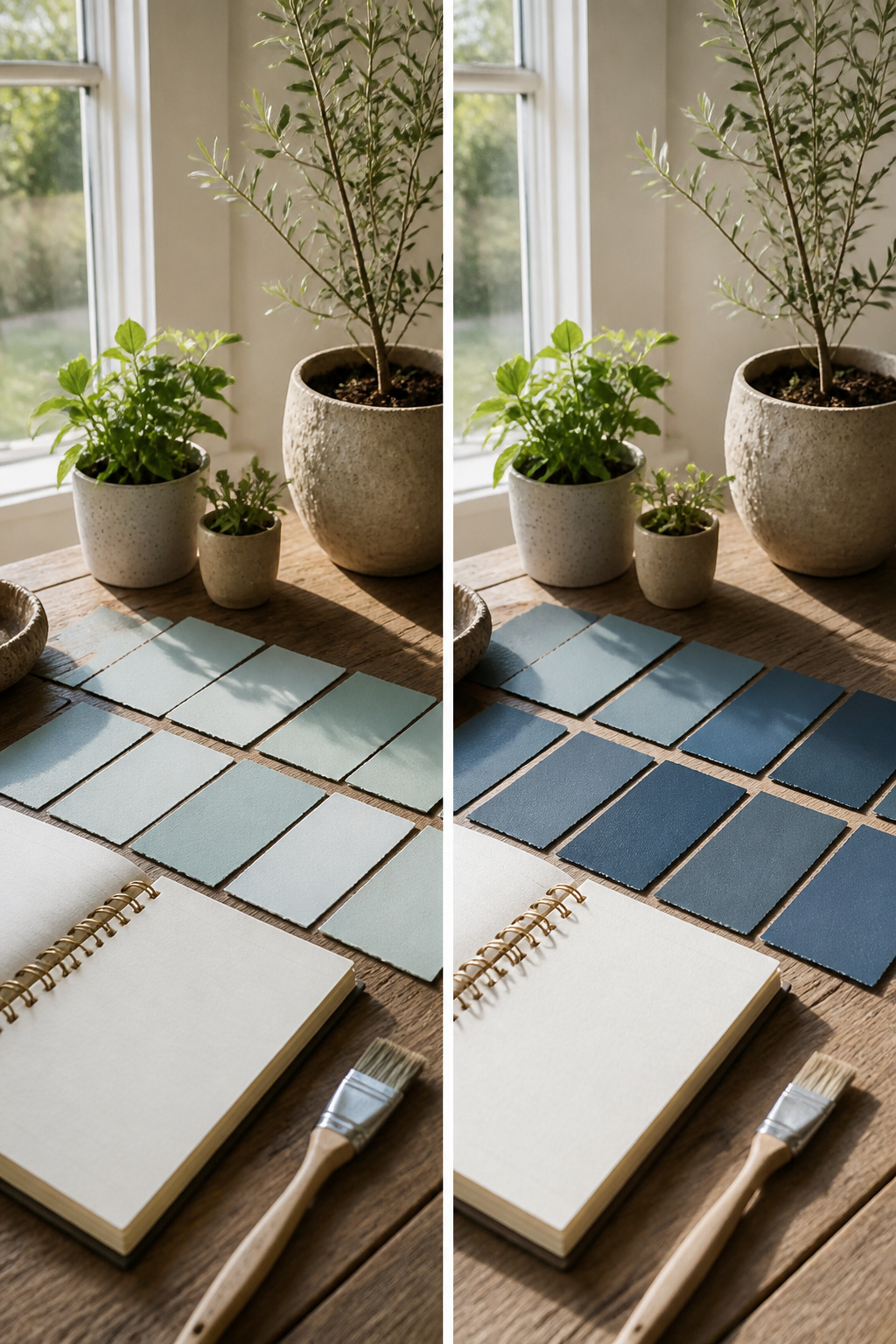
A blue-gray paint that looks perfect on the chip can turn green on your wall by three o’clock. That shift isn’t a defect; it’s the undertone reacting to your light. East- and west-facing rooms change the most, since morning and evening sun hit at sharp angles that pull different notes out of the same color. Calico, for instance, reads blue in direct sun but edges greener as the room darkens.
The direction matters less than knowing what you have. A gray with blue undertones behaves differently than a blue with gray undertones, and the second one is far more likely to surprise you. The difference is which color is doing the heavy lifting. In dim light, a deep blue with green undertones can cozy up a room; add too much light and it goes straight to teal. The same pigment under little natural light collapses toward blue-black.
If you want control over the shift, test at the hour you actually use the room. A morning kitchen sample checked at sunset tells you nothing useful. The paint isn’t lying to you; the light is just telling a different story.
Recommended Uses
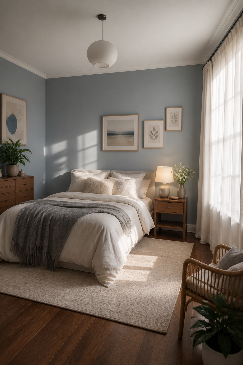
Bedrooms and bathrooms pull the most value from a blue-gray because the color does actual psychological work. The mix of gray’s neutrality and blue’s drop in heart rate quiets a space without making it feel cold or forgotten. I have seen a dusty blue like Niebla Azul SW 9137 read as serene in a bedroom with morning light and still hold that calm after sunset.
Kitchen cabinets and accent walls are the bolder play. Salty Dog SW 9177, a navy with real depth, works on cabinets when you want the kitchen to feel grounded rather than sterile. The same color on a single living room wall gives you the comfort without the commitment of wrapping the whole room. Lighting matters more than people expect: a blue-gray with green undertones turns cozy under warm bulbs but shifts toward teal in too much natural light, and a deep shade in a dim hall can read near-black by afternoon.
The practical limit is the room’s function. Spaces where you already need energy, a home office with tight deadlines, fight against the tranquility instead of using it.
Testing Samples
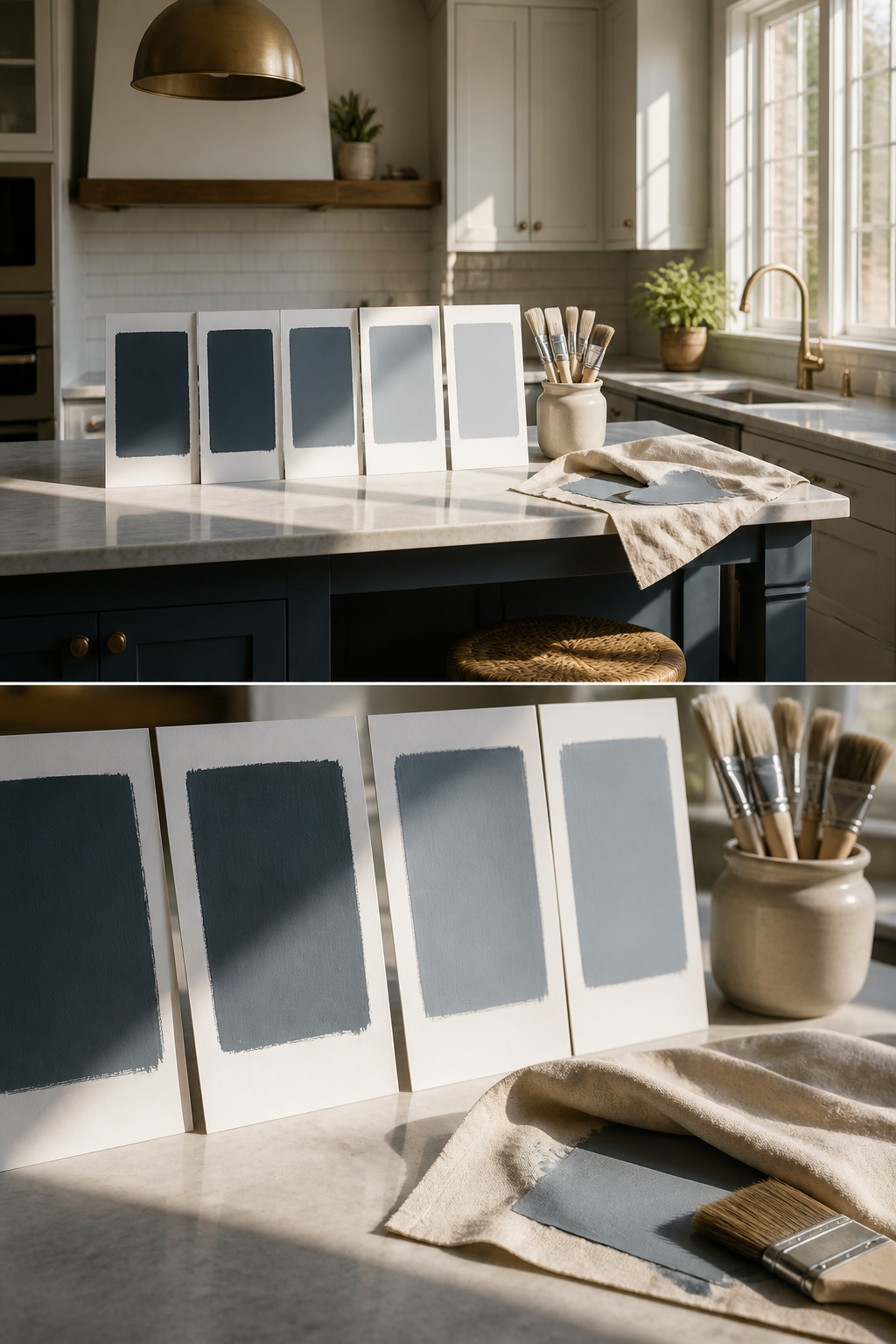
A gray blue paint chip under store lighting tells you almost nothing about what happens at home. The same color that reads as a quiet gray on paper can turn nursery-bright on the wall once the sun hits it.
- Paint samples on white poster board, not directly on your existing wall color. The old paint underneath will skew what you are seeing.
- Move the boards around the room. Morning light from an east-facing window pulls cooler tones forward; afternoon western light warms everything up.
- Check them across a full day. Benjamin Moore Eclipse, for example, shifts between reading more gray and more blue depending on the hour. East and west-facing rooms shift the most, so those spaces need the longest audition.
- Look at the sample in the dark too. Some blue-grays pick up green undertones once the direct light drops off, which matters if you use the room after sunset.
If the colors start blurring together after a few hours, that is normal. The subtle differences in undertones and light reflectance value only show themselves once they are living in your actual space.
Frequently Asked Questions
What are the best blue gray paint colors?
The best blue gray paint colors include Naval SW 6244, Storm Cloud SW 6249, Misty SW 6232, North Star SW 6246, Adrift SW 7608, Cloudy Sky 2122-30, Boothbay Gray, Pigeon by Farrow & Ball, Hague Blue 30, and Eclipse. Naval anchors a room without flattening it, Misty works as a near-neutral, and Eclipse sits at the darkest end of the spectrum for moody depth.
How do I choose a blue gray paint color?
Test samples on white poster board, not your existing wall, and move them around the room through a full day. Morning sun pulls cooler tones forward while afternoon light warms everything up. Check east- and west-facing rooms most carefully, since they shift the most. Some blue-grays pick up green undertones after sunset, so look at samples in the dark too.
What colors go well with blue gray?
Clean whites, creams, earthy greens, greiges, and warm browns all work well. Warm woods or creamy whites let pale shades like Misty stay quiet, while crisp black or charcoal sharpens them up. For North Star, avoid crisp white trim and choose something warmer like linen or pale greige instead.