
Gray paint ideas only work when you match the shade to the light your room actually gets. A near-white like Wickham Gray turns sterile and blue in a north-facing bedroom, while Kendall Charcoal at LRV 14.6 needs generous windows or it swallows the space. The twenty designer shades below start with Seashell Gray, a color that shifts from warm morning to cool evening without clashing with furniture you already own.
Seashell Gray
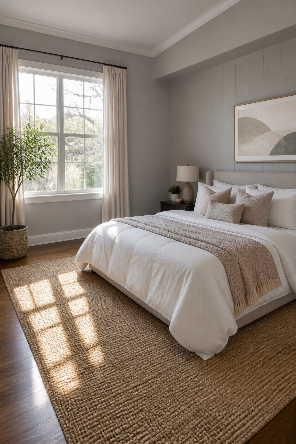
Seashell gray sits in that narrow band between warm and cool that makes a room feel finished without trying too hard. The undertone shifts with the light, reading slightly warm in morning sun and cooling off by evening, which means it rarely clashes with furniture you already own.
I keep coming back to it for bedrooms and hallways, places where you want calm but not cold. Valspar puts the case plainly: grays are adaptable. Differences in hue, saturation and intensity make for endless choices of gray paint colors. Grays can be used as an excellent base for layering in other colors.
That adaptability matters more than it sounds. A seashell gray wall lets you swap throw pillows, art, even a sofa without repainting. In north-facing rooms it leans cooler and crisper; in south-facing spaces it warms up like concrete at noon. The only place it struggles is under harsh fluorescent light, where the muted quality can flatten to nothing. Stick with dimmable LEDs or natural light if you can.
Gravity
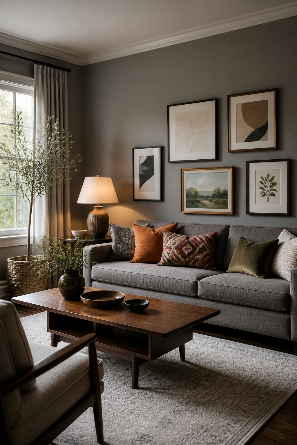
Mid-tone grays sit in the tricky middle ground where they can go flat fast, so the balance is in the undertone war, not the lightness itself. Sherwin-Williams Modern Gray (SW 7632) reads as a greige that manages to feel warm without tipping into beige territory, which is what "balanced" actually means in a room: the color holds steady whether your north window throws cool light at 10 a.m. or your lamps warm everything up by evening.
I have watched balanced grays shift less dramatically than their cooler cousins, and that stability matters in spaces you actually live in. Modern Gray works on walls, trim, or cabinets because it neither advances nor recedes aggressively. Benjamin Moore Coventry Gray HC-169 plays a similar role, though it leans slightly cooler.
The practical difference shows up in open layouts. A balanced gray lets furniture and art do the moving; the wall stays quietly present. In smaller rooms, Tracy Morris favors Galveston Gray for its depth, but that same depth can close in a dark corner. Modern Gray’s medium value avoids that gamble entirely.
Elephant Gray
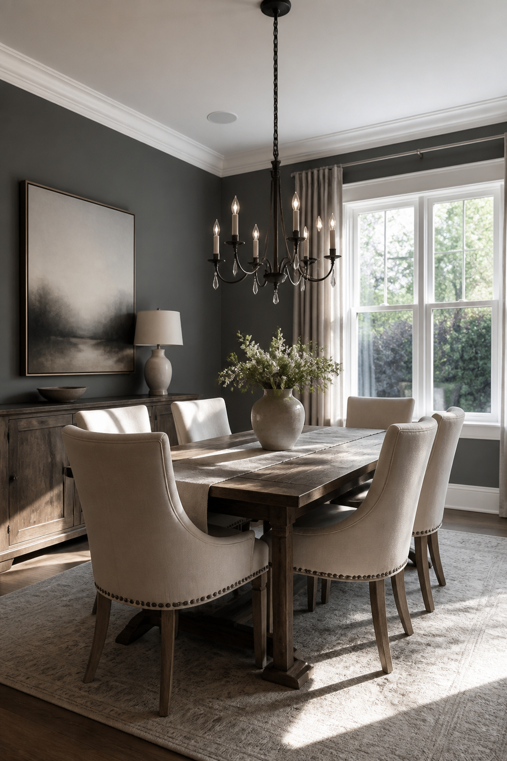
A wall in elephant gray carries enough depth to make trim and ceilings read as architecture instead of afterthought. Benjamin Moore’s Kendall Charcoal, at roughly LRV 14.6, sits at that threshold where gray turns into something closer to charcoal without losing its neutral status. I have watched lighter grays flatten in rooms with generous natural light; the pigment simply has nothing to push against. Elephant gray solves that by supplying the contrast itself, so the room builds layers even when the furnishings stay pale.
The risk is real, though. In a dim space or one with low ceilings, this depth can swallow the square footage you have. The sources split on how to handle it: Kendall Charcoal reads as a cocoon when taken wall to wall, while Chelsea Gray offers a warmer, more forgiving route if the room faces north or the windows sit small. For cabinetry or a single accent wall, the cooler elephant tone wins hands down. For the full room, the warmer deep gray keeps the sophistication without the cave effect.
Revere Pewter
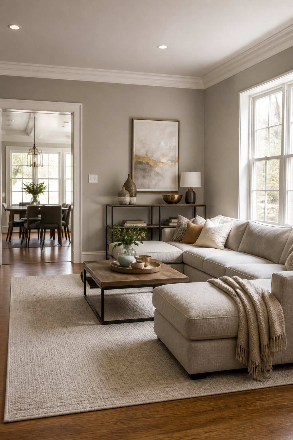
Revere Pewter (Benjamin Moore HC-172) sits at that useful middle ground where gray and beige overlap, earning it the "greige" label that keeps it from reading too cold in north-facing rooms or too muddy where afternoon sun pours in. Its LRV of about 55.5 puts it in the light-medium range, dark enough to feel grounded on walls but light enough that ceilings and trim in crisper white still pop against it.
What separates this shade from flatter grays is how actively it shifts. Morning light pulls the beige forward; under LEDs after dark, the gray takes over. That adaptability makes it forgiving in open plans where one color has to carry from a windowed entry to a hallway that gets no direct sun at all.
On Benjamin Moore’s color strip, Edgecomb Gray sits right beside it, and the two coordinate naturally. Edgecomb Gray runs creamier and more taupe in the same conditions, so the pairing works for adjacent rooms you want to relate without matching exactly. Either one handles the full range of living spaces to bedrooms, but Revere Pewter’s slightly cooler balance reads more neutral against bold furniture or saturated art.
Classic Gray
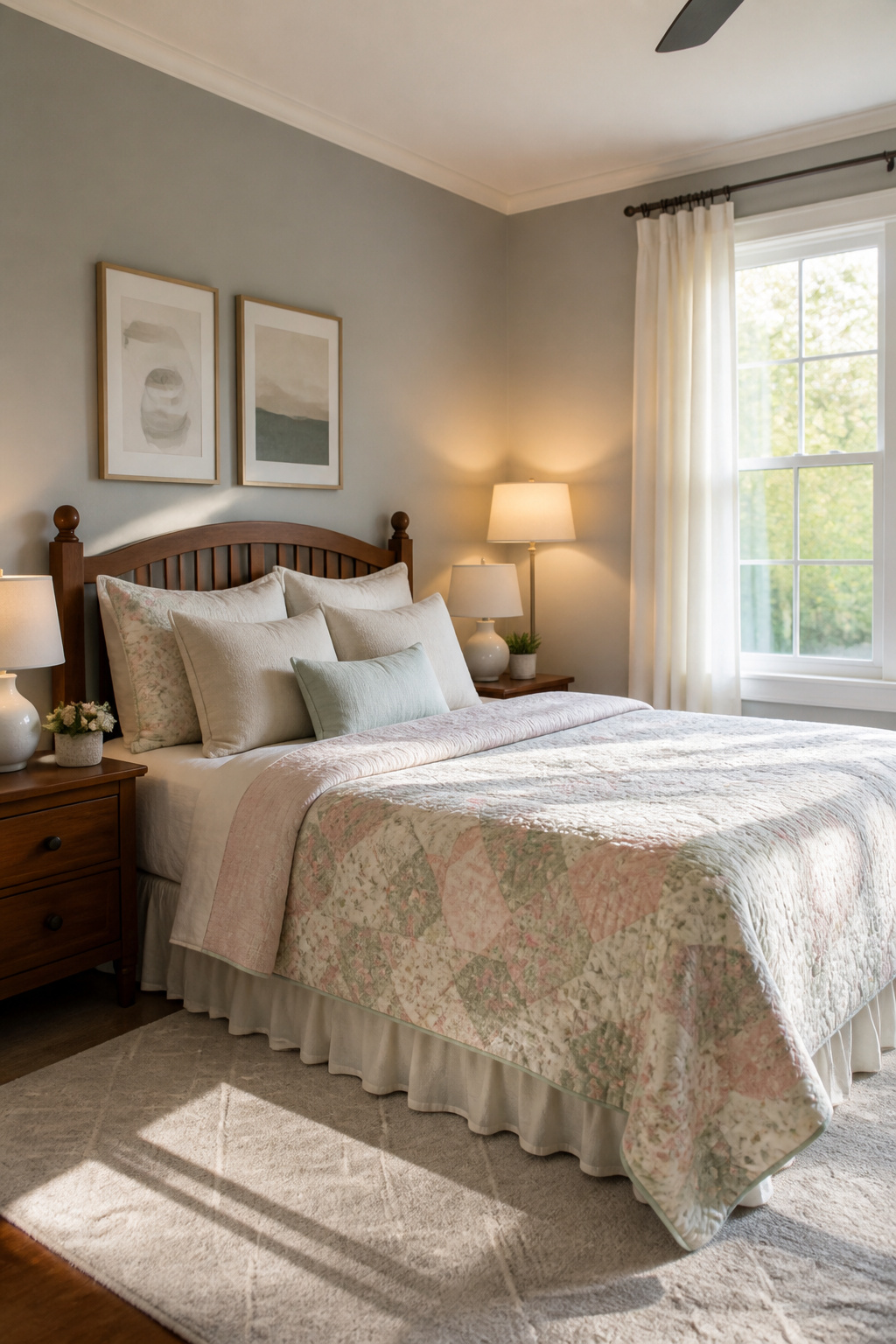
Benjamin Moore’s 1548 Classic Gray sits right on the edge where gray meets off-white, and that tension is what makes it work. Two designers back it specifically for airy spaces, and the reasoning holds up: the color carries warm undertones that keep it from going sterile, but it never drifts into beige territory.
Light shifts it throughout the day, which sounds like a risk until you see it in practice. In a guest room or a dining room, it stays soft without turning muddy. It also handles colorful art better than a true off-white would, giving the walls enough presence to frame the piece without competing.
The natural, earthy feel comes through more in person than on a chip, so testing it on the wall matters here. What reads as barely-there gray in morning light can pick up more warmth by afternoon, and that movement is the point, not a flaw to correct.
Wickham Gray
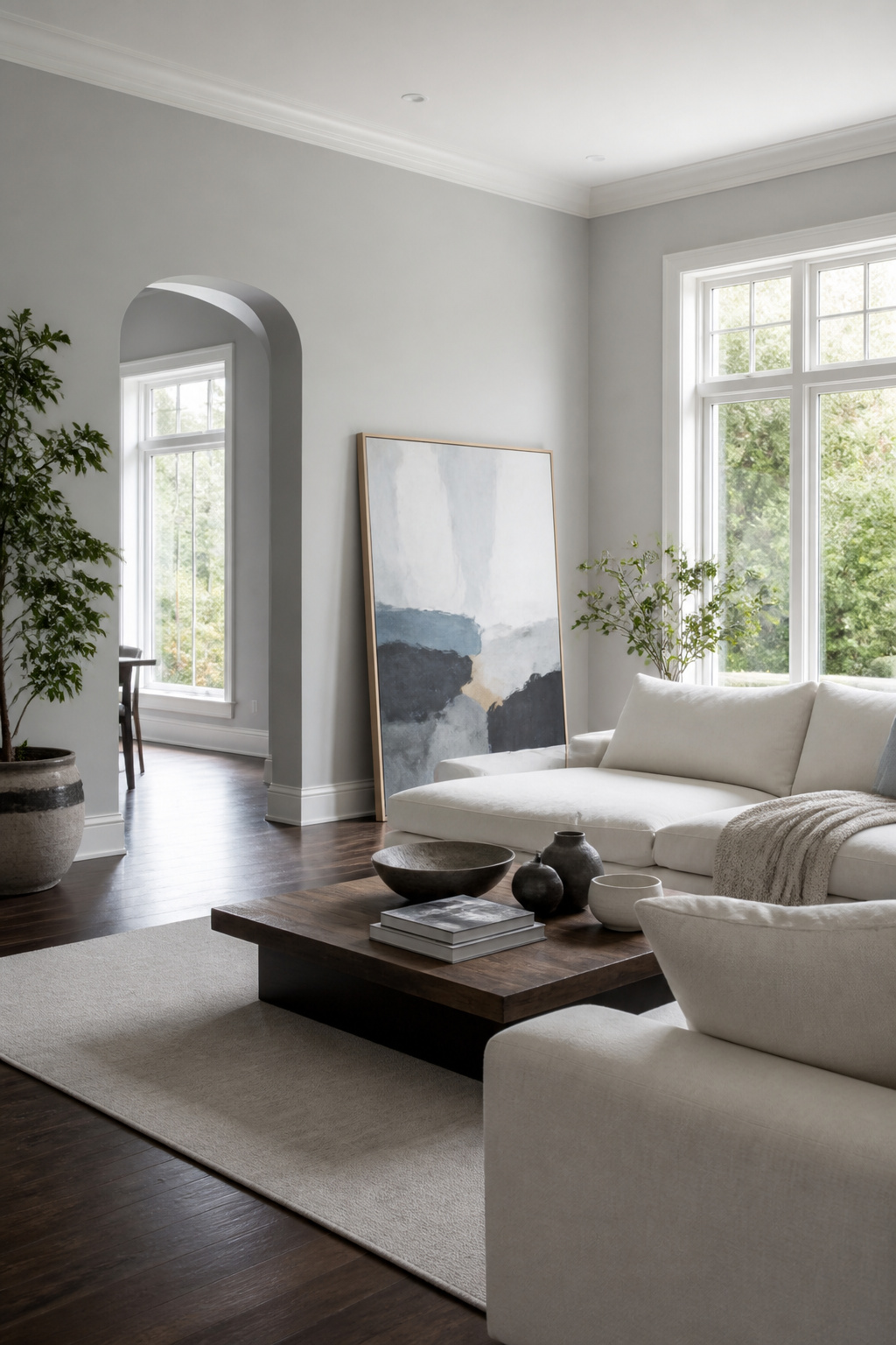
Benjamin Moore Wickham Gray HC-171 reads as a near-white with enough body to keep a room from feeling sterile. Its LRV sits around 68.9, which explains why south-facing spaces stay balanced and luminous rather than tipping into glare.
The undertones shift depending on who you ask, and that disagreement is worth watching. One read finds subtle blue, another catches green-blue, and both intensify as the day moves. Morning light pulls the color cooler; afternoon sun can flatten it toward plain off-white. Testing it on multiple walls matters more here than with grays that stay put.
Sydney Levy, a designer in Maryland, reaches for it in large living spaces where airy and elegant need to coexist. The light-reflective quality bounces around open plans without the chalkiness of a true white, and the subtle depth keeps corners from dropping into shadow.
Skip this one if your room faces north and already runs dim. The cool cast turns flat and slightly blue in weak light, and what reads as sophisticated brightness in a sunlit space can feel like an unheated waiting area elsewhere. Pair it with crisp whites and marble surfaces if you want the blue to read intentional rather than accidental.
Kendall Charcoal
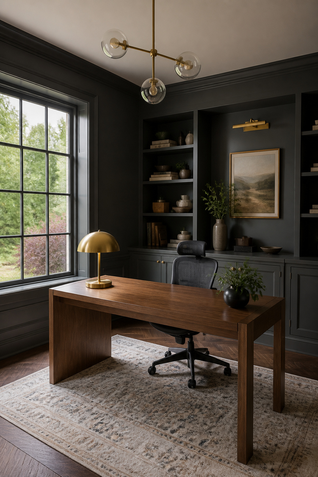
Benjamin Moore Kendall Charcoal HC-166 carries an LRV of roughly 14.6, which puts it deep enough to read as near-black in a dim hallway but still gray enough to soften under direct light. That warmth keeps it from going cold or flat, and the balance matters more than most people expect when they first sample it on a swatch.
The color works across eras without fighting the architecture. In a traditional interior, the warmth nods toward the browns and creams already in the trim or flooring; in something modern, the depth does the heavy lifting and lets cleaner lines speak. Four separate project records back that range: a legacy ranch renovation used it as the grounding neutral throughout, kitchen cabinetry in a lighter-contrast scheme paired it with crisp whites for a moody but fresh result, a dining room application preceded a full makeover, and accent-wall uses repeatedly show it holding its own against lighter grays without shifting blue or purple.
Some eyes pick up a faint green-brown undertone, others read it as true gray. The variation is real, so the swatch test matters here more than with mid-tone grays that forgive bad light. North-facing rooms will push it darker and possibly cooler; south light brings the warmth forward. Either way, the 14.6 LRV is your hard number: plan for that depth, or plan to use it only where you want the walls to advance.
Agreeable Gray
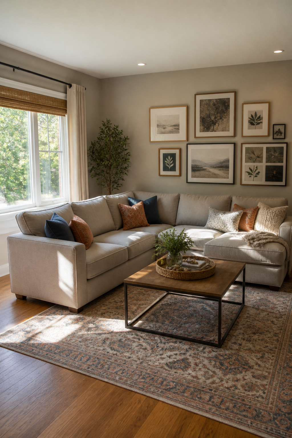
Sherwin-Williams Agreeable Gray, SW 7029, sits in that useful middle ground where a color earns its keep by doing more than one job. The same wall reads greige under morning light and shifts toward blue-gray by evening, which means the room stays interesting without demanding attention. I have watched enough paint swatches go flat to notice when one keeps working across the day.
The creamy base keeps it from going cold, and that warmth is what lets it travel from living room to home office without fighting the furniture. White trim against it pops the way designers want; the gray steps back and the millwork steps forward. It is the shade people reach for again when the first project goes well, which explains how it became one of the most popular grays on the market.
Dovetail
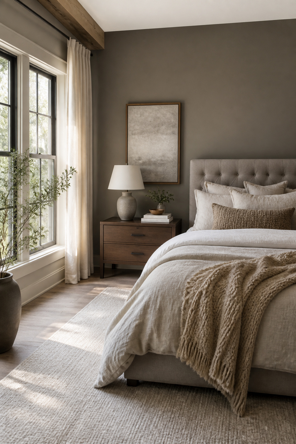
Sherwin-Williams Dovetail (SW 7018) sits at the warmer end of the gray spectrum, a rich mid-tone that reads almost taupe in certain light. Where cooler grays in this list can leave a bedroom feeling like a clinic, Dovetail wraps around the space. The red and yellow undertones do the work here, catching what light a north-facing room gets and bouncing back warmth instead of swallowing it.
I keep coming back to it for sleeping spaces because the color behaves like a neutral without the chill. Pair it with warm wood, something with actual grain and variation, and the room stops trying so hard. The contrast against cooler grays like Wickham or Gray Owl is the difference between a room you pass through and one you close the door on.
Iron Mountain
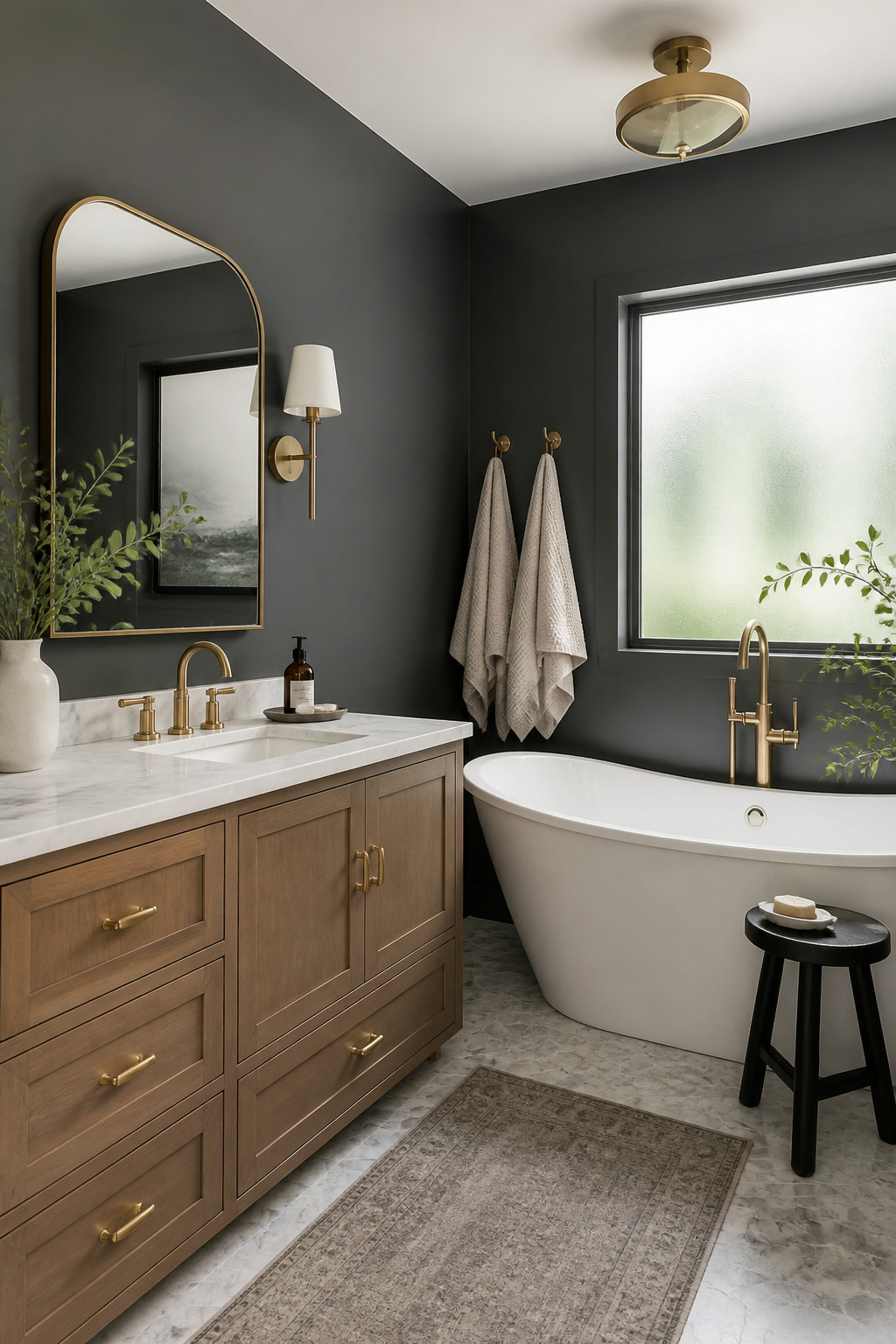
2134-30 sits right where dark gray starts to feel like a decision rather than a default. Benjamin Moore calls it Iron Mountain, and the name fits: there’s weight to it, but also enough warmth that a room doesn’t turn into a cave.
The balance is what makes this one of their best sellers. It carries drama without the harshness of black, which means you can use it in smaller doses and still get impact. A powder room vanity in high-gloss finish reads sophisticated rather than heavy; the warmth keeps it from flattening the space. For someone scrolling gray paint ideas and hesitating at the darker end of the strip, this is the shade that tests whether you actually want the depth or just think you do.
Smoke
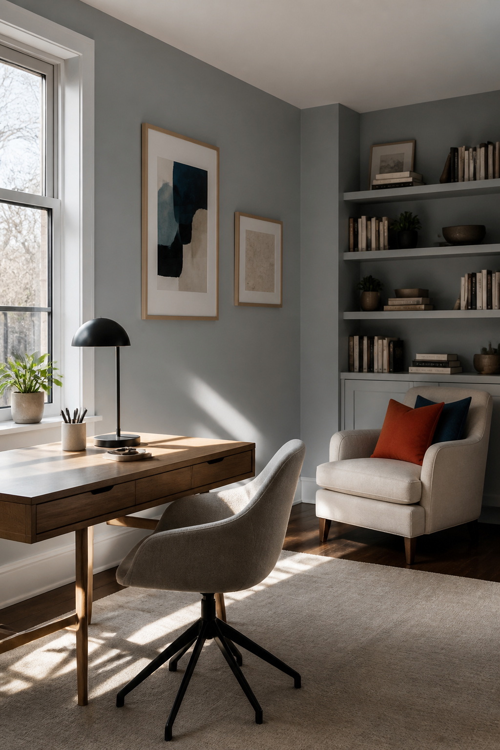
Benjamin Moore Smoke 2122-40 carries an LRV of 56.39, which lands it in that light-medium band where a color stays present without taking over the room. The gray in it runs deep enough to keep things grounded, while the blue pulls the whole thing toward calm. That balance reads as mature rather than playful, which is why bedrooms get mentioned first for this one. Bathrooms work too, though the sources lean heavier on sleeping spaces.
I have watched too many people grab a blue-gray hoping for serenity and end up with something that feels like a nursery. The gray undertone here does the heavy lifting to prevent that. At this LRV, Smoke holds up in rooms with decent natural light but will not turn cave-like in a space that relies on lamps after four o’clock. If your bedroom faces north and stays dim, this still reads as color rather than shadow.
Chelsea Gray
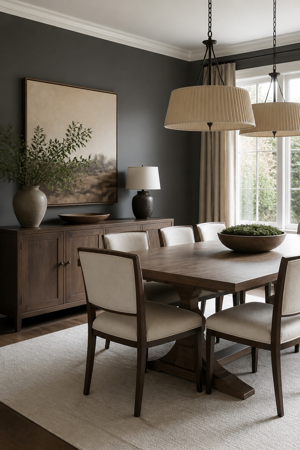
Benjamin Moore Chelsea Gray HC-168 sits at an LRV of roughly 22.1, deep enough to read as charcoal in afternoon light but still carrying enough warmth to keep a room from feeling like a showroom floor. The undertone here matters: this is greige pushed toward its darker limit, not a cool slate that turns blue after sunset.
What convinced me, reading through the recommendations, is how willingly this color moves between surfaces. Walls in a dining room, yes, but also cabinetry or an interior door where you want the visual weight of black without the harshness. Pair it with lighter trim and the contrast does the work for you; the color itself does not need to shout.
The risk is using it where you actually need brightness. North-facing rooms, small offices without generous windows: the warmth helps, but 22.1 is still 22.1. Reserve Chelsea Gray for spaces that already receive light, or for moments where you are deliberately building a mood. A bold yet timeless statement only holds up when the surrounding materials give it room to breathe.
Peppercorn
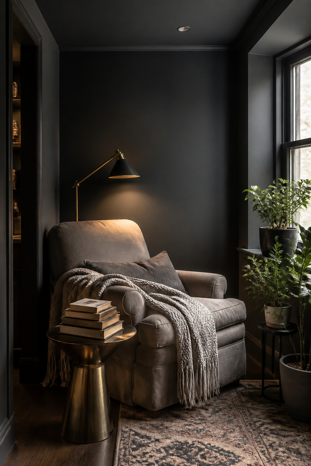
Sherwin-Williams Peppercorn sits right on the line between charcoal and near-black, and the shift between cool and warm is what makes it worth testing twice. Morning light pulls out a slate edge that feels almost blue; by late afternoon the same wall turns toward something softer, closer to burnt umber. That movement is quiet enough to miss in a single visit to the paint store, which is where people get caught out.
I learned to check it at both ends of the day after watching it read almost brown in one room and steely in another, same orientation, different times. The undertone doesn’t flip dramatically; it inches. In a north-facing space the cool side tends to stay dominant, while southern exposure gives the warm note more hours to show. For a feature wall or a wrapped reading corner, that subtlety keeps the color from flattening into a flat dark slab. It stays alive.
Gray Owl
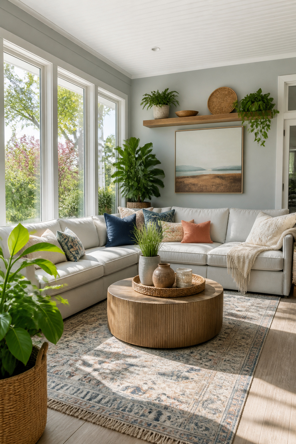
Gray Owl by Benjamin Moore has become one of those colors that shows up on Pinterest boards for a reason. It walks a line most light grays miss, balancing enough warmth to feel welcoming with a neutrality that does not go muddy. The LRV sits at roughly 65.7, which puts it in that brightening range without washing out.
The catch is the undertone. In rooms flooded with natural light, the color reads as a clean, airy gray. Shift to artificial light with no windows and it starts pulling green, still pleasant but not what you picked it for. I have watched enough project photos to notice the same paint looking like two different colors between a sunlit wall and the shadowed corner beside it.
For east-facing rooms, the morning warmth flatters it; by afternoon the cooler light settles the gray down. South-facing spaces are forgiving, letting the color warm up without drifting beige. North-facing rooms are where you need to test carefully, since the cool indirect light amplifies any green or blue lurking in the formula. A warmer bulb around 2700K softens the cool edge if you are committed to the shade for a dim space.
Modern Gray
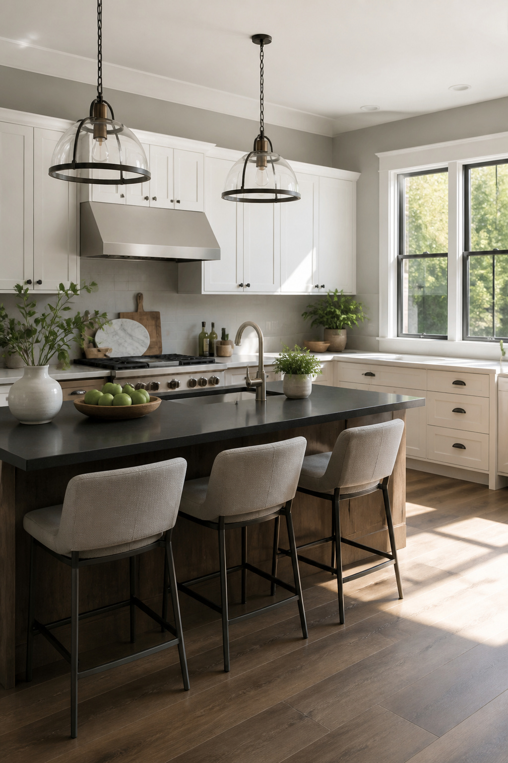
Sherwin-Williams Modern Gray (SW 7632) sits in that narrow band where a mid-tone gray still reads as warm rather than moody. The earthy undertone keeps it from feeling flat under afternoon light, which is where cooler mid-tones on this list tend to turn institutional.
Katalin Farnady, a designer based in Annapolis, calls it her absolute favorite gray for exactly that balance: timeless enough to live with, soft enough to feel finished rather than merely painted. I have used it in enough mock-ups to notice the same thing. Where a gray like Revere Pewter leans heavier on beige, Modern Gray stays closer to true gray without crossing into the charcoal territory that makes small bedrooms feel like evening all day.
The versatility is what earns it a spot here. Walls, trim, cabinetry, even a full kitchen repaint: it holds up because the warmth is quiet, not insistent. If you are comparing mid-tones and want coziness without committing to greige, this is the one to test first.
Classic Silver
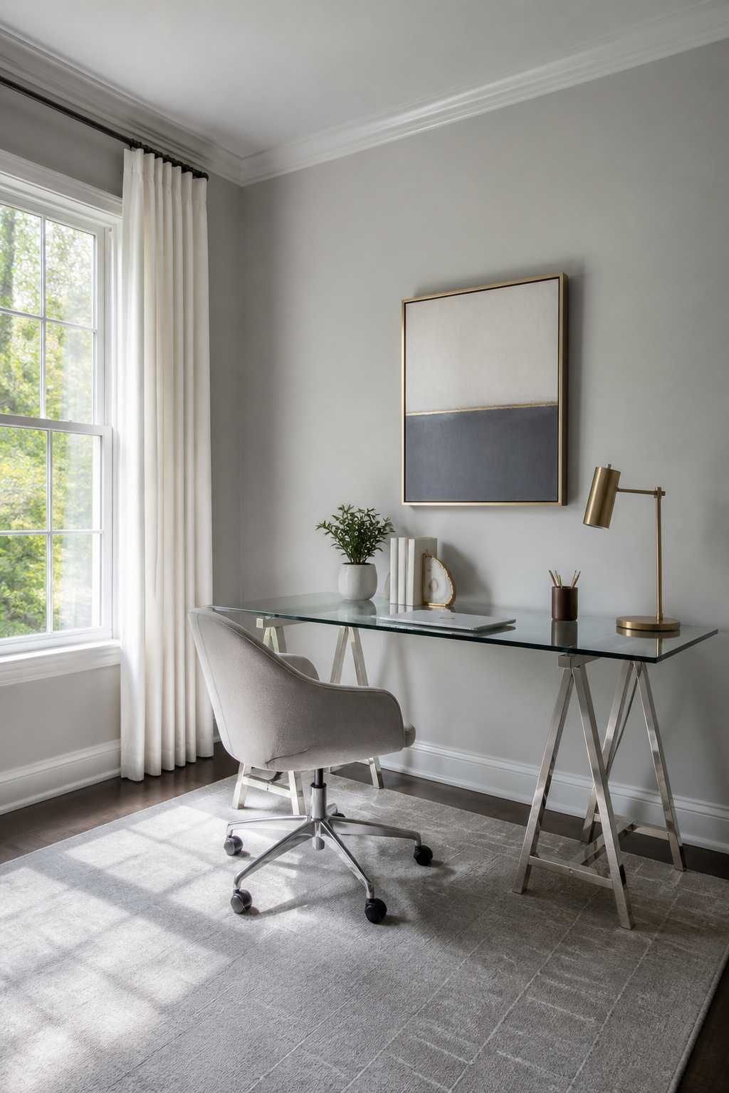
Classic silver sits at that useful midpoint where a wall still reads as gray in daylight without closing in the way darker shades can. The effect is spatial: rooms feel settled but not shut in, the color doing quiet work to push walls outward visually rather than drawing them toward you.
Benjamin Moore’s Coventry Gray HC-169 lands here with an LRV around 48, enough light reflectance to keep a living room or home office from dimming by late afternoon. Its slight cool undertone steers refined rather than chilly, a distinction that matters in north-facing spaces where grays can go flat.
Gray Owl OC-52 pulls lighter at roughly 65.7 LRV, shifting green or blue depending on the window. That chameleon quality makes it forgiving in open-plan layouts where one stretch of wall meets another angle of light; the color stays coherent without turning institutional.
Galveston Gray

Benjamin Moore’s Galveston Gray, also known as Graystone, carries a slight green undertone that reads as earthy and organic rather than cold. The color shifts with its surroundings, pulling warmth or coolness from adjacent walls and light. Tracy Morris, a Virginia-based designer, reaches for this shade in smaller spaces where depth matters without heaviness. Kitchen cabinets get the same treatment. The green cast keeps mid-tone gray from flattening into builder-beige territory, and the subtle warmth stops it from feeling like a shadow. In a compact room, that balance means walls recede without the space disappearing entirely.
Cityscape
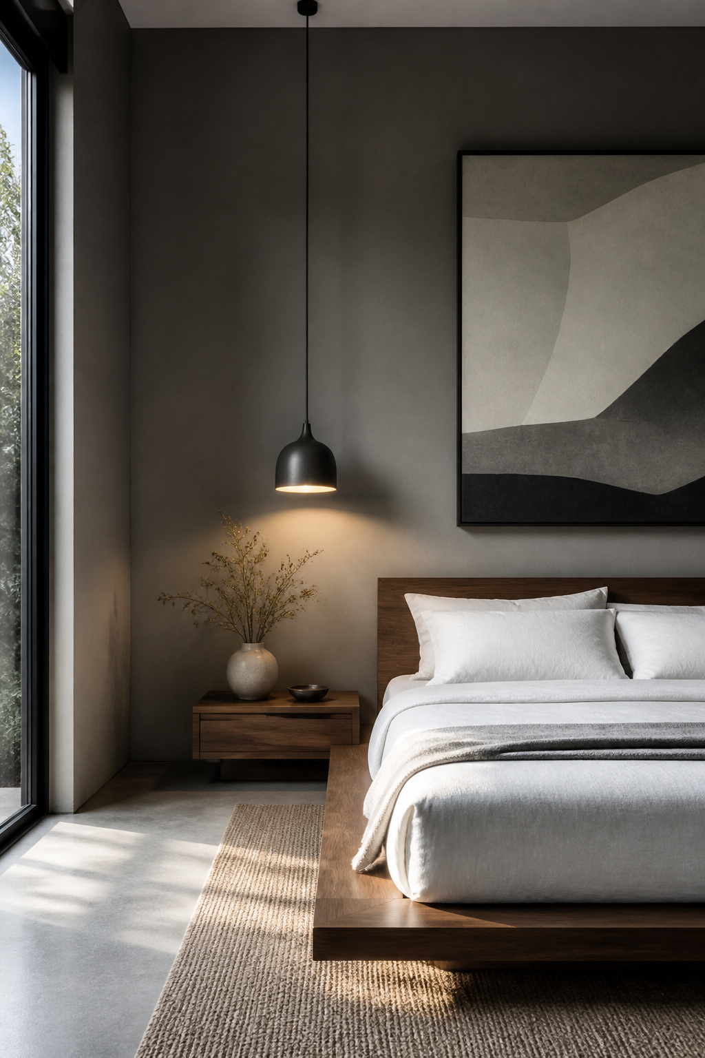
Soft cool-toned charcoal reads as a quiet shadow rather than a statement. In a room stripped down to the essentials, it lets the architecture do the talking while the paint itself steps back. I tried something similar in a narrow guest room where every wall had to work, and the color kept the space from feeling like a rental even though nothing in it was expensive. The cool note matters here: a warmer charcoal would have turned cozy, which sounds nice until you want the room to feel edited rather than furnished. For that minimalist backdrop to hold, trim and ceiling need to stay in the same restrained family. White that is too crisp against this gray starts a fight your eye keeps returning to, and the whole point of the shade is to stop that from happening. Flat or matte finish keeps it quietest; eggshell wakes it up more than you would expect.
Mindful Gray
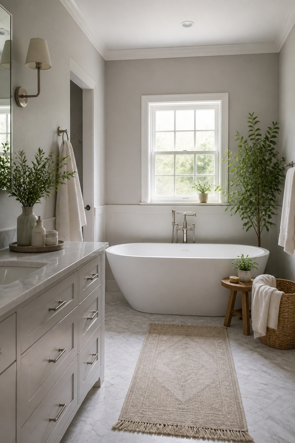
Mindful Gray sits right in that middle space where warm and cool keep trading places. Morning light pulls the beige forward; by afternoon the same wall reads closer to a soft blue-gray. The shift is dramatic enough that you will want to live with a sample for a full day before deciding.
I learned this the hard way with a north-facing bathroom that looked cozy at 10 a.m. and felt like a clinic by four. The room had only cool, indirect light, which amplifies any blue or green hiding in the undertone. In that situation, Mindful Gray can slip cooler than you expect.
South-facing rooms give you more forgiveness. The warm, steady light balances the color and keeps it feeling neutral rather than moody. East and west orientations are where the real show happens: the tone changes as the sun moves, sometimes within a single hour. If you want consistency, pair it with warmer bulbs around 2700K to steady the effect after dark. Cooler 4000K bulbs will push it straight into crisp territory.
For testing, paint a large board and track it. Move it wall to wall, watch it at breakfast and again after dinner. What reads as refined in one spot may feel flat in another, and with this shade, the light decides which version you get.
Tranquil Gray
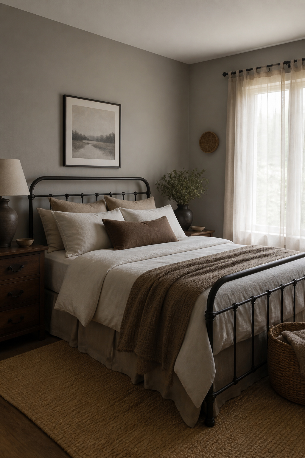
Tranquil Gray carries just enough taupe to keep it from reading as a flat, cool gray, which is exactly why it works in rooms that need balance without veering into beige territory. The brown undertone sits quietly beneath the gray, adding softness without announcing itself as color.
I have watched this shade shift across a single afternoon, turning slightly warmer as the sun drops, then cooling again under lamplight. That movement keeps a space alive in a way pure gray rarely manages.
North-facing rooms, where light stays indirect and can feel chilly, take to it especially well. The underlying warmth counters the cool cast of that exposure rather than fighting it.
Pair it with warm wood and natural fiber textures; the shared earthiness makes the combination feel settled rather than decorated. Rustic settings or a quiet bedroom both suit it, and the color stays versatile enough for either without losing its particular calm.
Understanding Undertones
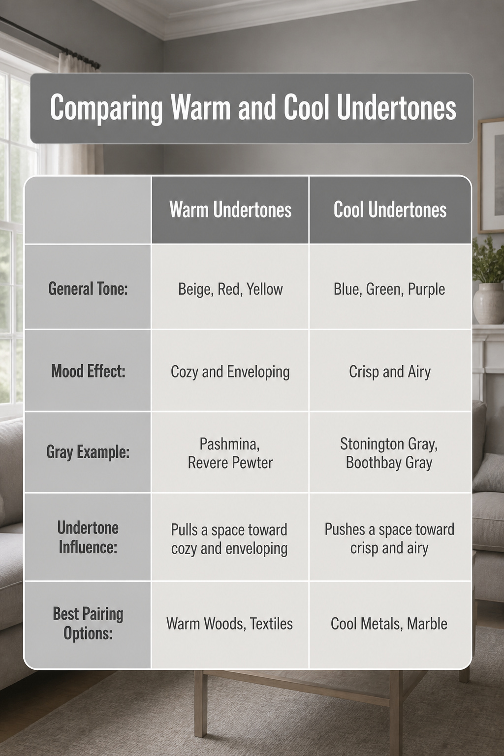
Gray isn’t really gray. The color that reads neutral on the strip hides a second color underneath, and that hidden hue decides whether a room feels like a warm afternoon or a cool morning.
Warm undertones carry beige, red, or yellow, and they pull a space toward cozy and enveloping. Cool undertones lean blue, green, or purple, and they push a room toward crisp and airy. A gray with sandy beige beneath it sits completely differently than the same depth of gray swimming with blue.
The undertone matters most when you start pairing. Matching warm with warm or cool with cool keeps the whole house from feeling like a fight. Pashmina and Revere Pewter both carry warmth that plays well together; Stonington Gray or Boothbay Gray run cooler and want company that does the same. Getting this wrong is the fastest way to make a gray wall look dirty or flat instead of intentional.
Lighting Effects

Light shifts gray more than most colors because its undertones sit quiet until the light hits them. A paint that reads crisp at nine can look moody by six, and the same gray under 2700K bulbs will soften where 4000K bulbs turn it sharper and bluer. North-facing rooms pull blue and green forward, so a warmer gray or greige keeps the space from going cold. South light forgives more, warming cool grays and enriching warm ones. East rooms start bright and warm, then cool; west rooms do the opposite, throwing intense warm light late in the day that saturates whatever gray is on the wall.
Benjamin Moore’s Gray Owl shows how this plays out in practice. The color balances warm and neutral beautifully, but too much artificial light with no natural window can push it nearly green. Corners in that brick-walled room looked nothing like the sunlit sections, and that difference is the color, not a mistake in the can. The fix is the one designers repeat: paint a large foam board, move it around, and watch it across a full day before committing. What the morning sells, the evening may change entirely, and gray’s trick is that both versions are real.
Choosing the Right Finish

The finish changes gray as much as the color itself. Matte swallows light and gives walls that velvety, almost fabric-like depth, which sounds ideal until someone brushes against it with a coffee cup. Flat hides every lump and picture-hook scar, so it earns its keep in low-traffic rooms where the light hits just right and nobody’s scrambling around after toddlers.
Eggshell sits where most of us actually live. The slight sheen catches enough light to keep gray from reading as dead, and the surface survives a wipedown without leaving a shiny scar. Living rooms, bedrooms, the hallway everyone uses, the dining room you finally painted because the old color aged badly, eggshell handles all of it without demanding you treat the wall like museum glass.
Satin steps up where moisture or grubby hands show up regularly. Kitchens, bathrooms, kids’ rooms, the back hall that collects boots and mud and dog, that pearl-like sheen repels water and scrubbing in ways eggshell only manages for so long.
Semi-gloss and high-gloss belong on trim, doors, cabinets, the architectural edges that take the real beating. A silvery-gray in high-gloss on a built-in or a door reads as intentional luxury, not utility, though the durability is the same either way.
Eggshell is the finish most people land on after testing the others, not because it wins any single category, but because it loses none of them badly enough to matter.
Pairing Colors With Gray
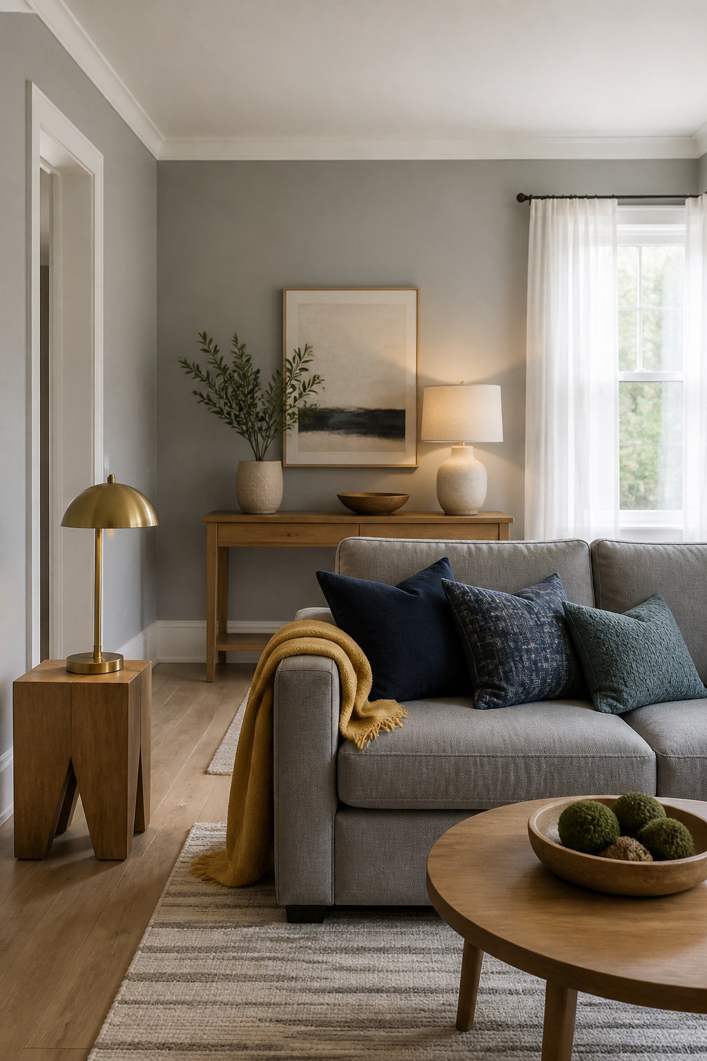
Gray’s real strength shows up once you start layering other colors against it. Crisp whites such as Benjamin Moore Simply White OC-117 or Distant Gray OC-68 on trim and ceilings keep the look clean without drifting sterile; the contrast reads as intentional rather than unfinished. Blues pull the same trick with more depth. Deep navy or teal works, and lighter shades like Mysterious AF-565 or Santorini Blue 1634 hold their own without shouting.
Wood is where I see most rooms go wrong or right. Oak, walnut, or cherry furniture adds warmth that keeps gray from flattening into coldness, especially with cooler gray bases. The grain does the work; you don’t need much of it. I’ve watched a single oak console salvage a gray living room that felt like a showroom floor until that piece arrived.
For accents, the sources lean toward mustard yellow, burnt orange, soft pinks like Tissue Pink 1163 or Head Over Heels AF-250, and greens from emerald to sage. The rule I took from this: one warm accent beats three competing ones. A wool throw or brass lamp at 2700K–3000K lighting temperature does more to soften the space than a scattershot palette.
Testing Paint Colors

- Paint the sample onto a large foam board if that is what you have on hand, but peel-and-stick samples made from real paint are the cleaner way to test gray paint ideas in your actual space. They lift off without residue and store flat for later reference.
- Stick the sample directly onto the wall, never over your existing color. The old paint will bias your eye and the gray will read wrong.
- Move the sample to every wall in the room, near windows, beside your flooring, and against any wood tones or fabrics you are keeping. Gray shifts dramatically with its surroundings.
- Check it from morning to evening, under both natural and artificial light. What reads crisp at nine o’clock may turn moody by dinner, and that daily swing is exactly why gray demands this step.
- Keep the sample up for a full day cycle before you commit. The undertones you miss in a quick glance are the ones you will live with for years.
Designer Tips for Using Gray

Gray behaves like a chameleon in ways beige never does, so professionals treat sampling as non-negotiable. Paint a large foam board with your chosen shade and move it through the room from morning to evening. What reads crisp at 9 a.m. can turn moody by lamplight, and that shift is exactly why gray fascinates some designers and frustrates others.
The same undertone discipline applies to everything else in the room. Match warm grays with natural woods and soft textiles for depth, or pair cool grays with polished nickel or marble for a cleaner effect. Mismatched undertones, a warm gray against a stark white trim with blue notes, read as a mistake the eye catches instantly.
Finish choice matters more than people expect. Matte absorbs light and hides wall imperfections, which works in low-traffic bedrooms. Eggshell adds slight sheen and durability, the better call for hallways or living areas where hands actually touch the wall. Undertones intensify once paint fully dries, so the wet sample on the wall still understates what you will live with.
Frequently Asked Questions
What are the most popular gray paint colors?
Revere Pewter, Classic Gray, and Kendall Charcoal rank among the most popular grays. Benjamin Moore also lists Coventry Gray, Gray Owl, and Wickham Gray as top sellers. Sherwin-Williams favorites include Agreeable Gray, Modern Gray, and Mindful Gray.
How do I make a gray room feel warm and not cold?
Layer in warm textures like wool, velvet, and linen; add furniture in oak or walnut; and choose accent colors with warm undertones such as terracotta or rust. Light bulbs around 2700K cast a softer glow, and metallic finishes in brass or copper help too.
What’s the best paint finish for gray walls?
Eggshell offers the best balance for most gray walls, giving a slight sheen that adds depth without highlighting imperfections. For darker charcoals like Cityscape, flat or matte keeps the color quietest; eggshell wakes it up more than expected.