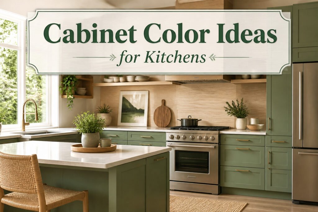
The right cabinet color idea for 2026 depends on whether your kitchen drinks in afternoon sun or relies on overhead fixtures to do the work. White still claims roughly 40% of installations because it bounces light and lets hardware change without a repaint, yet that same reflectivity makes every fingerprint visible by dinnertime. Navy or black can anchor a modern space, but only if you have the wattage or windows to keep them from flattening into gloom. Sage and olive greens handle the daily wear that shows on brighter colors, though they shift toward plain gray by late afternoon in north-facing rooms. Get the swatch onto an actual cabinet for a full day before you commit; the color that held at noon may be a different decision by evening.
1. Classic White
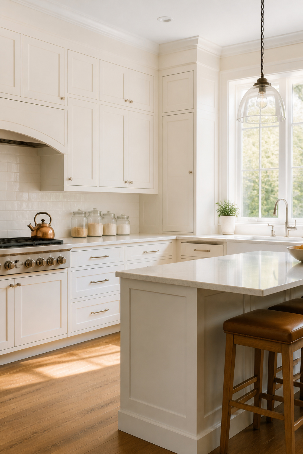
White still accounts for roughly 40% of cabinet choices, and the reason is practical as much as visual. A white kitchen bounces light around, reads clean against countertops you already own, and leaves room to swap hardware or accessories later without repainting.
Two paints come up consistently: Benjamin Moore White Dove (OC-17) and Sherwin-Williams Alabaster (SW 7008). White Dove leans slightly warm, which keeps it from going sterile under LED bulbs. Alabaster reads creamier and pairs well with natural wood floors or stone counters that have warm undertones.
Maintenance matters more than people admit. Semi-gloss or satin finishes wipe clean without showing every fingerprint, and white makes it obvious when a cabinet needs attention rather than letting grime hide. That same visibility means you stay ahead of wear, not behind it.
The real test is what is already in the room. Flooring, countertops, and fixtures should pull the white in one direction or another, cool or warm. Get that wrong and the cabinets look like they landed from another house.
2. Navy Blue
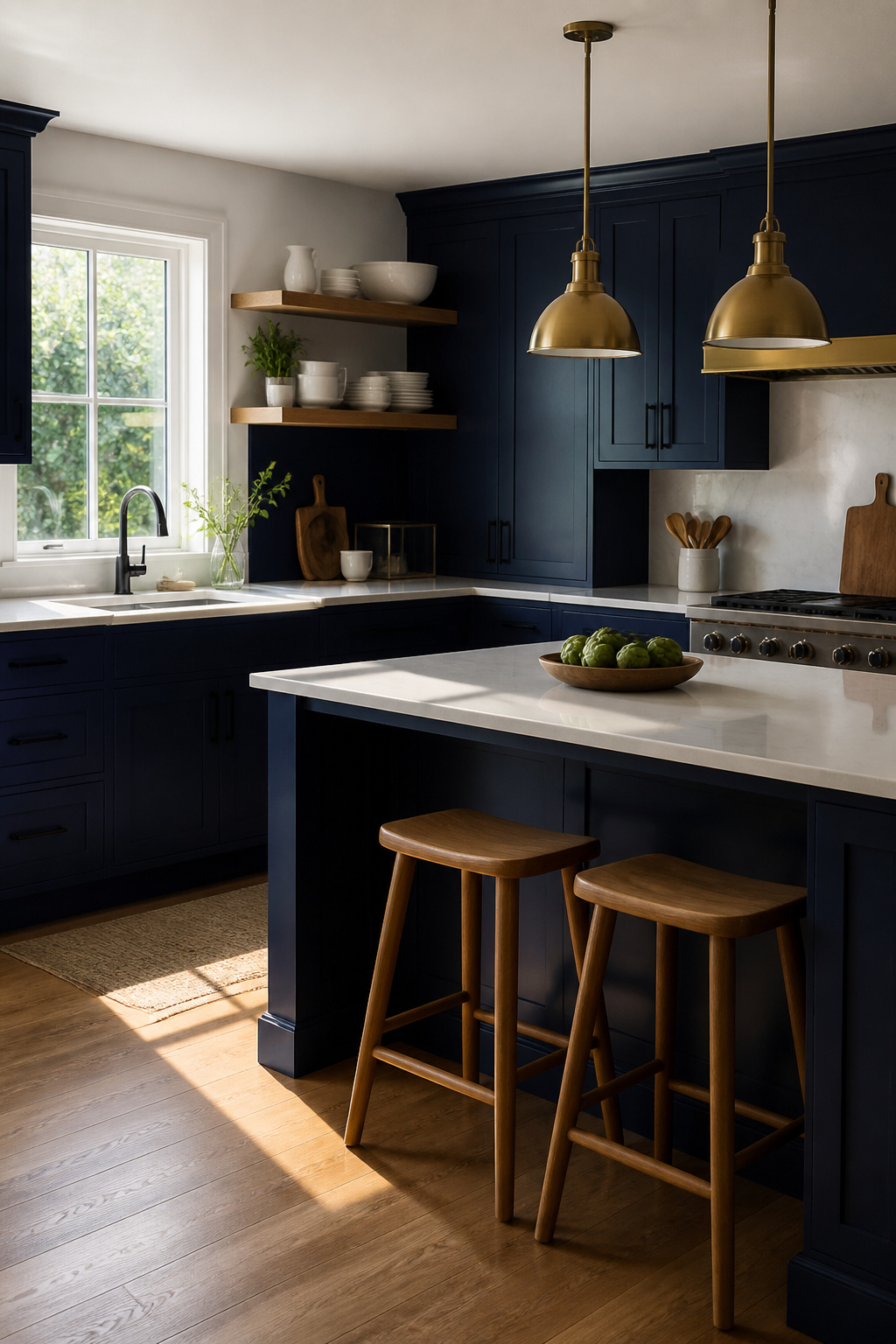
Navy reads as a neutral in person, but photographs like a decision. That split personality is what makes it livable year after year: bold enough to anchor a modern kitchen, restrained enough to sit in a traditional one without shouting.
Two paint colors own this space. Benjamin Moore Hale Navy HC-154 carries a whisper of green that keeps it from going theatrical under warm bulbs; Sherwin-Williams Naval SW 6244 runs a shade deeper, toward charcoal, and flatters north-facing light that would turn brighter blues dour. Both behave like chameleons. Morning sun pulls out their brightness; by evening under pendant fixtures, they sink into something closer to black without ever losing their shape.
The hardware pairing matters more than with paler cabinets. Brass against navy registers as classic, almost inherited. Matte black reads cleaner, more current. White countertops keep the whole thing from feeling like a study; wood accents, especially oak with its own warmth, nudge it toward rustic without the color itself changing at all.
If the commitment feels heavy, the island is the testing ground. A single navy block against surrounding neutrals gives you the impact without the envelope.
3. Sage Green

Earthy greens have moved from accent wall to full cabinet commitment, and sage sits right where calm meets usable. Benjamin Moore Saybrook Sage (HC-114) carries enough gray to read as neutral in afternoon light, while Sherwin-Williams Evergreen Fog (SW 9130) drifts a shade deeper for kitchens that need more grounding without going dark. Both sit well against wood tones, whether that is a honey oak floor you are keeping or walnut open shelving you are adding. Brass hardware warms sage up; black iron cools it down. The mistake is treating it as a color that handles itself. In a north-facing room, sage can flatten to plain gray by 4 p.m., so the test swatch needs to live on the cabinet for a full day, not just the sunny morning.
4. Black

Black cabinets read as instant drama, but the drama falls flat in a dim kitchen. Light gets swallowed fast, so under-cabinet strips, pendants over the island, and any window you have become non-negotiable. Pair them with white countertops and the contrast keeps the room from feeling like a cave.
Two blacks keep coming up: Benjamin Moore Onyx (2133-10) and Sherwin-Williams Tricorn Black (SW 6258). Both are deep enough to register as true black rather than charcoal, though Onyx carries a slightly softer edge in afternoon light.
Finish matters more than color here. Matte or satin hides fingerprints better than high-gloss, which turns into a smudge board the first time someone opens a drawer with buttered-popcorn hands. Even with a protective coating, black shows dust and grease faster than mid-tone colors, so the maintenance plan is real: wipe-downs matter, and the casual "I’ll get to it Saturday" approach shows.
5. Greige
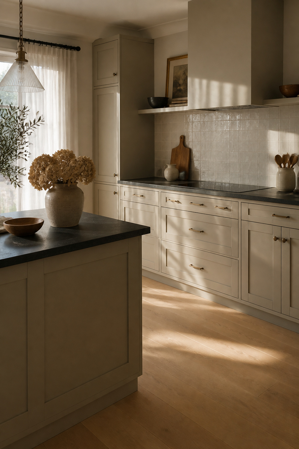
Greige sits in the middle of the temperature scale, neither pulling cool like straight gray nor warming up into territory that reads dated. Sherwin-Williams Agreeable Gray (SW 7029) and Benjamin Moore Revere Pewter (HC-172) are the two names that come up when contractors want that middle ground: warm enough for brass hardware, cool enough for matte black.
The shift between beige and gray is real and it is annoying. Morning light from the east wall leans the cabinets cooler; afternoon sun bouncing off oak flooring pulls them warm. The same painted box reads two different colors by dinnertime.
Greiges and off-whites will take center stage, and they’ll look spectacular with light wood grains, muted tiles, and subdued patterns.
That pairing advice is the practical takeaway. If your countertops are already busy, greige handles the competition without adding another voice. If your floors are pale oak or white oak, the color stays quiet. The chameleon quality that makes it interesting is also what makes it forgiving for an afternoon paint job you do not want to revisit.
6. Cream
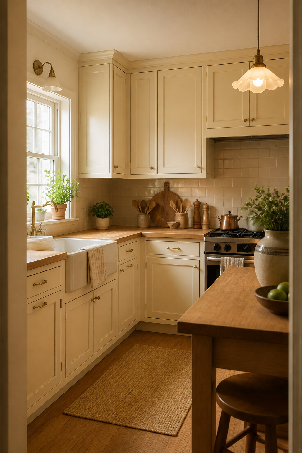
Cream reads as the color white relaxes into after a long week: still light, still clean, but unwilling to fight every scuff. That slight yellow undertone hides the wear that bright white broadcasts across cabinet faces near the stove or sink. The warmth flatters vintage hardware and traditional raised-panel doors in a way gallery white never quite manages, though the same undertone can turn buttery under warm bulbs or flatten to dishwater under cool LEDs. Walnut lowers with cream uppers keep the look from reading as a rental default, and brass hardware picks up the creamy note without competing. Small kitchens profit most, since the shade reflects light without the clinical edge that makes a tight room feel like a lab. Check your paint chip at the hour you actually cook, not just at noon.
7. Charcoal Gray

Charcoal gray carries the same weight black brings to a kitchen, but stops short of the harshness. Morning light softens it into something warm; after dark, under bulbs, it holds depth without turning the room into a cave. That forgiveness matters if your kitchen faces north or relies on overhead fixtures instead of windows.
The shade sits well against white subway tile and stainless steel, though the pairing that convinced me was brass hardware. Warm metal against cool gray adds tension without clutter. Matte black handles work too, and the flexibility helps if you are ordering pulls before the paint is dry. In a bright space, charcoal reads as intentional drama. In a smaller room, reserve it for lower cabinets or the island and keep the uppers light. The two-tone route lets you test the mood without committing the whole kitchen to it.
8. Butter Yellow
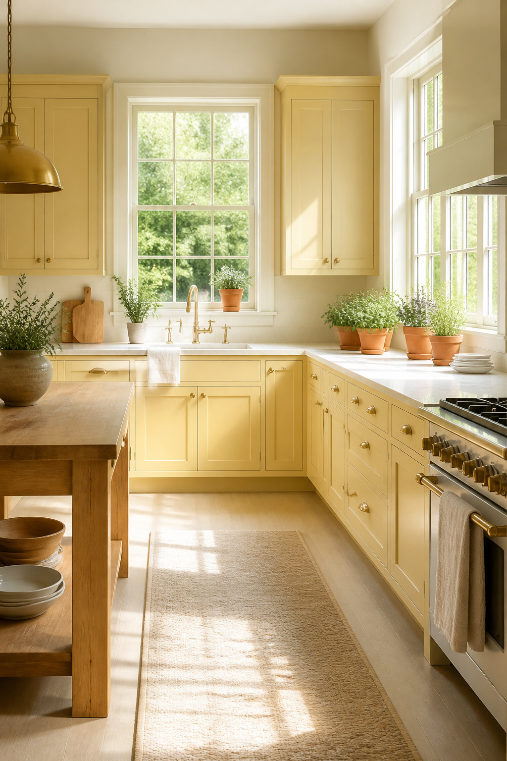
Butter yellow sits in that sweet spot between neutral and actually colorful, and 2025 is the year it finally stopped reading as dated. Morning light pulls it toward soft cream; afternoon sun deepens it to something closer to honeyed gold. That shift is the whole point. A north-facing kitchen that drinks up every photon will feel warmer and larger with these cabinets than with anything cooler on the wheel.
The period feel is real. Cottage kitchens, heritage builds, and any space aiming for that 1940s-through-60s energy can use butter yellow without turning it into a theme park. Modern versions keep the saturation low enough that the color does the work of a neutral.
Countertops are where this lives or dies. White countertops and stainless appliances lean retro in the right way, clean and intentional. For something grounded, walnut or oak counters and open shelving pull the warmth in a more organic direction. Terracotta floors or stone checkerboard tile complete the picture, but they also commit you to the full mood. If that feels like too much, cream walls and quiet off-white trim let the cabinets be the one bold move.
9. Dusty Pink

Dusty pink reads warmer and more grounded than you’d expect from a color that still makes some contractors pause. The trick is staying muted: think faded terracotta with the saturation dialed back, not the bubblegum shade that belongs on a bedroom accent wall. Pair it with brass hardware and pale marble counters and the look shifts from playful to deliberate, almost gallery-like.
Living houseplants become the contrast that saves this palette from going flat. A fiddle-leaf fig or trailing pothos against dusty rose cabinetry gives you the green-pink tension without committing to painted walls. Natural wood floors or open shelving keep the room from feeling too styled; oak especially, with its honey undertones, bridges the gap between the coolness of pink and the warmth of metal fixtures.
Regional style matters more here than with safer neutrals. Dusty pink scans West Coast or Southwest to most eyes, relaxed and sun-washed, and it can feel forced in a traditional New England setting unless you push the wood and brass elements harder. Two ways to play this: lean into the softness with gray walls and white countertops for a calming, sunset-adjacent mood, or ground it with deeper wood tones and matte black accents if the space needs more weight.
10. Rich Brown
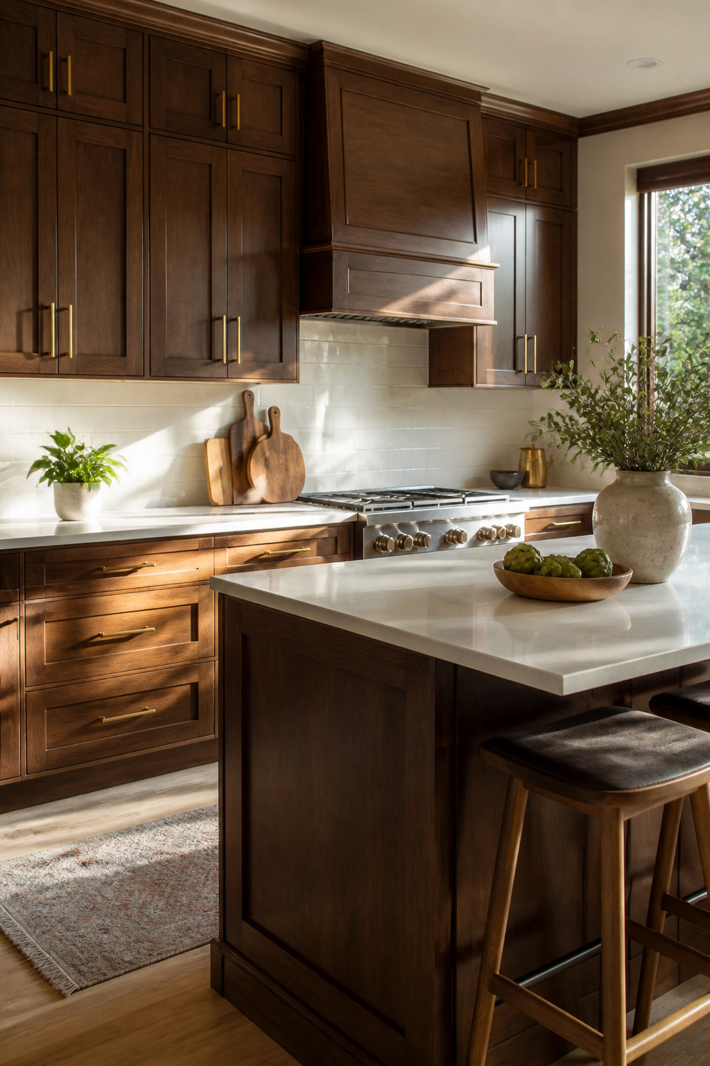
Rich brown lands somewhere between the honeyed oak everyone rushed to paint over and the flat espresso that can swallow a room whole. It is the color of warmth without the busy grain, which matters when you want wood’s comfort but not the 1980s cabinetry your parents finally tore out.
A kitchen flooded with morning light handles this shade easily. The brown deepens as the day fades, but it never drops into gloom because the sun keeps lifting it. Darker spaces are the test. North-facing rooms or galley kitchens with one window can let rich brown flatten into something heavy and closed-in. In those, the finish matters more than the swatch. Satin or semi-gloss catches what light exists and bounces it around; matte absorbs it and the walls close in.
I have seen this color read as sophisticated in a bright, open plan and as basement-rec-room in a tight corner with bad bulbs. The difference was not the paint. It was the wattage and the window count. If your kitchen lacks both, rich brown asks for under-cabinet lighting or a lighter partner on the uppers. That is not a compromise. It is the color telling you what it needs to work.
11. Light Blue
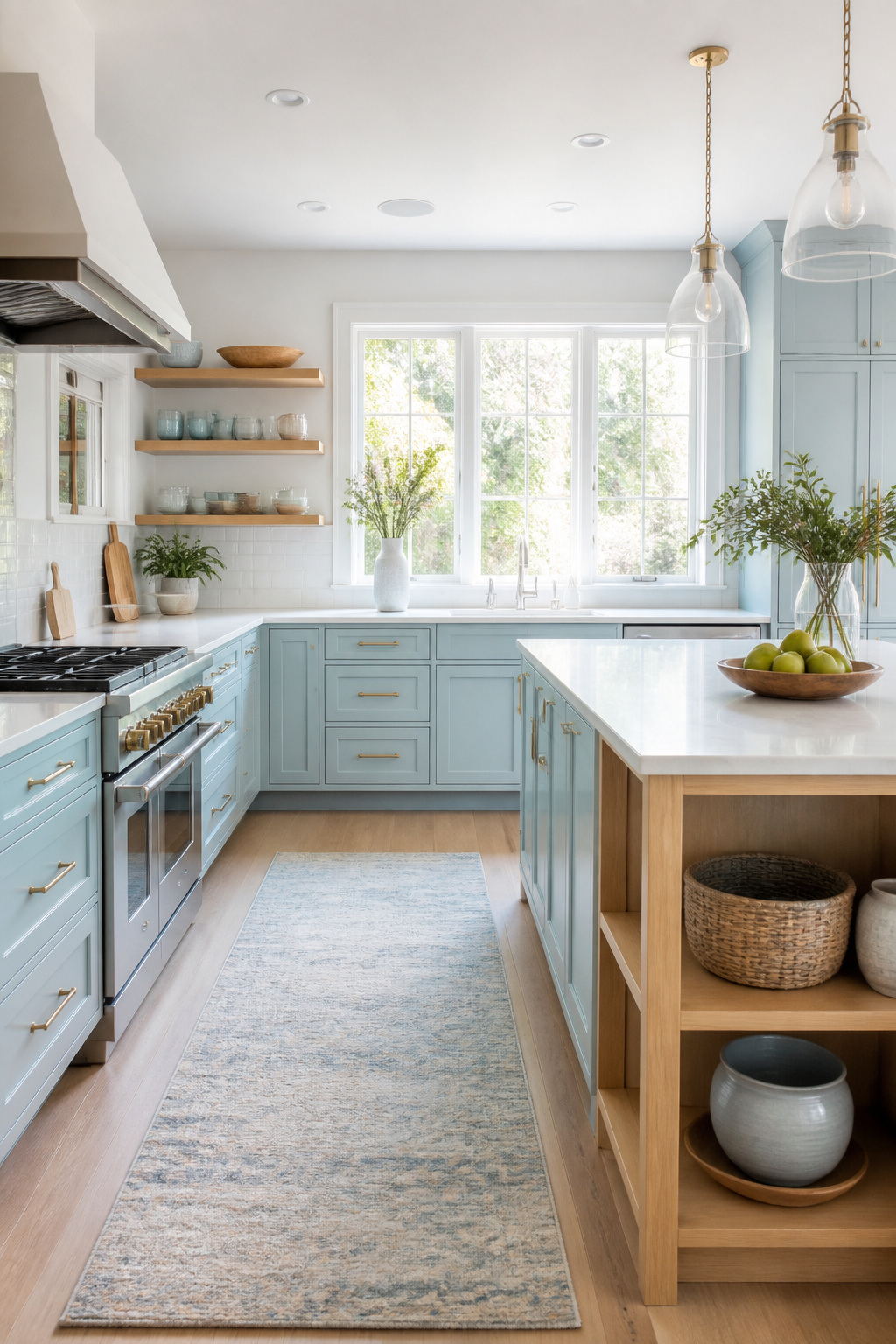
Light blue reads coastal at first glance, but the shade works inland without any rope trim or shell motif required. South-facing kitchens run hot through afternoon light, and pale cabinets cool the room the way a white wall never quite manages. The color stays crisp where darker blues would sink into shadow by four o’clock.
White countertops keep the pairing from drifting into nursery territory. Open shelving above those counters lets dishes and glassware do the decorating, so the blue stays the quiet base rather than the whole statement. Natural wood accents warm it up if the overall effect starts feeling too polished.
Powder tones lean tranquil; dusty tones lean lived-in. Either handles the mix of warm and cool accents that accumulate in a real kitchen over time.
12. Terracotta
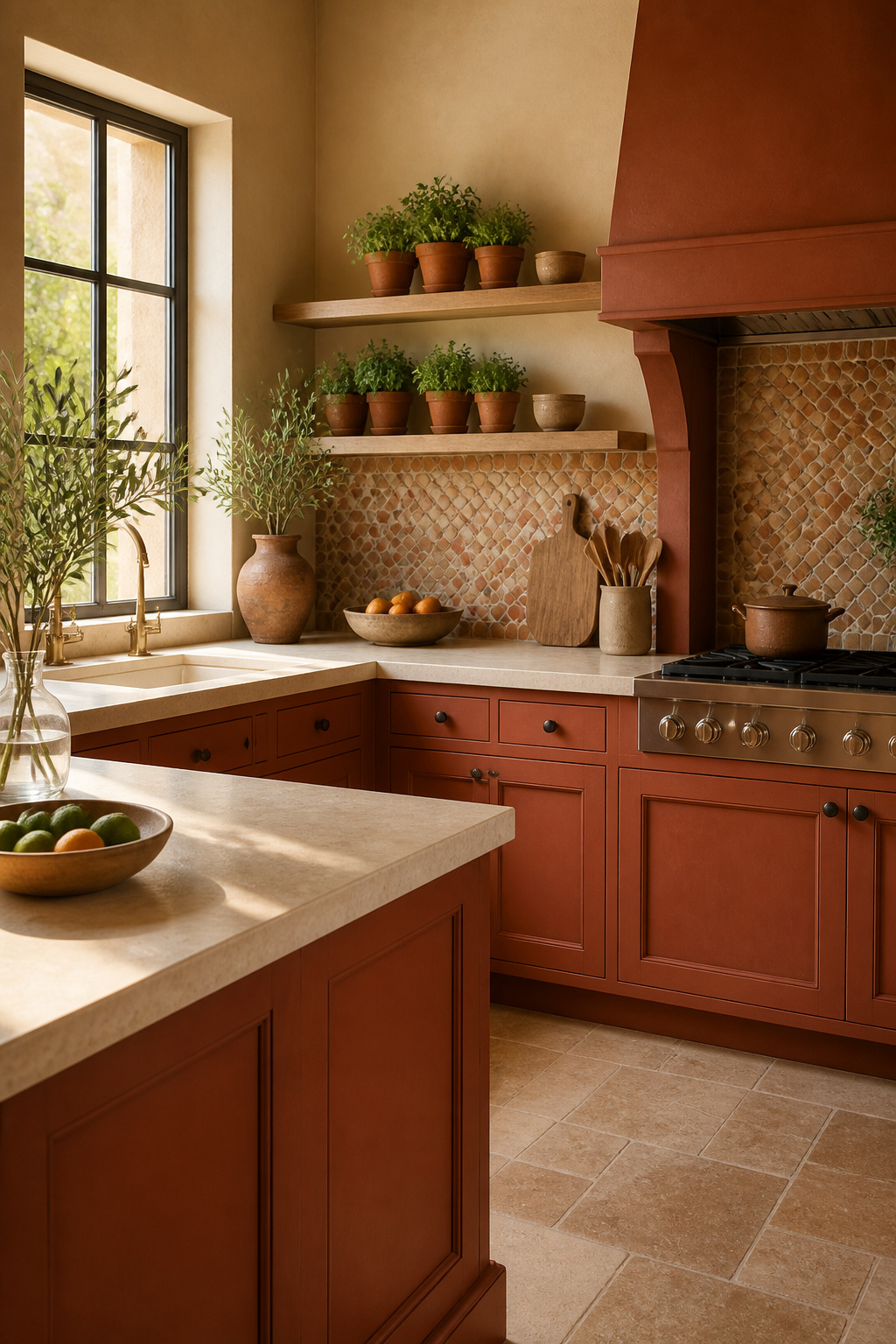
Terracotta cabinets carry that sun-baked warmth you see in Mediterranean kitchens, and the color is climbing back into favor for 2026. The earthy, grounded quality reads as exotic without feeling untouchable, especially when you pair it with natural wood accents or a stone countertop.
The risk is letting the warmth run away with the room. Balance terracotta with cooler elements, something I learned watching a friend’s kitchen renovation tip too far into orange territory. She had the clay-toned lowers she wanted, but without any visual counterweight above, the space felt like a terracotta pot itself. Cooler hardware, a muted backsplash, or even creamy uppers would have pulled it back.
If you are drawn to olive green or ochre, terracotta sits in that same muted, organic family, just bolder. It demands the same discipline: one warm statement, then step away.
13. Olive Green

Olive green carries more weight than sage without tipping into the moody territory of forest or black. The color pulls from two useful reference points: military surplus and midcentury kitchen cabinets, both of which leaned on this particular depth because it handled daily wear without looking dirty.
Pair it with unlacquered brass and butcher block and the kitchen reads collected rather than decorated. The brass starts bright and dulls to a soft patina; the wood develops knife marks and oil stains. Olive green holds steady between them, too grounded to feel precious about either change.
Dark colors can compress a space, so this one needs either natural light or a deliberate lighting plan. On base cabinets with white uppers, it grounds the room without swallowing it. Full monochrome works too, but only where the ceiling height and window count justify the gamble.
14. Burgundy

Burgundy reads formal in a way navy or black never quite manages, and that wine-inspired depth soaks up more light than most homeowners expect. The color trends toward luxury, but it needs either strong natural light or a deliberate lighting plan to keep the kitchen from feeling like a closed study after four o’clock.
Pairing matters. Marble countertops or any pale stone surface pull the room back toward balance, giving the eye somewhere to rest. Cream works especially well, and aged bronze hardware locks in that traditional, almost English pantry feel without drifting antique. Two ways to use it: a full wall of burgundy cabinets for mood, or an island in this shade as a single dramatic anchor while uppers stay lighter. The second option forgives a dimmer room. Fluted wood panels on the island or range hood add texture that keeps the color from reading flat, since burgundy this deep can slip toward black if the finish has no variation at all.
15. Electric Blue
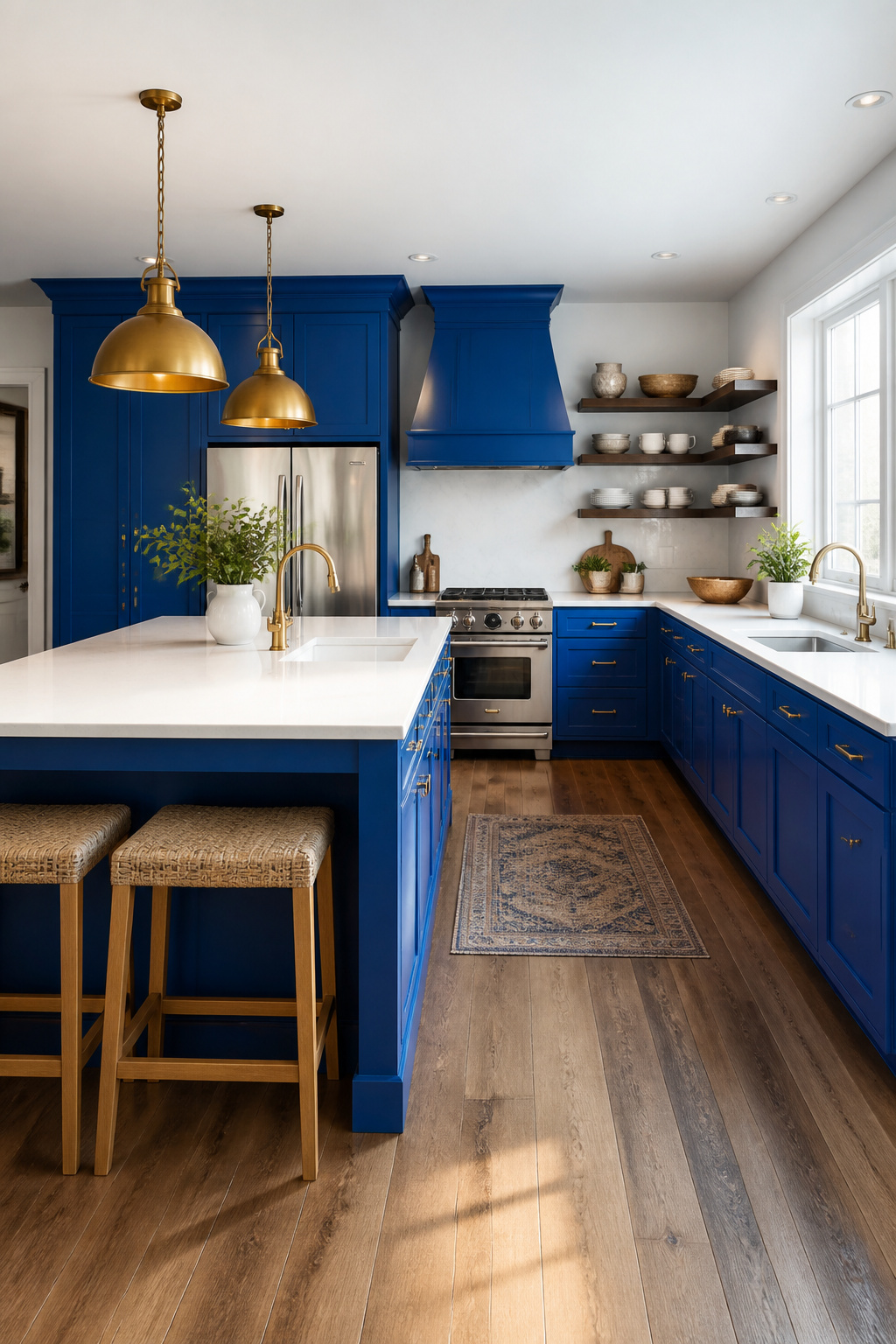
Electric blue sits at the edge of what most kitchens can handle, which is exactly why it works when it works. The saturation is unforgiving: half-strength reads as a mistake, so commit to the full pigment load or skip it entirely. I have seen it tame a room that got too much afternoon sun, the cool undertone pulling the walls back visually, though in a narrow galley the same shade turns claustrophobic fast. For most households the safer play is an island or a single bank of lowers, enough to feel intentional without the color owning every sightline. Full-wrap electric blue demands space to breathe and lighting that can keep up, otherwise the kitchen energy tips from lively to restless by seven p.m. If your ceilings sit low or your bulbs run warm, the color flattens toward purple and the whole gamble loses. Paint a door, a hutch, the toe-kicks first. Live with that for a week before you order the gallons for everything else.
16. Soft Lavender
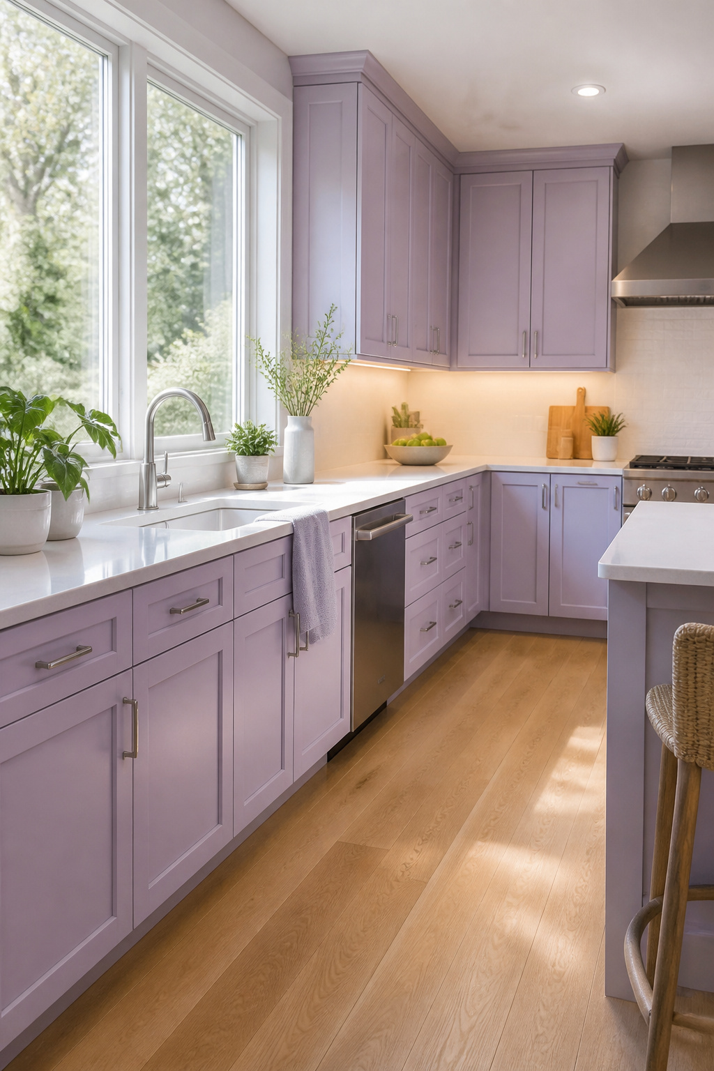
Soft lavender reads as a cool neutral with gray undertones that keeps it from veering into nursery territory. The gray base is what makes it workable for cabinets; without that grounding, the color tips toward something too sweet for a kitchen. In north-facing light it stays decidedly cool, almost reading as a pale stone with a whisper of color, while afternoon sun can pull out a warmer, duskier note that some find calmer and others simply muddy.
Hardware choice becomes the deciding factor. Silver or chrome hardware locks in that cool, contemporary edge and lets the gray undertone do the talking. Antique brass or matte gold does something different entirely, adding warmth that can feel either sophisticated or conflicting depending on how the light hits the cabinets that hour. The safer play for a cohesive look is the cool metal; the brass is a deliberate contrast that needs confidence to carry off.
17. Mint Green

Mint green reads as retro without feeling like a museum piece, and the brightness is the part that trips people up. A kitchen with solid natural light keeps it looking fresh and clean; in a dim space it can flatten into something closer to seafoam gone tired.
White countertops pull it toward vintage cottage territory, which is where the color first found its footing. Gray countertops ground it in something more current, though the shift is subtle enough that hardware ends up doing the real deciding. Antique brass or matte gold warms the tone and leans hard into that mid-century kitchen feel. Polished nickel or matte black pushes the same cabinets toward contemporary, almost Scandinavian. The metal choice flips the era, not the paint itself.
Small detail worth planning for: mint shows every brush line if the finish isn’t dead even. Spray application or a very patient roller saves the look.
18. Smoky Purple

Smoky purple sits in that rare space between color and neutral, shifting from warm plum to cool slate depending on the hour. Morning light pulls out the brown-gray base and makes it read almost like a deep taupe; by evening the purple rises and the cabinets turn moody and intentional. The undertone you notice changes with the bulb temperature, so this is one to test at both 2700K and 4000K before you commit.
The chameleon quality extends to hardware. Brushed brass warms it toward wine, while satin nickel pushes it cooler and more architectural. Mixing both metals in the same kitchen actually works here because the color itself bridges the gap. A matte black pull will emphasize the gray; unlacquered brass brings out the brown.
What stopped me from using it in my own space was the sample panel at 2 p.m. versus 8 p.m. looked like two different paints. That is not a flaw, but it is something to want rather than tolerate. If your kitchen gets flat northern light all day, smoky purple stays consistently cool and loses some of its complexity. South-facing windows let it move, which is the whole point of choosing it.
19. Coral

Coral sits in that narrow space between pink and orange where a kitchen feels awake but not shouty. The warmth registers immediately, yet it carries enough softness to avoid the punch-in-the-face quality that pure orange can bring to four walls of cabinetry.
Regional memory colors this one heavily. Coastal kitchens from Florida through the Carolinas have leaned on coral for decades, and the shade still reads as beach-house familiar in those zip codes. Further inland it becomes more deliberate, a choice that signals summer year-round rather than inherited taste. Seasonally it peaks in spring and summer for obvious reasons, though a matte finish can push it into fall without looking like a seasonal decoration left up too long.
The pairing that consistently works is teal or navy at the island or on a standalone hutch. Either one anchors the warmth and keeps the whole room from floating away into pastel territory. Brass hardware with coral risks too much sweetness; brushed nickel or matte black pulls ground it better. One caution: coral under yellow-toned LED bulbs shifts unmistakably toward orange, so test your actual bulbs on a sample door before committing the full run.
20. Mixed Metals

Mixed metals only work if the cabinet color does the actual work of holding the room together. Brass, chrome, and matte black hardware each read differently against paint, and the wrong cabinet shade turns that variety into visual clutter rather than intention.
The strategy is to treat the cabinet color as a neutral bridge. Sage green handles this well; it sits warm enough for antique brass or matte gold, cool enough for polished nickel, and grounded enough that matte black does not feel dropped in from another kitchen entirely. Warm metals pull out the earthy side, cool metals push it toward slate, but the color itself never competes.
What convinced me, reading through how these combinations actually get built, is that two metals is the practical limit for most layouts. Three can read collected if the cabinet color is doing the bridging work, but only where the metals repeat at different scales: maybe brass on the cabinet pulls, black on the faucet, nothing else competing for attention. The moment you add a fourth finish, even a stainless appliance starts to feel like a mistake.
Testing Colors in Your Actual Light

North-facing kitchens do better with warmer tones, while south-facing rooms can carry cooler colors without turning flat. That rule only helps once you see it in your own space, though.
Paint a sample board at least large enough to read against your countertop, then move it from wall to wall and watch it through a full day. Morning light against the same swatch can look almost like a different color by evening, especially with whites. Sherwin-Williams Pure White, for instance, carries just enough softness that it can read gray, pink, or yellow depending on what your windows throw at it. Store lighting lies. Your kitchen does not.
I spent one Saturday tracking a board through the hours and still nearly committed to a color that died after sunset. The artificial light in my kitchen after dinner flattened everything. That board saved me from a choice I would have regretted by Monday.
Two-Tone Combinations
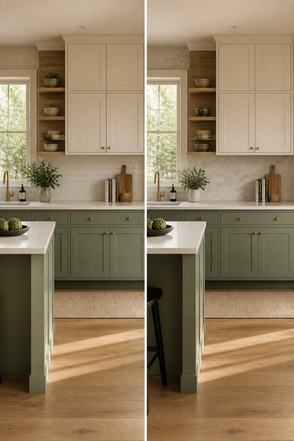
Two-tone kitchen cabinets give you room to use more than one color without the space feeling like a paint store exploded. The usual split runs lighter shades up top and darker ones below, or reserves the bold hue for the island so the perimeter stays calm. Sage green on the lowers with cream uppers keeps things grounded; navy island cabinets against white perimeter cabinetry does the same job with more contrast. The weight goes low, the air stays high; that proportion keeps a kitchen from feeling top-heavy or cave-like. Wood-tone bases with light gray uppers work for the same reason. Evergreen on lower cabinets paired with cream or white uppers hits the same balance with more drama than sage. What I look for in a two-tone job is whether the darker color has enough surface beneath it to feel intentional; a thin strip of navy at the bottom reads as an accident, not a choice.
Maintenance by Color Family

Darker cabinet colors hide dirt and fingerprints better than lighter shades, but that advantage flips when the finish is matte black or navy. Those deep, flat surfaces seem to pull every smudge into the light, and the marks sit there obvious enough that you notice them mid-coffee. Gloss or satin helps, which is why Benjamin Moore pairs its darker hues like forest green and charcoal gray with finishes that withstand wear instead of advertising it.
Lighter cabinets have the opposite reputation. They broadcast every splash of tomato sauce and the oil from a palm print, especially along the edges where traffic concentrates. Newer paint formulations make cleanup easier than it used to be, but the schedule stays tighter. You are wiping more often whether the job goes fast or slow.
Natural wood tones split the difference. Walnut and oak veneers hide scratches and wear better than paint, which matters in a kitchen that sees actual living. Painted finishes chip, though touching them up is simpler than matching a stained grain.
The real choice is not light versus dark. It is how much tolerance you have for maintenance versus how much you want to notice it.
How Color Reads in a Kitchen

Green reads calm in a kitchen because the eye links it to growing things, to renewal, to the idea of health. That is the reason sage has held on past trend status into 2026: it is a color that lets a room breathe. Warm colors pull the walls toward you and add energy, which can turn a morning coffee routine into something that feels awake rather than endured. Cool colors do the opposite; they step back, and a small kitchen gains a few imaginary inches when the cabinets read as farther away than they are.
White and cream keep a kitchen feeling clean and uncluttered, a reset button for a space that collects mail and crumbs. Gray hangs in the middle, calm without the clinical edge. Blue does something similar and adds focus, which matters if the same counter becomes a desk after dinner. The bolder end, black or navy, brings in formality and drama; it is the choice when the kitchen faces guests rather than hiding at the back of the house.
The mistake I have watched is treating color as only what you like looking at. The cabinets set the emotional temperature for the hours you spend there, and that temperature should match what actually happens in the room: chaos, refuge, or both.
Frequently Asked Questions
What are the best kitchen cabinet colors?
White, navy blue, sage green, black, greige, and cream are the strongest cabinet color ideas for 2026 kitchens, with white still accounting for roughly 40% of all cabinet choices. The best color for your space depends on your existing countertops, flooring, natural light, and how much maintenance you are willing to do.
How do I choose a cabinet color?
Start with what you cannot change: countertops, backsplash, flooring, and wall colors. Test paint samples on actual cabinet doors and observe them through a full day of changing light before committing. Consider your room size, since lighter colors open up small or dark kitchens while darker shades add drama to larger spaces.
What is the most popular cabinet color?
White remains the most popular cabinet color, making up about 40% of choices. Benjamin Moore White Dove and Sherwin-Williams Alabaster are the two most consistently recommended whites, with White Dove reading slightly warm and Alabaster carrying a creamier undertone that pairs well with natural wood floors.