
Grayish SW 6001 is a cool-leaning paint color with a violet undertone that shifts dramatically under different light. Its LRV of 60 puts it at moderate reflectance, but north-facing rooms can push it toward lavender while south-facing light softens it closer to true neutral. The purple base does not hide; paired with warm wood or golden fixtures, it turns muddy rather than muted.
What Grayish SW 6001 Actually Looks Like
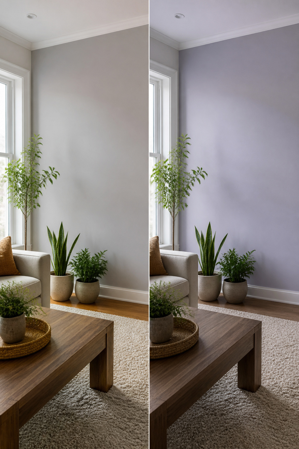
HEX #C1BCBE and RGB values of R:193, G:188, B:190 put Grayish SW 6001 in a middle ground between gray and greige, though the violet undertones pull it firmly toward the cool side. The first time I rolled it out, the color read softer than the chip suggested, not flat or boring but carrying a muted quality that separates it from standard gray.
That purple undertone is the personality trait you cannot ignore. In balanced natural light, Grayish behaves like a sophisticated neutral with a quiet edge. Turn it toward a north-facing window and the color comes alive in a different way, sometimes reading almost lavender. The pink and red traces in the mix keep it from going fully cold, but they do not override the dominant coolness.
What Grayish refuses to be is a safe, agreeable neutral that works everywhere. It has opinions about its surroundings. Rooms with warm-toned interiors or limited light exposure fight against what this color wants to do. The shift between warmer and cooler moments is dramatic enough that two walls in the same room can feel like different paints depending on time of day.
LRV 60 and What That Means in Real Rooms

An LRV of 60 sits right in the middle of the scale, which means Grayish reflects a moderate amount of light without bouncing it everywhere or swallowing it whole. That middle position sounds flexible, and it is, but it also means the color needs help from the room itself.
In a space with good natural light, Grayish reads airy and open. The walls feel present without pressing in. Take that same color into a windowless hallway or a basement corner, though, and the tone shifts fast. The purple undertones strengthen, the mood turns heavy, and what looked like a soft neutral becomes something closer to lavender-gray shadow. I have seen this split happen between two rooms in the same house, the difference coming down to nothing more than which way the windows faced and whether the afternoon sun reached that far.
South-facing rooms tend to be the sweet spot. Warm, bright light softens the cool cast and keeps Grayish looking closer to a true neutral gray. North-facing light does the opposite, amplifying that violet edge until the walls feel distinctly cool. East and west rooms shift through the day, cooler in morning light, warmer by evening, which means the color never quite settles.
LRV of 60 is workable but not foolproof. You need decent light for it to make it work.
That line is worth pinning to your sample board. If the room lacks windows or relies on warm white bulbs after dark, Grayish will likely read darker and more purple than the chip suggests. Cool white or daylight bulbs keep it cleaner. Before committing, test it on two walls: the one that gets the most light and the one that gets the least. The gap between them tells you whether this color belongs in that room at all.
The Purple Undertone Problem

The primary undertone in Grayish SW 6001 is violet, straight-up purple, and it does not hide well. Hold it next to a warm beige and the violet snaps forward almost aggressively. That same shift can slide into pink or blue-gray depending on the light source, which is exactly where people get caught off guard.
A north-facing room or any space with weak natural light will push Grayish toward the cooler end of that range. The purple stiffens, the gray turns steely, and the wall starts reading as something closer to lavender than neutral. Southern light does the opposite. Warm, yellow afternoon sun softens the violet enough that the color can pass for a gentle gray, though the purple never fully disappears.
The real trouble shows up against warm finishes. Orange oak, golden flooring, or incandescent bulbs set the undertone fighting. What reads as a quiet gray in the store chip turns muddy or simply wrong once it shares a room with anything yellow-red. Pair it with cool whites, soft blues, or charcoal grays and the violet settles into something intentional rather than accidental.
How Light Direction Changes Everything
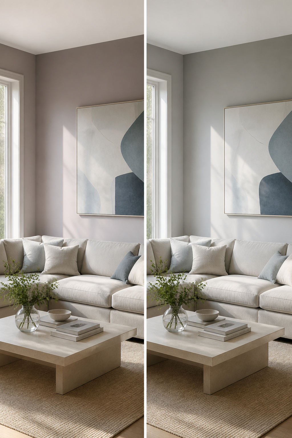
North-facing light pulls the purple forward in Grayish until the wall reads almost lavender-gray. That same wall, hit by south-facing sun, softens into something closer to a true neutral. I have watched this shift happen across a single room: morning light cool and purple-leaning, afternoon warmth bleeding the color back toward gray. The change is not subtle. It is the reason sample boards need to move through the space at different hours, not just sit where you first lean them.
East-facing rooms repeat that morning coolness, then balance by afternoon. West-facing rooms save the warmth for evening, when the violet finally quiets down and the color turns cozy. Artificial light matters too. Warm white bulbs push Grayish toward muddy; cool white or daylight bulbs keep it clean. Without testing both natural and bulb-lit conditions, you are choosing a color you have not actually seen.
Where Grayish Works Best

Grayish settles into bedrooms and living rooms the way a quiet guest settles into a conversation, not demanding attention but making the whole room feel steadier. Bathrooms suit it too; the cool violet undertone reads as clean without going clinical, especially against white fixtures and natural textures like linen or unfinished wood. Outside, the same color that can turn flat in dim interiors opens up in daylight, feeling warmer and more inviting on siding or trim.
The catch is the light. North-facing rooms and spaces with small windows will push Grayish toward purple in ways that feel off by afternoon. Warm interiors with honey oak or brass fixtures fight against it entirely; the color wants cool, modern lines and neutral furnishings, not competing warmth. If your room already leans dark or your woodwork runs golden, this is not the gray for you.
Trim and Accent Pairings That Hold Up

Crisp white trim is where Grayish SW 6001 looks most intentional. Extra White SW 7006 and Pure White SW 7005 both do the job, reflecting enough light to keep the wall color from sliding into gloom. The contrast reads clean without fighting the purple undertone.
Soft blues carry the same cool family and layer in quietly. Sea Salt SW 6204 or a dusty blue keeps the palette restrained, which is what this color asks for.
Warm colors are the mistake to avoid. Yellows, oranges, honey-toned anything, even warm beiges like Accessible Beige in adjacent rooms will sit wrong against that purple base. The clash is not subtle.
For sheen, eggshell or satin on walls gives durability with a little light bounce. Semi-gloss on trim in one of those bright whites keeps the edges defined and wipeable. Matte only makes sense in a bedroom where you want the softest possible surface and do not mind the flat finish showing wear faster.
Grayish Against Agreeable Gray and Repose Gray
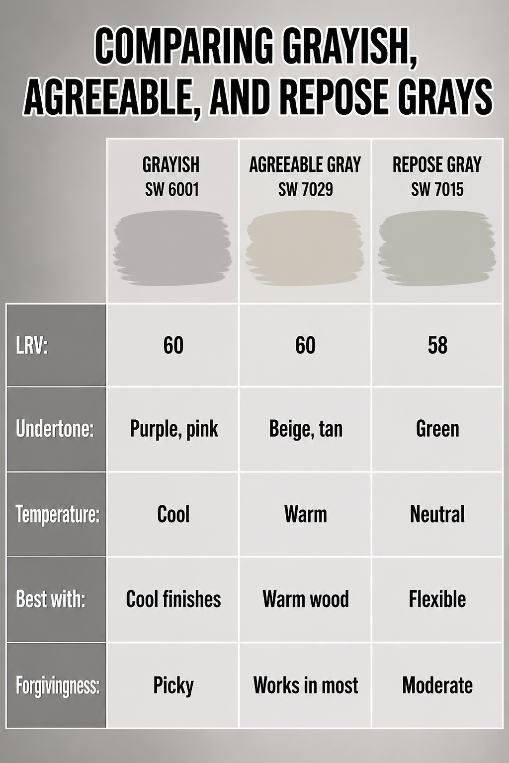
Agreeable Gray and Repose Gray are the two colors Grayish gets compared to most, and the difference comes down to temperature and undertone. Grayish carries purple and pink undertones that read distinctly cool, while Agreeable Gray leans warm with beige and yellow notes that make it more of a greige. Repose Gray sits between them but still reads more neutral than Grayish, with green undertones rather than purple.
All three sit close on the light scale. Grayish and Agreeable Gray both carry an LRV of 60, so they reflect the same amount of light. Grayish is slightly lighter than Repose Gray, which sits at 58 LRV. That two-point gap is small enough that wall-to-wall they would feel similar in brightness, but the undertone shift changes everything about the mood.
| Grayish SW 6001 | Agreeable Gray SW 7029 | Repose Gray SW 7015 | |
|---|---|---|---|
| LRV | 60 | 60 | 58 |
| Undertone | Purple, pink, violet | Beige, tan, yellow | Green |
| Temperature | Cool | Warm | Neutral |
| Best with | Cool finishes, modern spaces | Warm wood, traditional rooms | Flexible, bridges warm and cool |
| Forgivingness | Picky; needs planning | Works in most conditions | Moderate |
Grayish demands more intention than the other two. Agreeable Gray forgives mismatched lighting and layered wood tones without much fuss. Repose Gray handles mixed finishes better than Grayish too. If your floors are oak or your trim leans cream, Agreeable Gray is the safer bet. Grayish rewards the commitment only when the rest of the room already runs cool.
Sample Testing Before You Commit

- Order two samples, not one, and put them on different walls. A single swatch of Grayish SW 6001 on a single wall tells you almost nothing, because this color shifts hard as the light changes.
- Check it at 9 AM, then again at 5 PM. Morning light tends to pull the cooler notes forward; late afternoon sun can warm it toward that faint purple undertone that shows up in certain conditions. The difference is enough to make you love it or hate it in the same room.
- Move the sample around. North-facing rooms will hold the gray longer; south-facing ones may flash warmer than you expected. Grayish is not a general-use gray that behaves the same everywhere. It wants specific conditions to look right, and when it does not get them, it reads wrong.
- Peel-and-stick samples work better than brushing a test patch if you are still living with a previous color underneath. The old wall color bleeds through and lies to your eye.
- Live with the sample at least two full days before you buy the gallon. Your own perception of the undertone matters as much as the light does, and that takes time to calibrate.
Finish Choices That Flatter Grayish
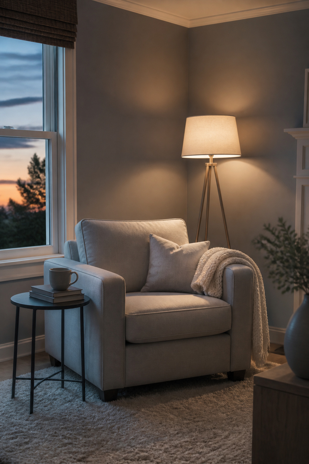
Eggshell or satin on walls keeps Grayish from going flat, and there is a real difference between the two. Eggshell gives that barely-there glow that softens the purple undertone without hiding it completely. Satin steps the reflection up one notch, which can make the color read a touch cooler in rooms with northern light. I would not go matte no matter how tempting the price break is. Matte scatters light everywhere and turns this color into a chalky nothing; the violet base goes muddy instead of subtle.
Semi-gloss on trim is the clean break this color needs. The higher sheen bounces light back at you, so the trim reads as bright architecture against the quieter wall, not as competing gray. The wrong finish pairing does real damage. Put semi-gloss on the walls and that purple undertone turns shouty. Put eggshell on the trim and the whole room sinks into one flat tone, no boundaries, no depth. The finish is not a afterthought here. It shapes what Grayish actually is once it dries.
Frequently Asked Questions
Is Sherwin Williams Grayish a warm or cool color?
Grayish SW 6001 is a cool gray. Its purple and violet undertones push it firmly into cool territory, even though some people mistake it for a greige or soft neutral. If you put it next to a true warm gray like Agreeable Gray, the temperature difference is immediately visible.
What are the undertones of Sherwin Williams Grayish?
Grayish has definite purple undertones with a touch of pink or red warming it up slightly. That fascinating mix means it reads cooler than most popular greige paints, and the violet base never fully disappears no matter what light hits it.
How does light affect Grayish?
In rooms with north-facing windows or limited natural light, Grayish leans hard into its cool, purple side and can read almost lavender. A south-facing window with warm, yellow-toned light softens the color and makes it appear much less cool or purple, though the undertone still lingers beneath.