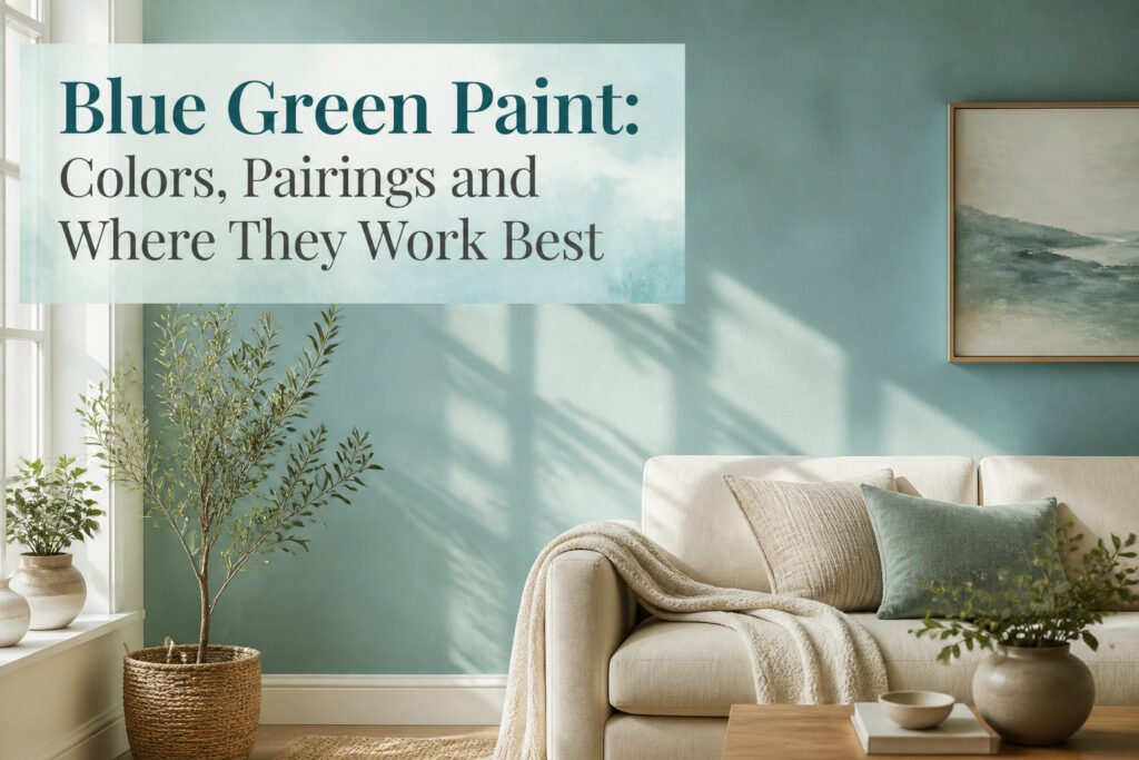
Blue green paint is the pigment that refuses to stay one color, shifting between blue and green as the light changes through the day. The catch is that the same quality makes it unpredictable: Sherwin-Williams Sea Salt can read airy in a north window and turn almost neon facing south, where one homeowner had the formula cut to 75 percent just to settle it down. Its LRV of 63 puts it in the safer range, but that number only tells half the story when the wall starts changing after lunch.
Sea Salt
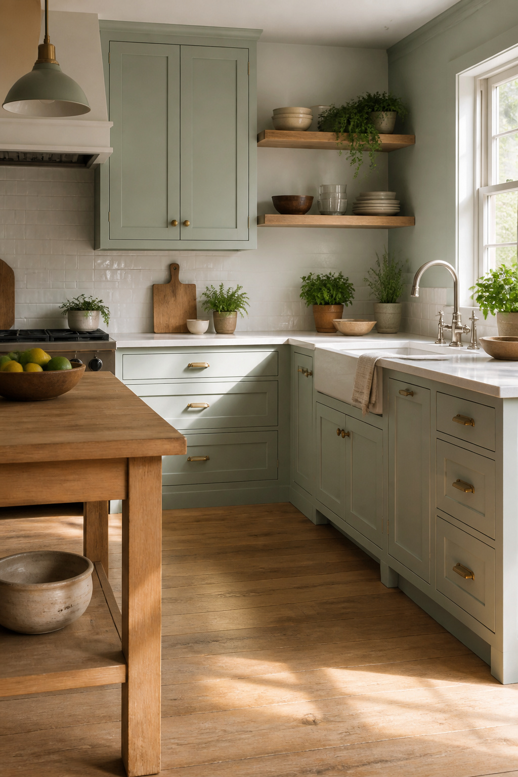
Sherwin-Williams Sea Salt SW 6204 carries an LRV of 63, light enough to read as airy without washing out against white trim. The gray undertones do the heavy lifting here, keeping it from tipping too far into nursery territory.
In my kitchen it behaved like a proper chameleon, reading greener under the warm overhead cans and flipping bluer where the north window hit it by mid-afternoon. Bedrooms and bathrooms seem to be where it earns its keep, though living spaces work if the light cooperates. A friend of mine had it go almost neon on her, dense and saturated in a south-facing room; she took it back to the counter and had them cut the formula to 75 percent, which settled it right down.
Pair it with a warm white, not a stark one, something with a little cream in it. Natural wood floors or a raw oak shelf keep the gray from going cold on you. The Benjamin Moore color by the same name is a completely different animal, so double-check the brand before the mixer starts spinning.
Palladian Blue
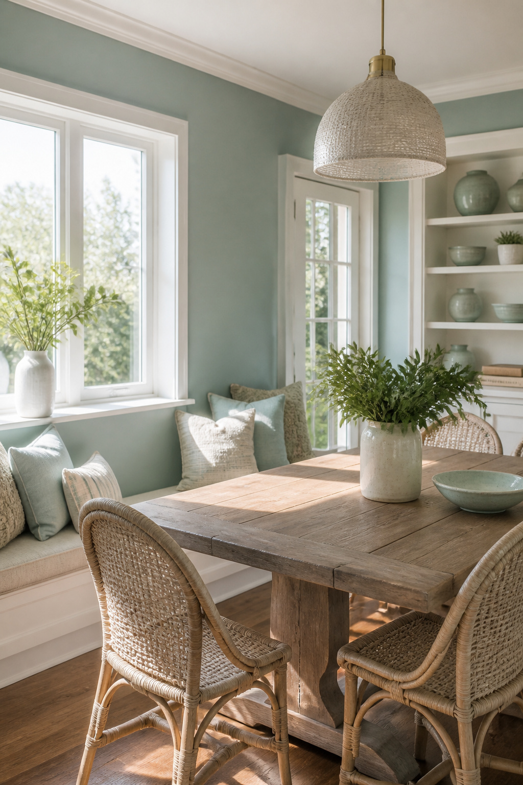
Benjamin Moore HC-144, Palladian Blue, carries an LRV of 61.17, which lands it in that airy range where walls feel open without washing out. The color has built a following for good reason: it reads as a soft blue-green that leans more green than the name suggests, especially in rooms with natural light, though it can shift toward blue under cooler artificial bulbs or when paired with crisp whites.
I compared this one to Sea Salt once, standing in a kitchen with samples on opposite walls, and the difference in how they moved through the day stuck with me. Palladian Blue kept that creamy, almost seafoam quality, while the other went grayer. The mother-of-pearl note Benjamin Moore mentions is accurate; there is a warmth here that keeps it from feeling sterile.
Pair it with bright white trim or push into bolder territory with pinks and corals if you want contrast that still feels coastal rather than tropical. Green undertones run warm, so matching them through the house keeps things coherent if you are carrying the color into adjoining rooms.
Aegean Teal
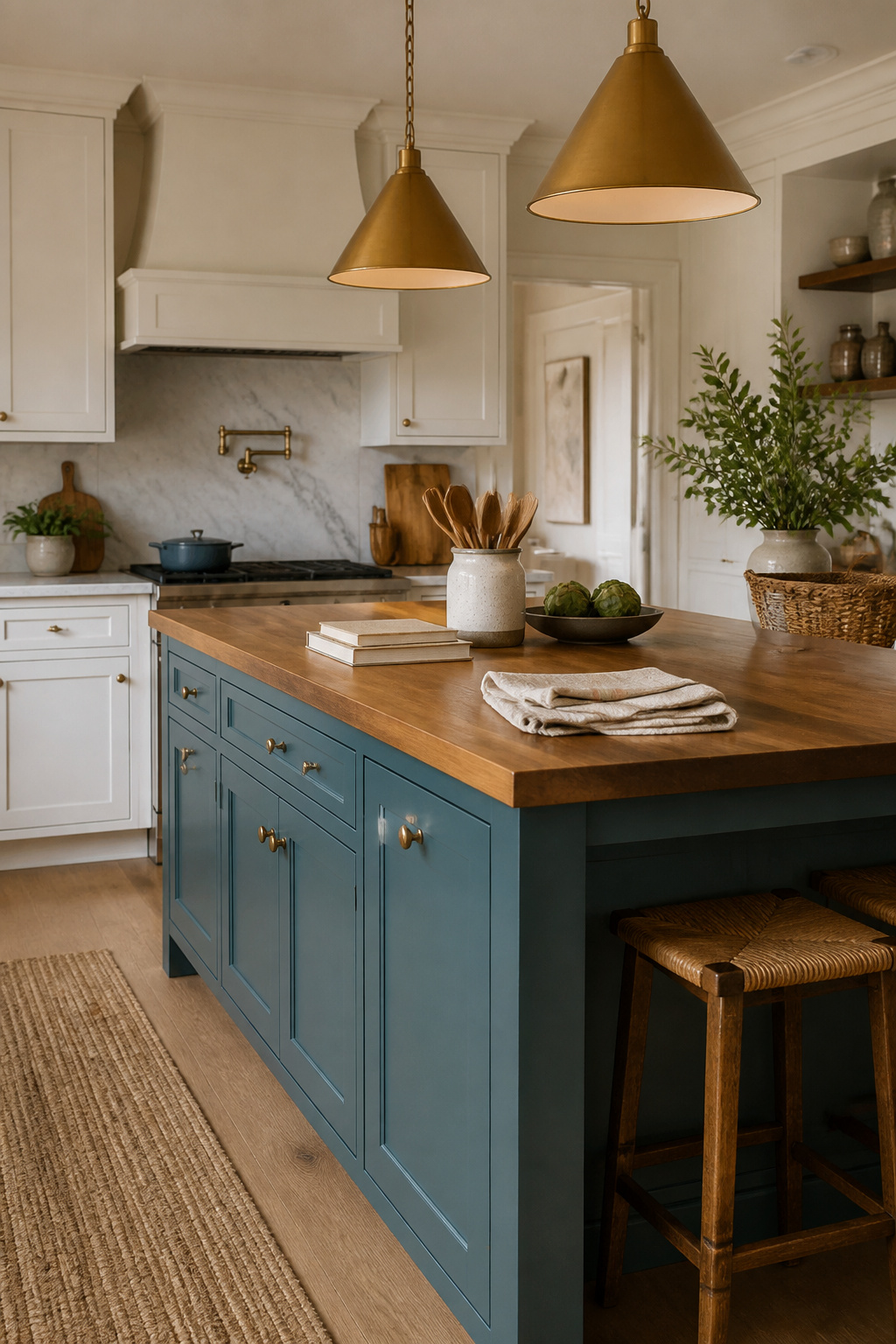
Benjamin Moore Aegean Teal 2136-40 carries an LRV of 23.96, which puts it in that zone where color starts to fight back against the light in a room. The saturation reads as a mid-tone blue-green with enough gray underneath to keep it from feeling tropical, but it is not a wall color to choose casually.
I have seen it work beautifully as a kitchen island or a front door, places where the eye expects a statement and moves on. Full walls in a small bathroom or a north-facing bedroom can turn heavy fast; the color pools in corners and the gray base starts to read as shadow rather than sophistication. Built-in bookcases are the safer middle ground, giving you depth without the commitment of four walls closing in.
The 2021 Color of the Year label got attention, but what matters is the light you actually have. Pair it with warm whites and natural wood tones if you use it; those keep the blue-green from going cold. Skip it for the main bedroom unless you get strong morning light and want the cave effect on purpose.
Healing Aloe

Benjamin Moore CSP-773 Healing Aloe sits at the paler end of blue-green paint, quiet enough to read as neutral until the light shifts and that watery undertone surfaces. The Light Reflectance Value sits in the low 60s, bright enough to keep a small bathroom from feeling boxed in but muted enough to sleep in.
I have seen this shade behave two ways depending on the trim. Against a crisp white like Chantilly Lace, it turns distinctly blue, almost the color of early morning light on a plaster wall. Pair it with a cream or ivory trim and the green warms up, turning spa-like in the way of old hotels where the tiles are original and the towels are thin. The cream pairing is the riskier move; in a north-facing room it can go muddy. White keeps it honest.
The mistake with Healing Aloe is treating it as a color that can carry a room alone. It cannot. It wants texture: a nubby linen, a raw wood shelf, something with grain or slub to keep it from feeling like a doctor’s office. I have watched it flatten out in rooms with too much polished chrome and no natural material in sight. The color is not doing the work there; the room is fighting it.
Rainwashed
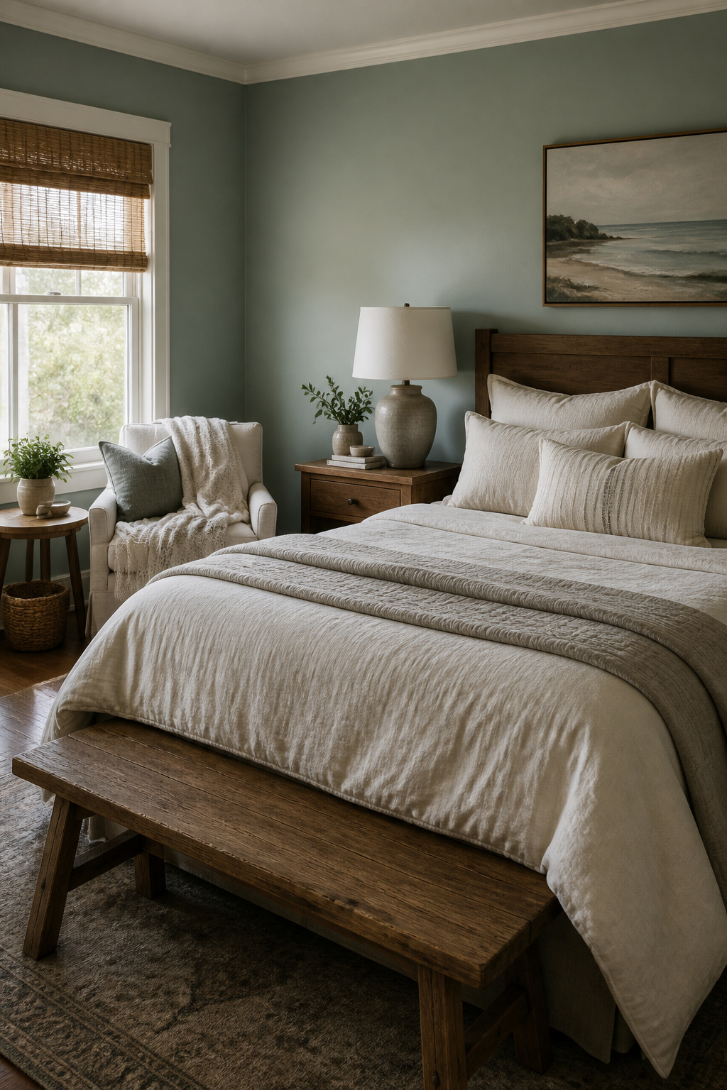
Sherwin-Williams SW 6211 Rainwashed carries an LRV of 60, which puts it right on the fence between light and medium. That middle ground is what makes it forgiving in rooms that get uneven light; it will not go chalky in a bright corner or cave in under a cloud.
The green lean is what you notice first, though the blue keeps it from reading as mint. In morning light the green steps forward and the color feels like the quiet side of a tide pool. By evening the gray base takes over and it flattens toward a soft, weathered siding. I watched this shift in a guest bedroom that faces east: the wall held warmth until about two o’clock, then turned almost silty by dinner. The coastal feel is there, but it comes through as something lived-in rather than decorated, more old cottage than staged beach house.
Rainwashed works best where you want that shift to read as atmosphere, not as a problem. Bedrooms, bathrooms, anywhere you move through at different hours and do not need the color to stay fixed. It is muted enough to pair with warm wood without clashing, and the gray keeps it from going too sweet against white trim.
Beach Glass
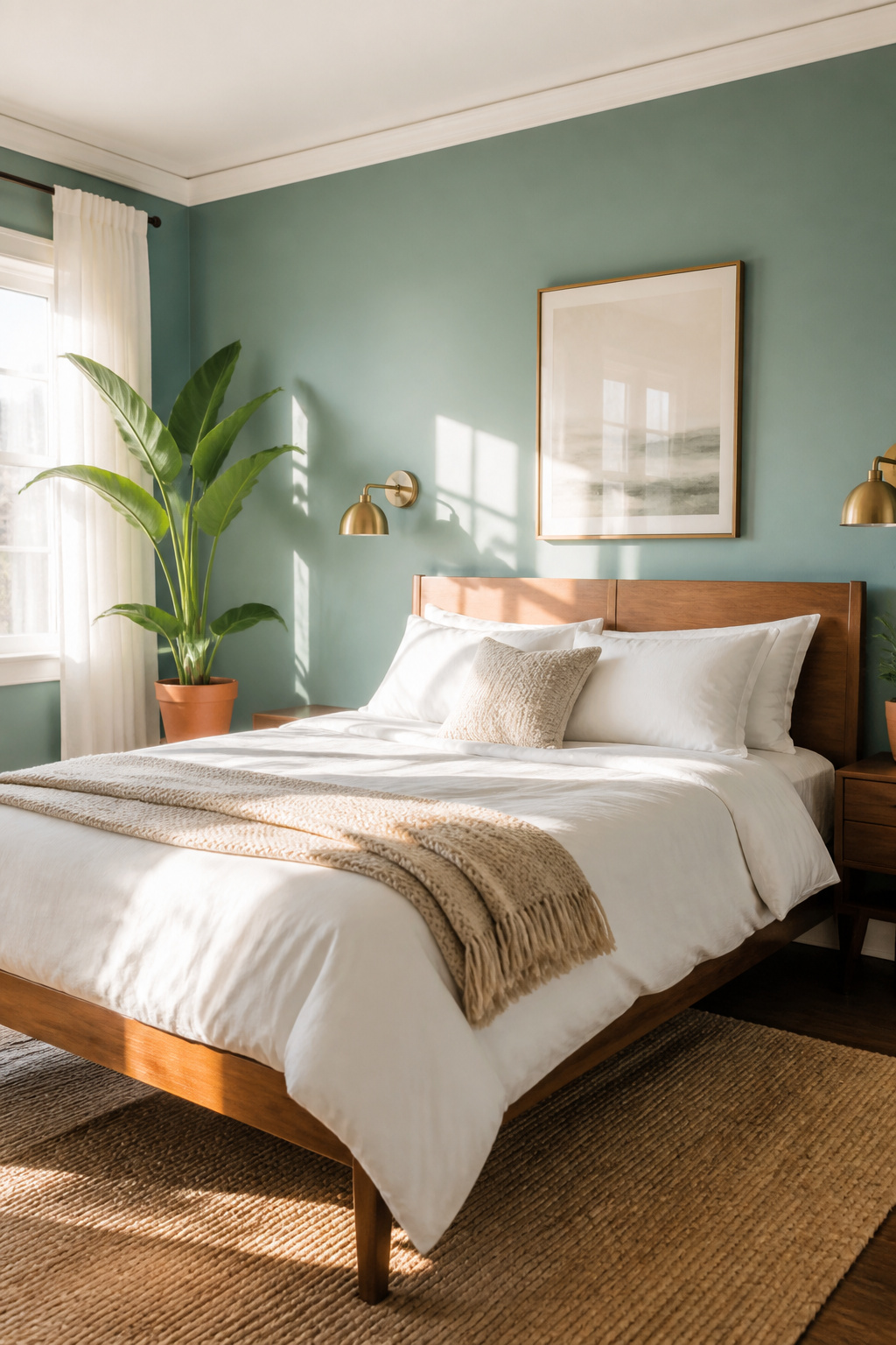
Benjamin Moore Beach Glass carries an LRV that keeps it firmly in the mid-tones, light enough to read as airy but grounded enough to hold a wall. What struck me about it is the gray that runs underneath; in north-facing light it pulls cooler and more blue, then shifts toward a muted sage when afternoon sun hits. That chameleon quality makes it act like a neutral even though it is not one.
I used it in a bedroom where crisp whites felt too sterile and warm beiges too safe. The color sat back, let the linen and walnut furniture do the talking, and somehow worked with both. Warm accents like brass or terracotta do not fight it, and cool pairings like slate or brushed nickel settle right in. The muddy undertone is the bridge. It is the kind of blue-green you choose when you want the room to feel finished rather than decorated.
Blue-greens are interior design’s perfect paradox: statement-making but soothing, trendy but timeless.
For a reader hunting a single color that adapts to whatever accents you already own, that paradox is the whole point. Beach Glass delivers it without asking for center stage.
Quietude
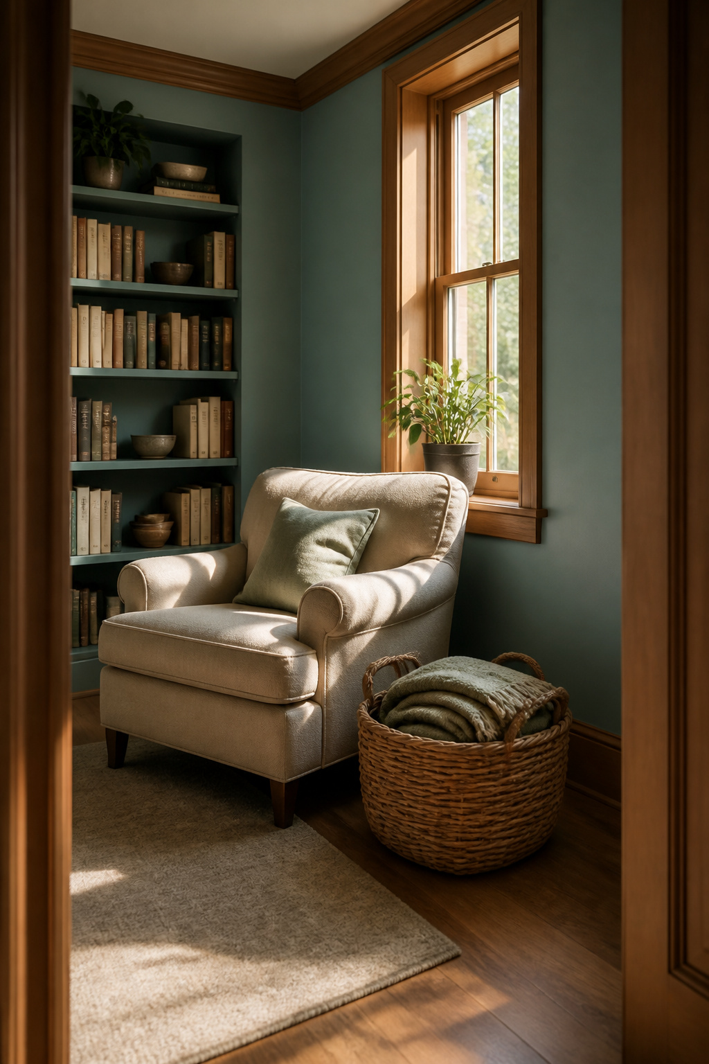
Sherwin-Williams Quietude sits in that narrow space where blue-green stops feeling like a color and starts feeling like a mood. The gray influence mutes it enough that it never reads as coastal or tropical; instead it does what the name promises, settling a room into something like the visual equivalent of a held breath. Its low-to-mid LRV means it holds depth even when the windows face north or the overhang blocks direct sun, which is exactly where brighter blue-greens can turn thin and chalky on you.
I learned this the hard way in a guest bedroom with one small window and an exterior porch roof that cut afternoon light to almost nothing. A cleaner teal I tried first seemed to glow from within in an unpleasant, artificial way once the sun dropped. Quietude, by contrast, flattened into a soft grayed pool that still carried enough green to keep it from reading as plain blue, enough blue to keep it from going sage. The color changed across the day, but never dramatically, never jarringly.
For a space meant for sleeping or reading, that steadiness matters more than the initial wall-sample charm. It pairs with warm linen and pale wood without turning muddy, and the gray base keeps white trim from looking too stark against it. The risk is using it somewhere you want energy; in a kitchen or home office, the same restraint that soothes a bedroom can feel like a lid being held down.
Oceanside
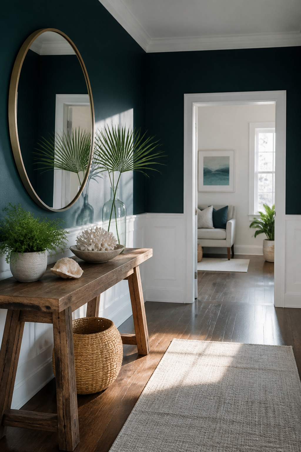
Sherwin-Williams named Oceanside its 2018 Color of the Year, and the choice still holds up for anyone after real saturation. The color reads deeper than a standard teal, closer to a jewel-tone marine blue with green running through it rather than sitting on top. That density means it performs best where you want deliberate drama: a single accent wall, a built-in cabinet run, or a front door that needs to carry the whole facade.
Its light reflectance value sits low, so the color swallows light rather than bouncing it back. My own experience lines up with what the swatch promises. I used it on a bathroom vanity in a room with one small window, and the finish turned almost navy in morning light while holding the green edge under warm afternoon bulbs. Brass hardware against that ground looked expensive without trying; matte black worked too, though it flattened the color slightly. Natural wood, especially oak with some grain variation, gave the best balance, the warmth cutting the depth without softening it into something generic.
The risk is overuse. Oceanside on every wall of a small room feels like diving to the bottom of a pool and staying there. One plane, chosen carefully, does the work.
Inchyra Blue
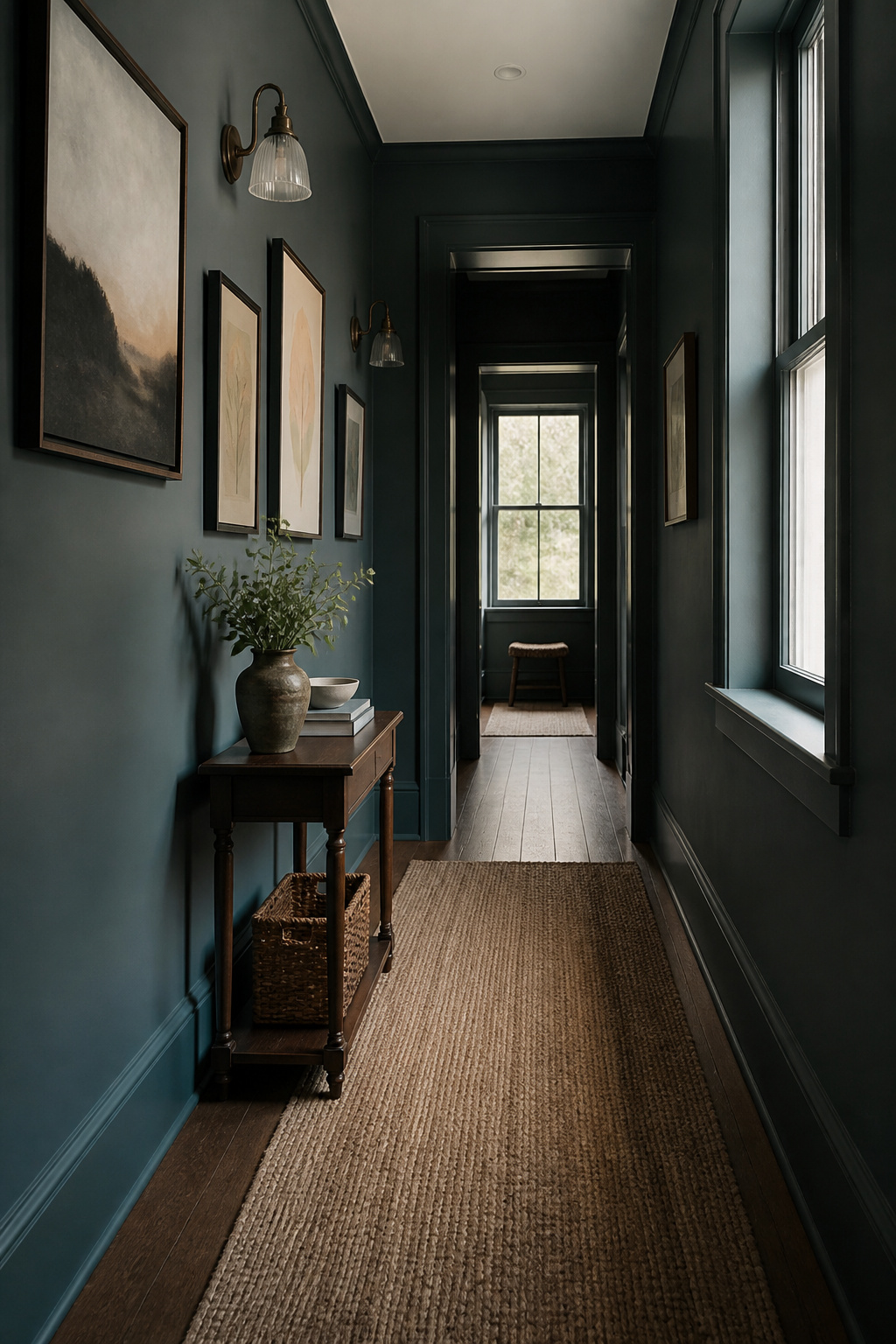
Farrow & Ball’s Inchyra Blue carries the weight of an English country house in a single can. The pigment sits deep, a blue-green so soaked with gray it forgets to announce itself as either color outright. Morning light pulls the green forward; by evening the blue steps back in, and the wall becomes something else entirely. That shapeshifting quality makes it a gamble in small rooms, where the darkness can swallow the corners, and a gift in spaces that catch sun from two directions.
The price stings on first look. Coverage demands patience; two coats are the minimum, and the finish rewards a steady hand more than a roller rushed before dinner. My own brushwork left faint streaks where I cut corners on the second pass, visible only once the lamp switched on at dusk. The color had shifted by then anyway, so the mistake lived in a light that no longer existed.
Stone Blue
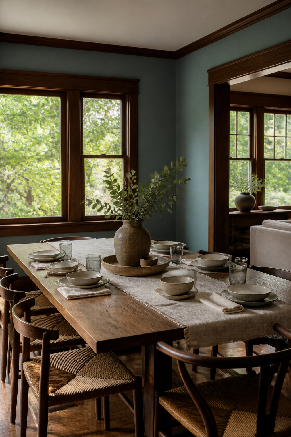
Stone Blue sits in that useful middle ground where visitors pause to decide whether the wall is blue or green, and the answer keeps shifting with the light. Farrow and Ball pitched it as a stony gray-tinged blue, but the gray actually lets the green step forward in afternoon sun, which is why it behaves like a true blue-green rather than a dusty blue.
I first brushed it out in a 1920s dining room with heavy oak trim, expecting the gray to feel somber against all that wood. Instead the color flattened just enough to read as modern without fighting the original millwork. Six months later I suggested it for a friend’s stripped-down kitchen with flat-panel cabinets and brass pulls, and the same sample that looked restrained in the old house turned almost mineral-bright against white quartz. The pairing that made both rooms work was the same strong white on trim and ceiling, something with enough body not to go chalky next to Stone Blue’s density. Farrow and Ball’s own All White does the job, but any clean white with a touch of cream in it keeps the gray from turning cold. Where Stone Blue fails is small dark spaces without natural light; the gray stacks up and the color retreats to murk. I learned that in a powder room with no window, where two coats read closer to slate than anything alive.
Color Pairing
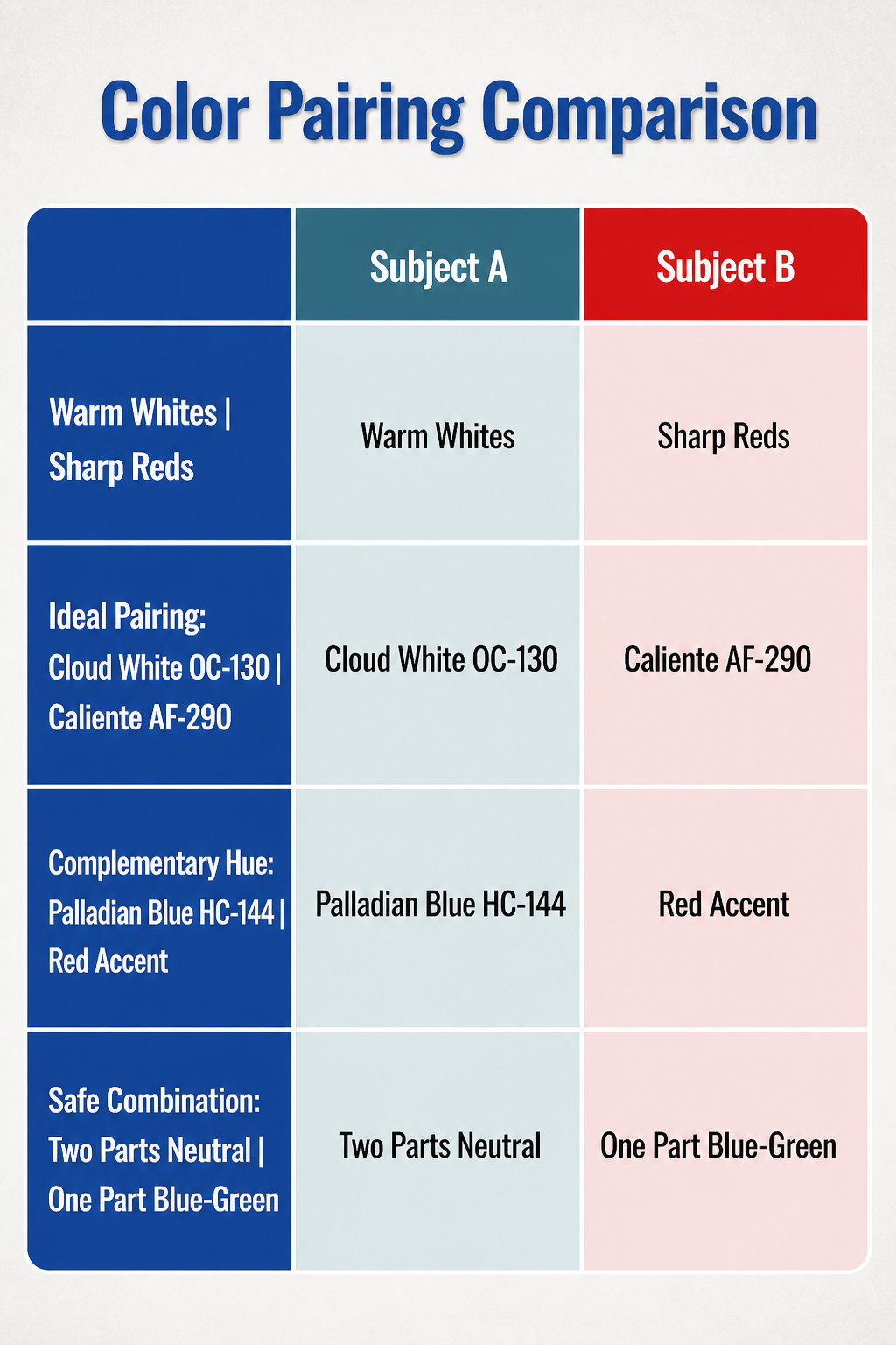
Warm whites like Cloud White OC-130 and Simply White OC-117 give blue-green paint its cleanest stage. The green undertone in Palladian Blue HC-144 or Bird’s Egg 2051-60 already leans warm, so pairing it with a white that has some cream in it keeps the room from feeling clinical. My first attempt went wrong when I used a stark white against Palladian Blue; the wall looked like a hospital corridor until I repainted the trim.
Sharp reds like Caliente AF-290 work as accent, but the ratio matters more than the shade. A single red lamp or chair against a blue-green wall reads nautical; red walls with blue-green trim reads carnival. I learned that after painting a bathroom door Caliente against Palladian Blue walls and having to repaint by Tuesday.
Neutral hues like Thunder AF-685 and Metropolitan AF-690 play it safer. They let the blue-green stay the story without competing for attention, which is what you want in a hallway or bedroom where the goal is rest rather than statement. The safe route is two parts neutral, one part blue-green, and accent only where someone stops moving.
Light Reflectance Value
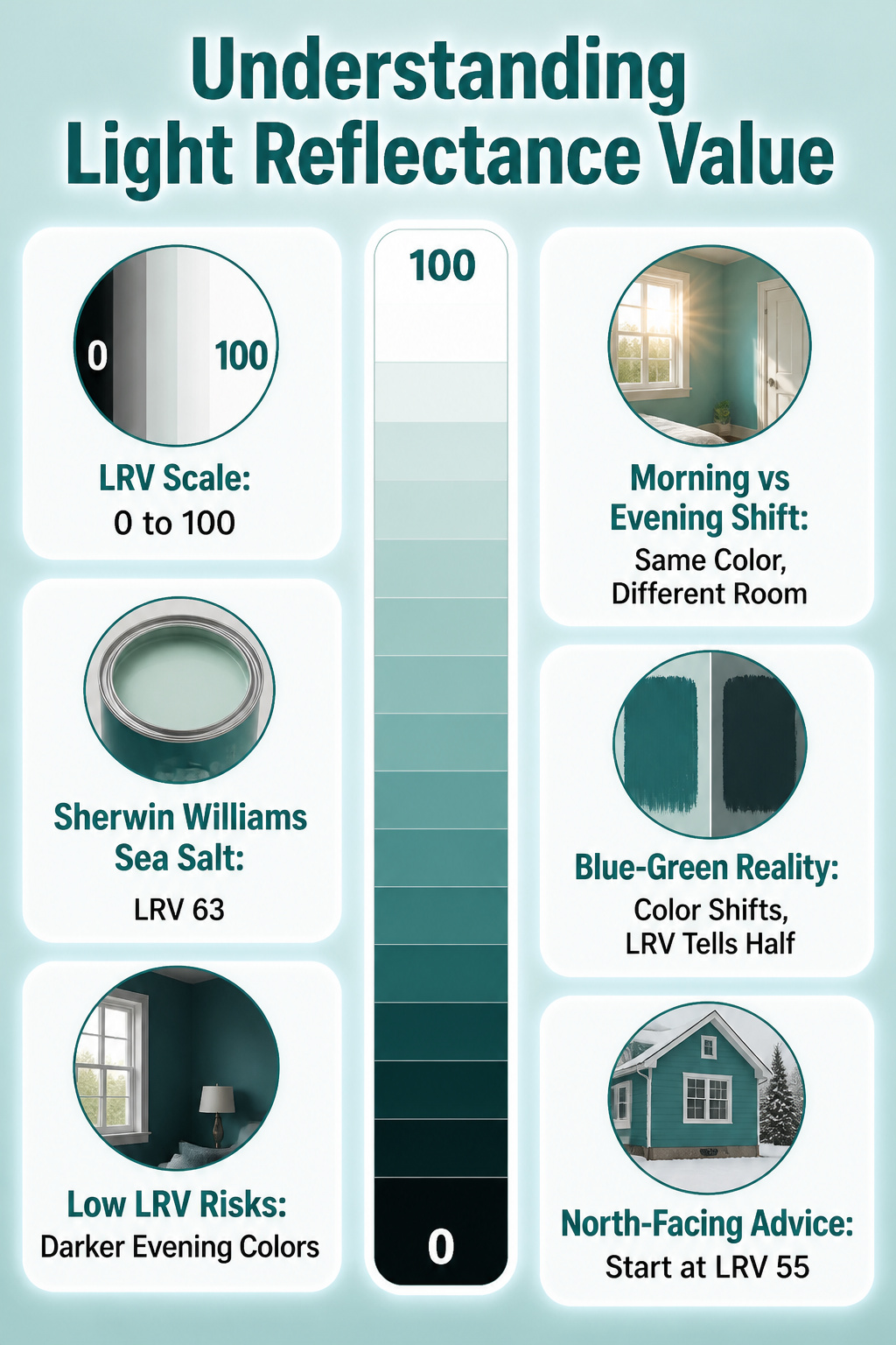
Light Reflectance Value runs from 0 to 100, where 100 is pure white bouncing back every photon and 0 is pure black swallowing the light whole. Blue-greens sit in a tricky middle zone because the color itself shifts with the light source, so the LRV number only tells half the story.
I learned this the hard way in our east-facing guest room. I chose a blue-green with an LRV in the low 40s, thinking the morning sun would balance it out. By noon the room glowed, but by four o’clock the walls turned almost navy and the space felt like a cave. The same pigment, same sheen, completely different room depending on when you walked in.
Sherwin Williams Sea Salt, with its LRV of 63, sits in the safer upper-middle range where most blue-greens behave more predictably. That number means enough light comes back to keep the color reading true across more hours of the day. Lower LRV blue-greens like Benjamin Moore’s Twilight can look jewel-toned and rich in bright conditions, then sink to near-black as evening approaches.
For a north-facing room or anywhere the light stays flat, I now start at 55 or above on the LRV scale for blue-green. You still get the color, but you also keep the walls visible after lunch.
Rooms That Suit Blue-Green
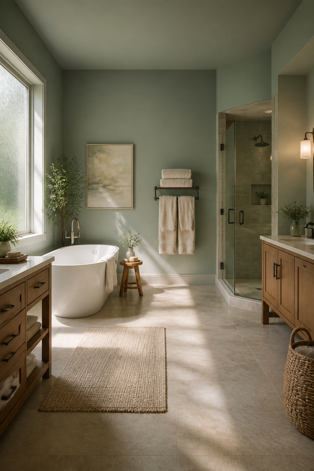
Bathrooms are where blue-green paint earns its keep. The humidity and hard surfaces already feel clinical; a shade like Benjamin Moore’s Jack Pine softens the space without fighting the white fixtures. I have seen it read almost gray in north-facing powder rooms and pick up a mint edge where afternoon light hits the tile. The spa effect works because the color borrows from water itself, so the eye does not register it as decoration.
Living rooms demand more caution. Jack Pine in a living room with warm wood furniture and soft lamps reads calm and timeless, as one designer put it, but the same color under cool LED overhead can slump toward sadness. The undertone matters enormously here. Sherwin Williams Underseas, with its stronger blue base and that kick of yellow, stays livelier in dim conditions. I would not use a blue-green this deep in a living room that gets only morning light; it closes in by four o’clock.
Bedrooms are where I got greedy and lost. Underseas on every wall of a master bedroom did create the promised zen retreat, but the renewal factor backfired. Mornings felt underwater instead of rested. The color theory was right; my application was not. Now I limit it to an accent wall behind the bed, or keep it to bathrooms and the odd hallway where the duration of stay is short.
Trends and Timelessness
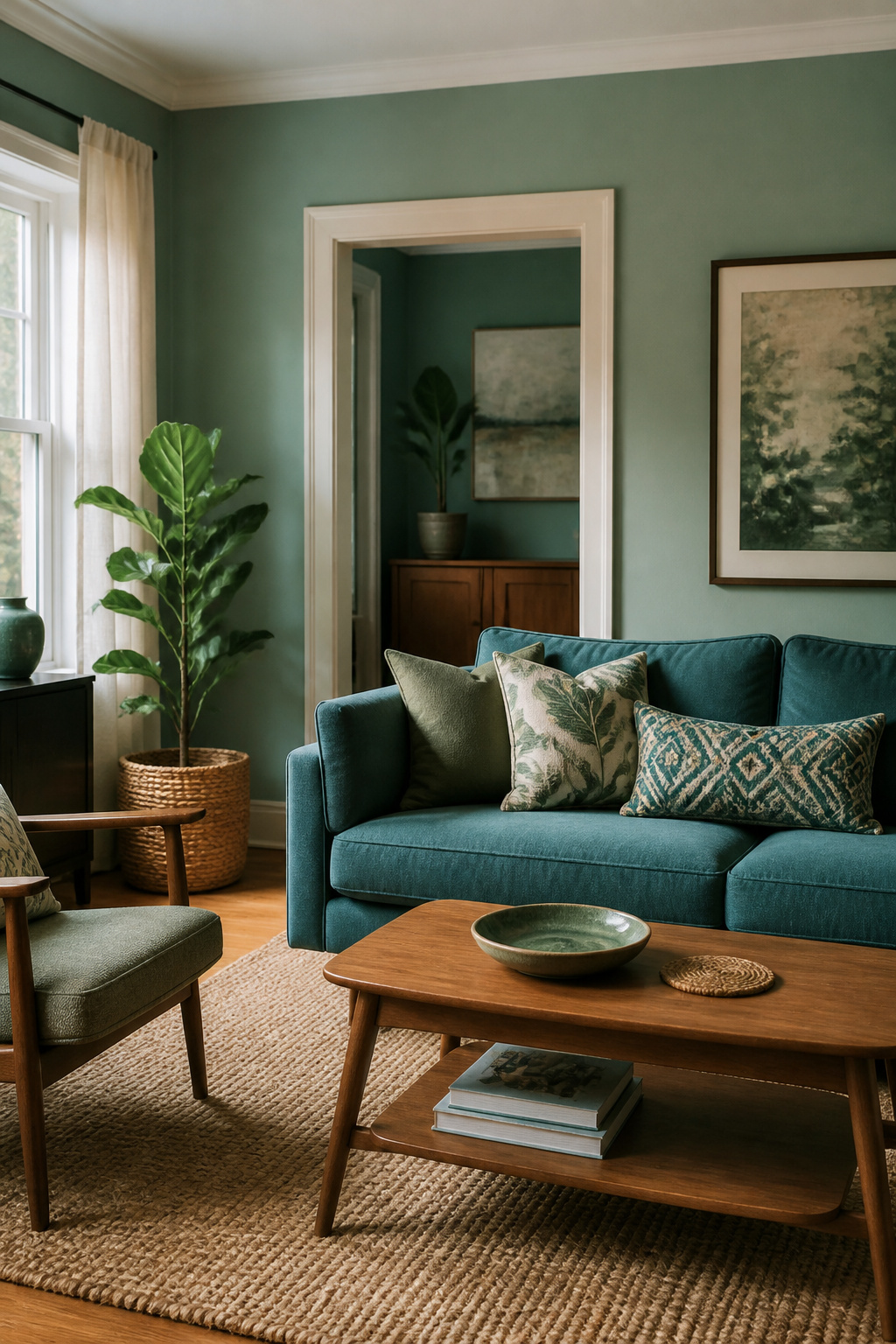
Blue-greens have cycled through at least three named eras since I started noticing paint trends. The coastal phase leaned heavily on sun-faded aqua, then modern farmhouse pulled everything toward muted sage-teal, and the current mood sits somewhere between those two poles, more saturated than farmhouse but less literal than beach-house kitsch. What struck me, reading through designer after designer, is how the same blue green paint keeps resurfacing even as the hashtags change. Palladian Blue, which reads more green than its name suggests, looked as current in 2014 beach-house spreads as it does now against warm wood and matte black fixtures. The sources describe it as soothing, and that quality seems to survive each style shift because it borrows from both blue’s retreat and green’s growth without committing fully to either. Living with a color through those transitions, the shade itself becomes the constant while the rooms around it swap out hardware and textiles. That is the practical case for choosing a blue-green: not because it is having a moment, but because it has already survived several.
Frequently Asked Questions
What are the most popular blue paint colors?
Benjamin Moore’s Hale Navy HC-154, Aegean Teal 2136-40, and November Skies 2128-50 rank among the most requested blues. Aegean Teal in particular draws attention for its depth and saturation, though the article notes it works best on islands, doors, or built-ins rather than full walls in dim rooms.
What colors pair well with blue-green paint?
Warm whites like Cloud White OC-130 and Simply White OC-117 give blue-green paint its cleanest stage. Sharp reds like Caliente AF-290 work as accents in small doses for a nautical feel. Neutral hues like Thunder AF-685 and Metropolitan AF-690 let the blue-green stay the story without competing. The safe ratio is two parts neutral, one part blue-green, with accents only where someone stops moving.
How do I choose the right blue-green paint color for my space?
Start with the light you actually have. For north-facing rooms or spaces with flat light, choose an LRV of 55 or above so walls stay visible after lunch. Consider the room’s purpose: bedrooms and bathrooms suit quieter shades like Sea Salt or Healing Aloe, while drama colors like Oceanside or Aegean Teal belong on single planes such as an island or accent wall. Test samples at multiple times of day; colors like Rainwashed and Inchyra Blue shift noticeably as the light changes.