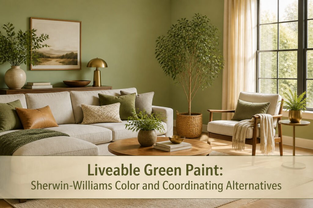
Sherwin-Williams Liveable Green (SW 6176) is a soft, earthy mid-tone green with warm yellow-gray undertones and an LRV of 61. Its real test comes from directional light: north-facing rooms drain the warmth and leave it reading flat and gray, while south light pushes the yellow forward and turns it almost sunny. That same shift is why the color pairs cleanly with warm woods and brass but can tip into dinginess without enough brightness to spend.
1. What Liveable Green Actually Looks Like on a Wall
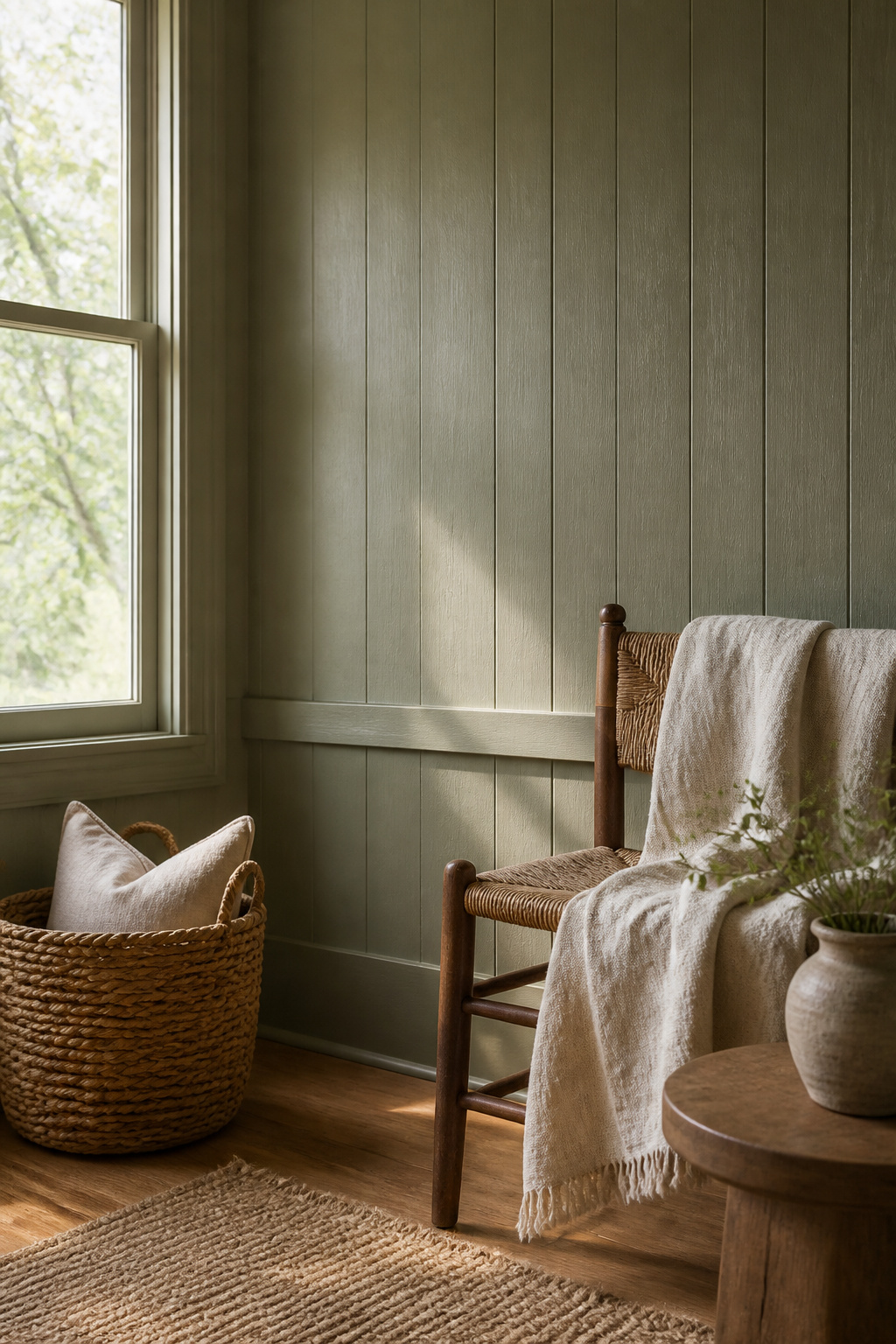
Sherwin-Williams Liveable Green (SW 6176) carries an LRV of 61, which lands it in that workable middle zone where walls stay light without washing out. The RGB mix comes in at R:206, G:206, B:189, and those numbers tell the story. The red and green sit even while the blue drops back, so the color reads as a soft earthy green with warm yellow-gray undertones rather than anything crisp or minty.
That balance between warm and cool is what makes it behave differently from room to room. Morning light pulls the yellow forward and the color feels almost like pale sage with sun behind it. As the day dims, the gray arrives more slowly, shifting toward a muted green-gray without going cold. I have seen the same swatch read as warm and grounding in one house and quietly neutral in another, and the difference was just which windows got afternoon light.
The yellow-gray base keeps it versatile across decor styles. In a space with warm woods and brass, it picks up the honey tones. Against cooler grays or chrome, the green stays present enough to keep the room from feeling sterile. It is not a chameleon color that disappears; it is a team player that adjusts its volume.
2. Softened Green When You Want Something Deeper
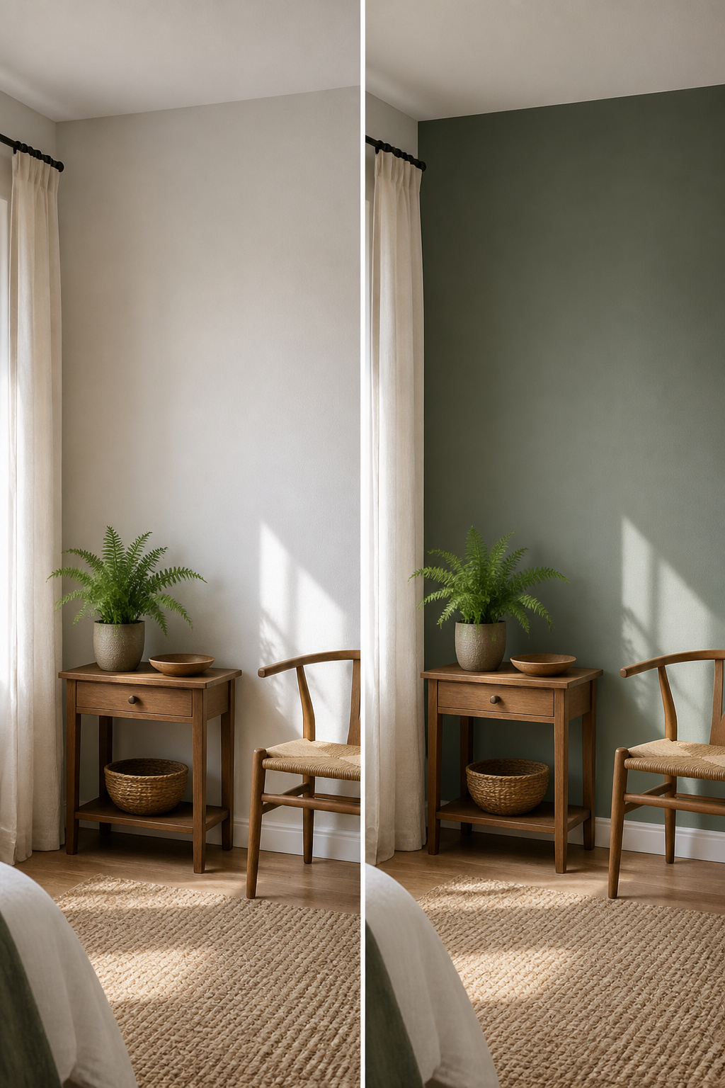
Softened Green (SW 6177) sits twelve points lower on the LRV scale than Liveable Green, and that gap is where the two colors part ways in a room. At LRV 49, Softened Green carries neutral green with slight gray undertones, closer to light sage, and reads as distinctly darker and more subdued. The gray in it mutes the green just enough that it blends into natural surroundings rather than picking up light and bouncing it back.
Where Liveable Green at LRV 61 stays airy and cheerful, Softened Green turns moody. That difference matters most in spaces where you want the walls to settle back instead of forward: a cabinet color, an accent wall, or an exterior where thick woods form the backdrop. On a house exterior, the depth keeps it from turning too vibrant, letting the structure hug the landscape rather than compete with it.
The choice between them comes down to how much light you have to spend. Liveable Green wins in rooms that need the help; Softened Green works when you already have enough brightness and want something richer, more organic, and less eager to please. Swatch both and watch them shift across the day, because daylight has a way of flattening the difference until you see it in place.
3. Sea Salt and the Blue Undertone Difference
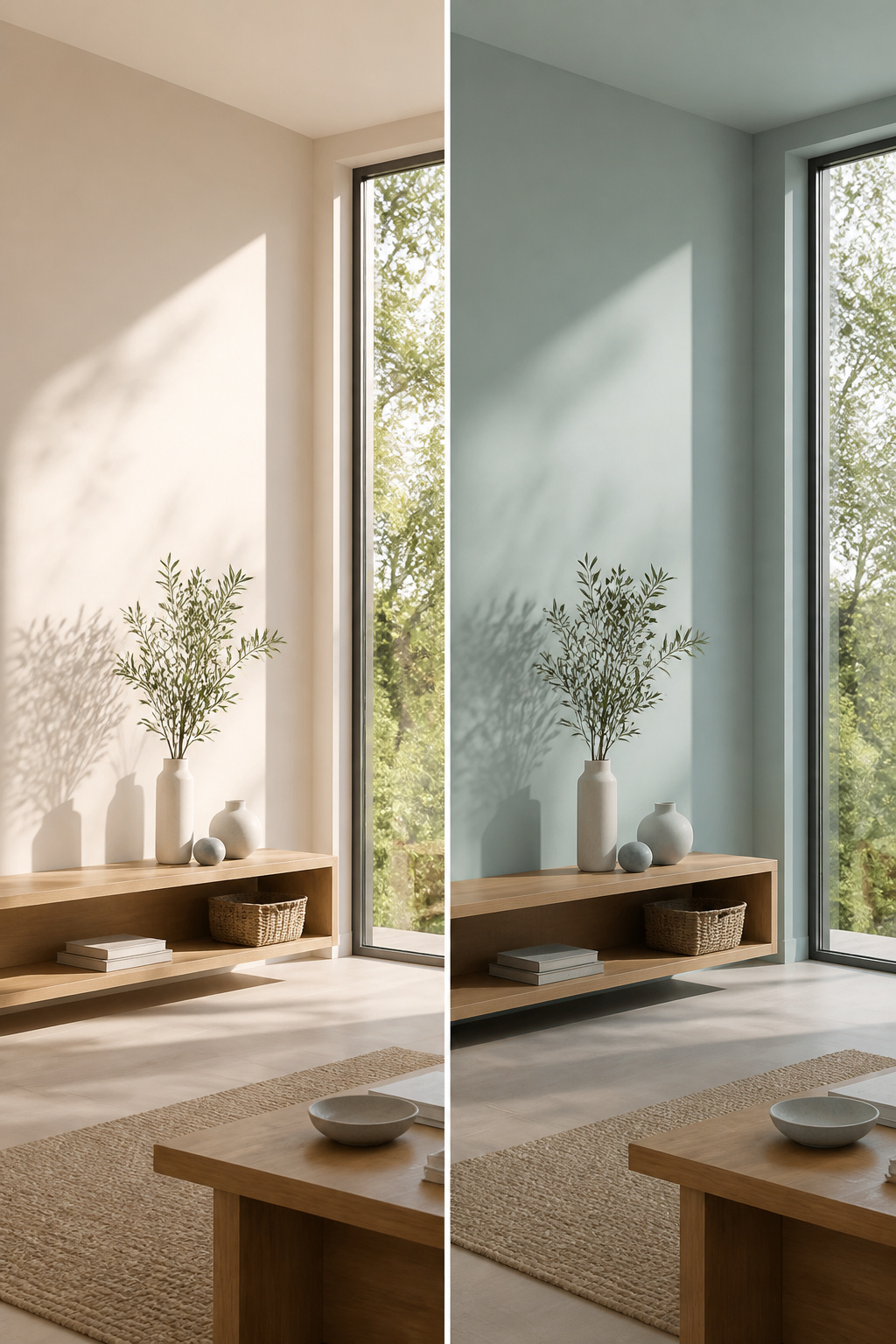
Sea Salt (SW 6204) sits just two points above Liveable Green on the LRV scale, at 63 versus 61, but those two points do not tell the temperature story. The blue undertone in Sea Salt pushes it cooler and lighter in practice, while Liveable Green’s yellow-green lean reads warmer and earthier on the same wall.
I have seen the two samples go up side by side in afternoon light, and the gap between them feels wider than the numbers suggest. Sea Salt will shift on you; it can read green, gray, or blue depending on the hour, which gives it that coastal, chameleon quality some rooms want. Liveable Green stays more consistent as the light changes, though it will gray down in dim conditions.
Choose Sea Salt if you want crisp and cool; choose Liveable Green if you want grounded and warm. The decision is less about brightness and more about which undertone you want living with you.
4. Filmy Green for a Less Saturated Room
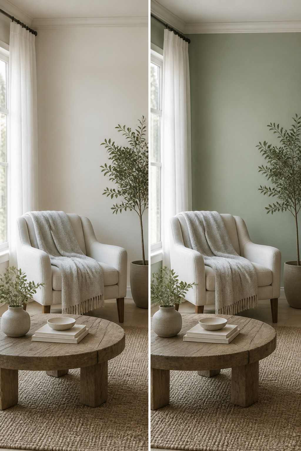
Filmy Green SW 6190 sits three points above Liveable Green on the LRV scale at 64, and that modest gap is enough to shift the whole mood of a room. Where Liveable Green carries more pigment presence and reads warmer, Filmy Green steps back and lets the walls breathe. The gray and blue undertones cool it down, so the green never quite announces itself the way Liveable Green does in the same light.
I would reach for Filmy Green in a space that already has enough visual weight, maybe from heavy trim or darker flooring, because the lower saturation keeps things from feeling stacked. Liveable Green grounds a room; Filmy Green refreshes it. The difference is not dramatic on a chip, but on four walls the airier feel is immediate. The 3-point LRV edge and reduced saturation make Filmy Green feel lighter without drifting into pale or washed-out territory. North-facing rooms pull more of the cool gray forward, while south light warms it just enough to keep the green from going sterile.
5. Soft Sage and the Warmer Yellow Pull
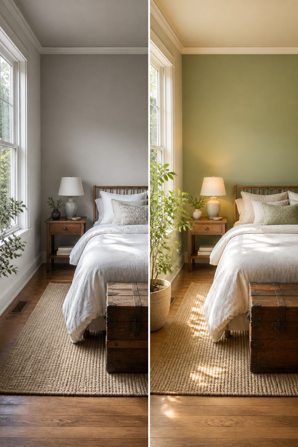
Soft Sage SW 9645 sits at an LRV of 50, eleven points darker than Liveable Green, yet it reads warmer rather than heavier. The subdued green carries stronger yellow undertones that pull the color toward morning light rather than afternoon shade. In a north-facing room that warmth can tip into dinginess, the yellow advancing until the wall feels like a foggy field instead of a quiet room. South light handles it better, letting the green stay present without the undertone taking over.
Between the two, Soft Sage suits spaces where you want nature to feel close and slightly untamed: a reading corner, a bedroom with aged wood furniture. Liveable Green keeps its composure in shared spaces where the goal is livable calm, not botanical statement. The eleven-point LRV gap matters less than the directional shift in undertone. Pick Soft Sage when your furnishings run warm already; stay with Liveable Green if the room needs the color to do the neutral work for you.
6. Soft Fern From Benjamin Moore

Benjamin Moore Soft Fern, coded 2144-40 at LRV 56.67, sits in that narrow gap between Liveable Green and Softened Green for lightness, though its spirit is closer to the latter. The blend runs mild green with yellow and gray undertones, a combination that reads as pulled-back nature rather than garden exuberance.
Crossing brand lines has never bothered me when the color itself solves the problem, and Soft Fern is one of those cases where the right undertone matters more than the logo on the can. Against Liveable Green, it carries a heavier green-gray hand and less warmth; against Softened Green, it steps up a half-tone lighter while keeping that same muted, restful quality. For rooms where Liveable Green tips too warm and Softened Green sinks too deep, this is the middle position that actually works.
How Light Changes What You See
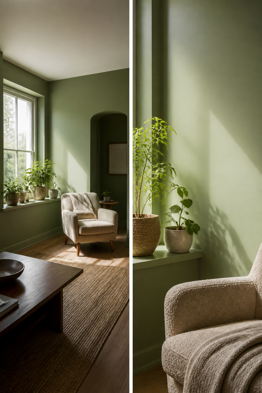
Liveable Green shifts more than most weekend painters expect. In bright natural light the color opens up and reads distinctly greener, almost fresh against white trim. The same wall after sunset turns warmer and more muted, the yellow-gray undertones pushing through until the room feels cozier than it did at noon.
North-facing rooms are where people get surprised. The cooler, indirect light drains the warmth and Liveable Green reads noticeably grayer, sometimes flat. South-facing exposure does the opposite: the yellow intensifies and the color warms up, almost sunny.
At an LRV of 61, Liveable Green sits in that middle zone where it neither bounces light around nor absorbs it. That moderate reflectance means the shift from morning to evening is visible, not subtle. Flat or matte finishes hold the soft, warm look; anything glossier brightens the hue and can make the color feel like a different shade entirely.
The only way to know which version you will live with is to paint a sample on the actual wall and watch it across a full day. What reads sophisticated at 10 a.m. may read tired by lamplight, or the reverse.
Rooms Where Liveable Green Works Best

Bedrooms are where this shade earns its name. The soft tone reads as a tranquil, restorative color that promotes sleep and stress relief, and it handles small rooms well: compact bedrooms feel airier without losing coziness. I would pair it with crisp white bedding, muted brass accents, and warm woods like birch or walnut rather than trying to force a cool, modern palette against its nature.
In a living room, Liveable Green works as a grounded, comfortable backdrop that lets artwork and decor stand out. It stretches across styles from rustic farmhouse to sleek contemporary, though I think it looks most honest with warm wood tones and natural textiles like linen or jute. Cream sofas and beige drapes keep the look earthy but polished rather than rustic in a themed way.
The sources I read focused on those two rooms specifically. They did not cover kitchen or exterior applications for this color, so I am leaving those out rather than guessing. If you are set on either, I would test a large sample board first and watch how the light shifts it across a day.
Colors That Hold Hands With Liveable Green
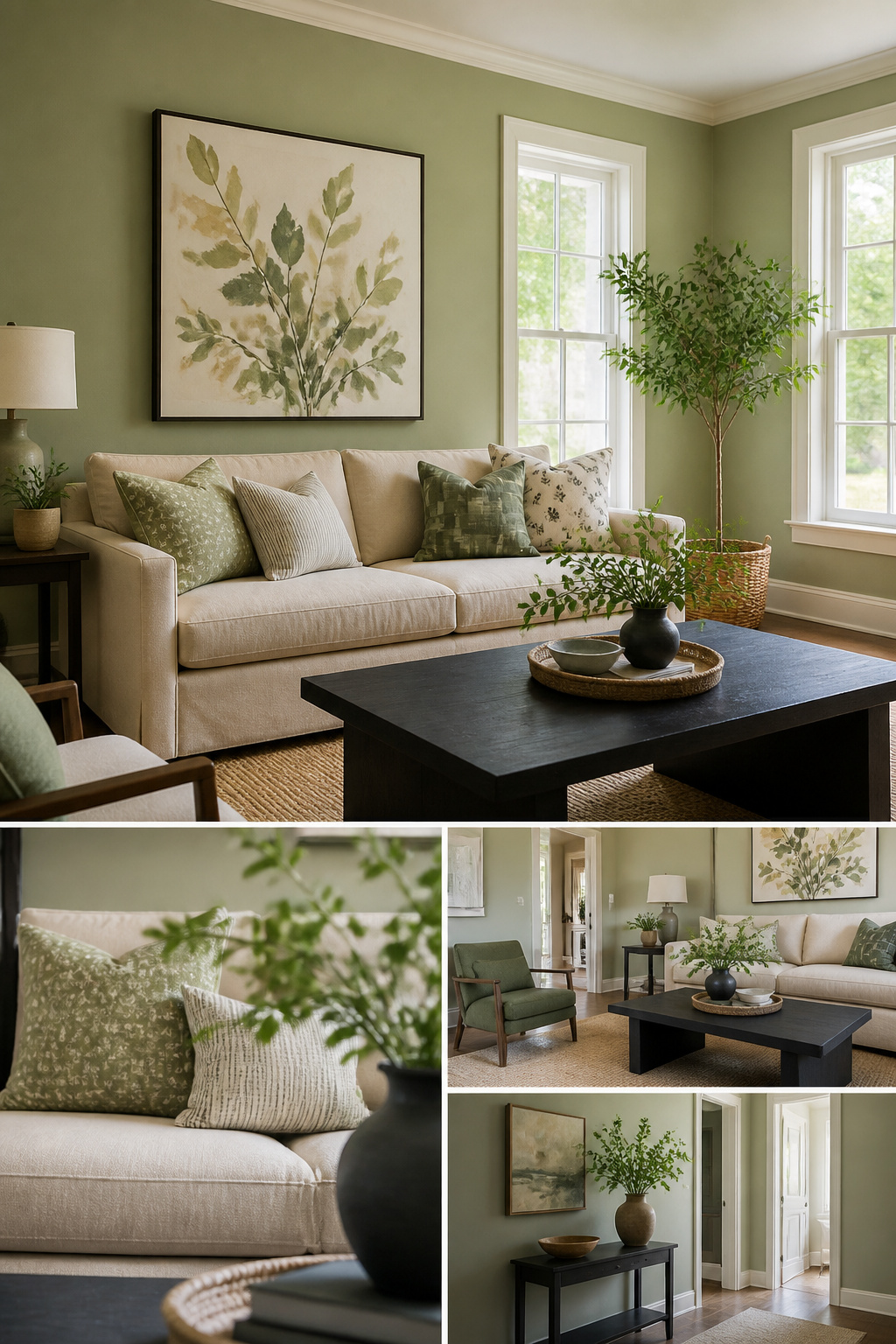
Liveable Green sits in that middle space where warm and cool meet, so its companions need to know which side they are joining. Shell White keeps things airy without going cold; the warmth in it picks up the subtle yellow in Liveable Green rather than fighting it. I have seen the pairing go flat when a stark white crashes the party, and that is the mistake worth skipping.
For depth without drama, Sagey (SW 6175) stays in the same family but pushes richer. It works on a built-in or an accent wall where you want tone-on-tone without everything reading as the same flat note. The blue-leaning greens like Rainwashed or Tradewind do something different: they pull out the cool undertone and turn the room spa-quiet, which is lovely until you add too much and the whole thing goes icy.
Then there is Iron Ore for the moments you need weight. Deep charcoal trim, a painted interior door, a fireplace wall: it gives Liveable Green something to push against. The contrast is strong, but the shared gray keeps it from looking like you dropped a black hole in the corner. Urbane Bronze works too, though it leans browner and reads warmer against the green.
Beige neutrals like Accessible Beige or Natural Linen fill out the soft palette if monochromatic is the goal. Whole Wheat falls in the same camp. The risk there is mush: everything too close in value, nothing for the eye to land on. My own preference is to let Liveable Green be the green and use the others for trim, textiles, or a single piece you can swap out when the mood shifts.
Frequently Asked Questions
Is SW Liveable Green warm or cool?
Liveable Green is a warm green. Its red and green RGB values sit even while blue drops back, giving it yellow-gray undertones that read cozy and grounded rather than crisp or minty. The warmth intensifies in south-facing light and softens in dim conditions, but it never goes fully cool.
What is the undertone of Liveable Green?
Liveable Green carries warm yellow-gray undertones. The yellow pulls forward in morning light for a pale sage effect, while gray arrives more slowly as daylight fades. That balance keeps it versatile across both warm and cool decor palettes without disappearing into the background.
What are the best uses for Liveable Green?
Liveable Green works best in bedrooms and living rooms, where its soft, restorative quality promotes calm without losing warmth. It suits compact spaces well, keeping them airy yet cozy, and pairs naturally with warm woods, brass, crisp white bedding, and natural textiles like linen or jute.