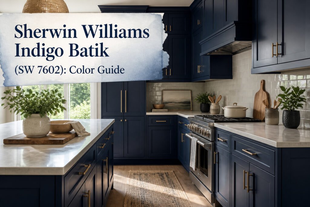
Sherwin Williams Indigo Batik (SW 7602) is a deep navy blue with gray undertones and an LRV of 8, dark enough to absorb most light in a room. The catch is that south-facing evening light can pull out unexpected purple notes, so the swatch that looked straightforward in the morning may not read the same after sunset. A kitchen in the Stonecreek Signature Series with cabinets in this color runs $4,199 for a basic 10-by-10 layout, which gives you a sense of how far the commitment extends beyond a sample pot.
What Indigo Batik Is
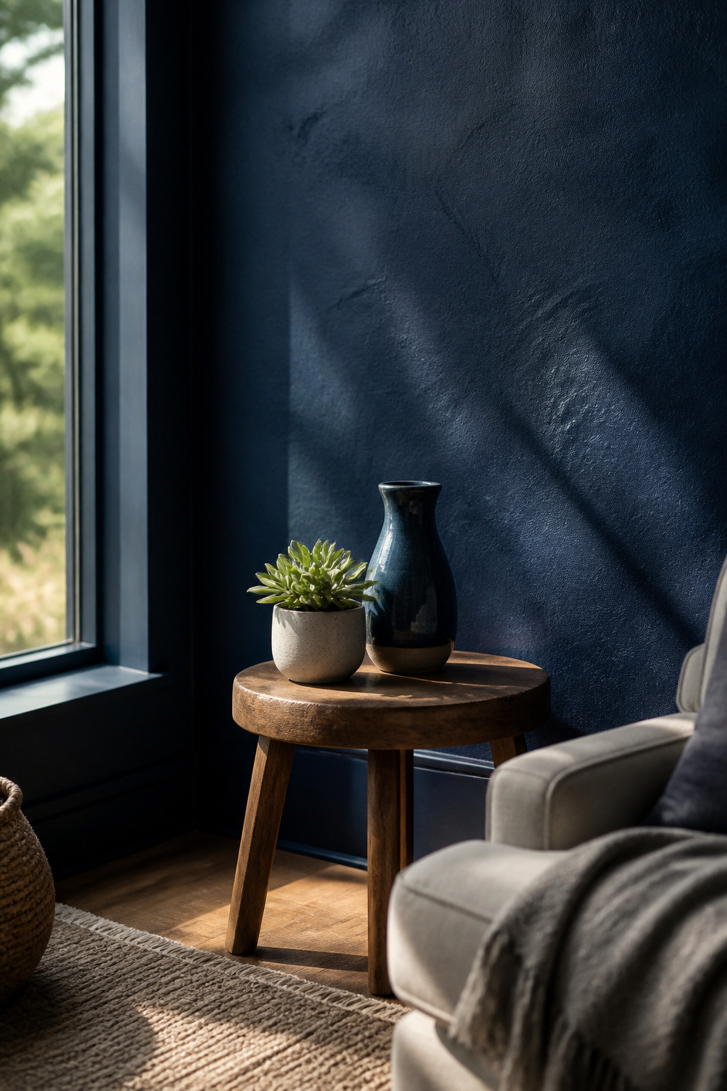
Sherwin Williams Indigo Batik (SW 7602) reads as a deep navy blue with subtle gray undertones that keep it from tipping into the brighter territory of a true royal. The numbers back this up: an LRV of 8 puts it firmly in the dark range, so the color absorbs most light rather than bouncing it back into a room. For anyone matching digitally, the RGB values run 62, 80, 99, with a HEX code of #3e5063.
That gray cast is what gives Indigo Batik its staying power. Sources describe it as both bold and timeless, a combination that usually requires compromise but somehow does not here. The saturation reads as a true blue in most lights, yet the muted quality lets it slide between design styles without fighting the surrounding materials. It carries enough pigment to anchor a space, enough neutrality to let other colors do the talking.
Coordinating Colors
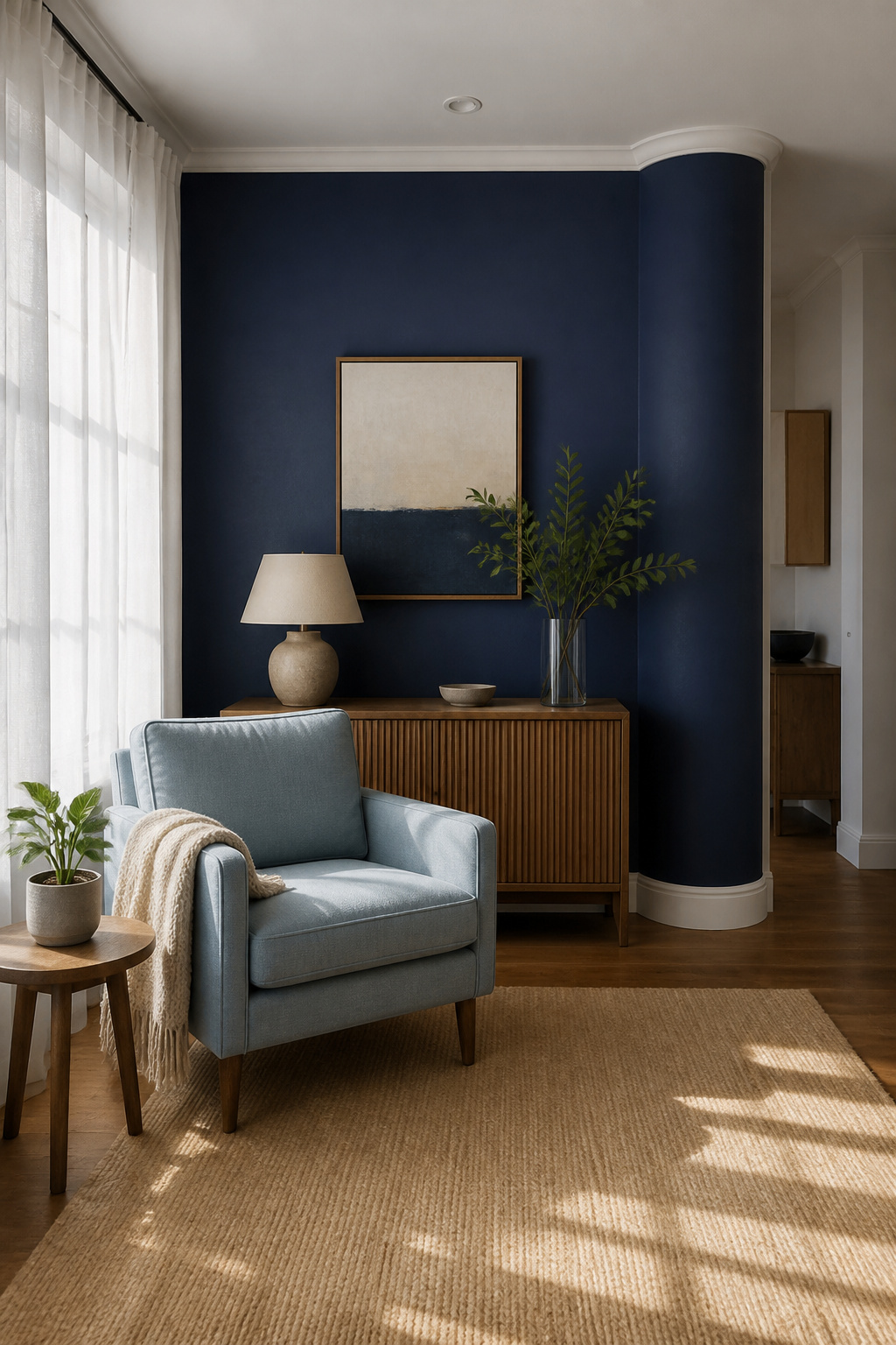
Indigo Batik sits deep enough on the wall that pairing it wrong flattens the whole room into a single note. The colors that actually work with it fall into two camps: the ones multiple sources keep returning to, and the ones that show up once but still hold up.
The pairings backed by two sources each are the safest starting place:
- Pure White (SW 7005) for ceilings, trim, and moldings gives the creamier, more refined look against this navy; sources agree it softens the contrast without going stark
- Stardew (SW 9138) picks up the gray undertone in Indigo Batik and keeps things in the same cool family
- Sparkling Sage (a Valspar color) shifts between cool gray and warmer green depending on the light; Sherwin Williams Sea Salt sits close if you want to stay in one brand, and Retreat goes darker in the same mood
- Accessible Beige (SW 7036) works because this navy needs something grounded and warm to keep it from reading too cold in a lived-in space
- Sands of Time (SW 6101) does similar work as a warmer neutral, more specific in its undertone than an off-the-rack white
- Icicle (SW 6238) stays pale enough to function as near-white while carrying just enough color to relate to the wall
- Pacer White (SW 6093) leans warmer against Indigo Batik’s richness; it is underused for how close it sits to popular off-whites like Oyster White or Shoji White
Single-source pairings that still deserve attention:
- Bracing Blue (SW 6242) builds a monochromatic story with enough distance in value to keep it from looking like a mistake
- Charcoal Blue (SW 2739) and Sea Serpent (SW 7615) both function as near-neighbors; either can step in as a lighter or darker accent within the same scheme
- North Star (SW 6246) reads as a lighter, cooler blue-gray that lets Indigo Batik do the heavy lifting
- Dakota Wheat (SW 9023) brings in the golden side of the palette; against this navy it reads intentional rather than accidental
The through-line is restraint. Blues with blues, warm neutrals with the cool ones, and whites that know whether they are warm or crisp before they hit the wall.
How Light Changes It
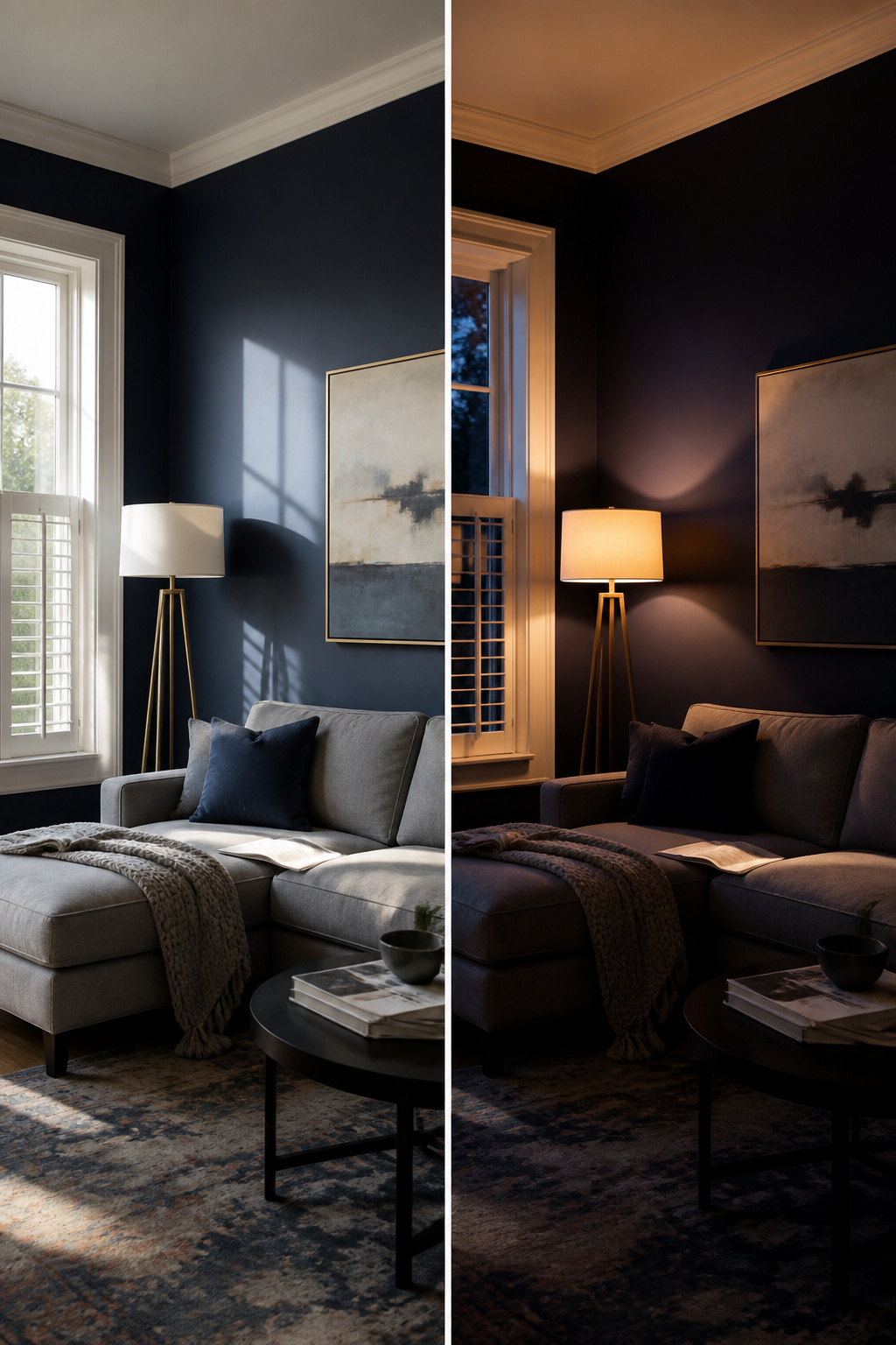
Natural light pulls Indigo Batik toward a brighter navy, almost like Sherwin-Williams’ Bracing Blue, while the same wall after sunset sinks toward a blue-black. That swing is dramatic enough that a south-facing room can flash hints of purple at the day’s end, a shift most people do not expect from what looked like a straightforward dark blue in the can.
The LRV sits at 8, which puts it firmly in the territory where walls advance visually and a space starts to feel smaller. I have seen makers fall in love with the morning swatch and regret the evening result, especially in rooms that already get limited daylight. The fix is neither expensive nor complicated: a few large swatches, moved across multiple walls, checked at morning, noon, and after dark. Paint stores sell sample pots for a reason, and this color is the reason.
Best Rooms for Indigo Batik
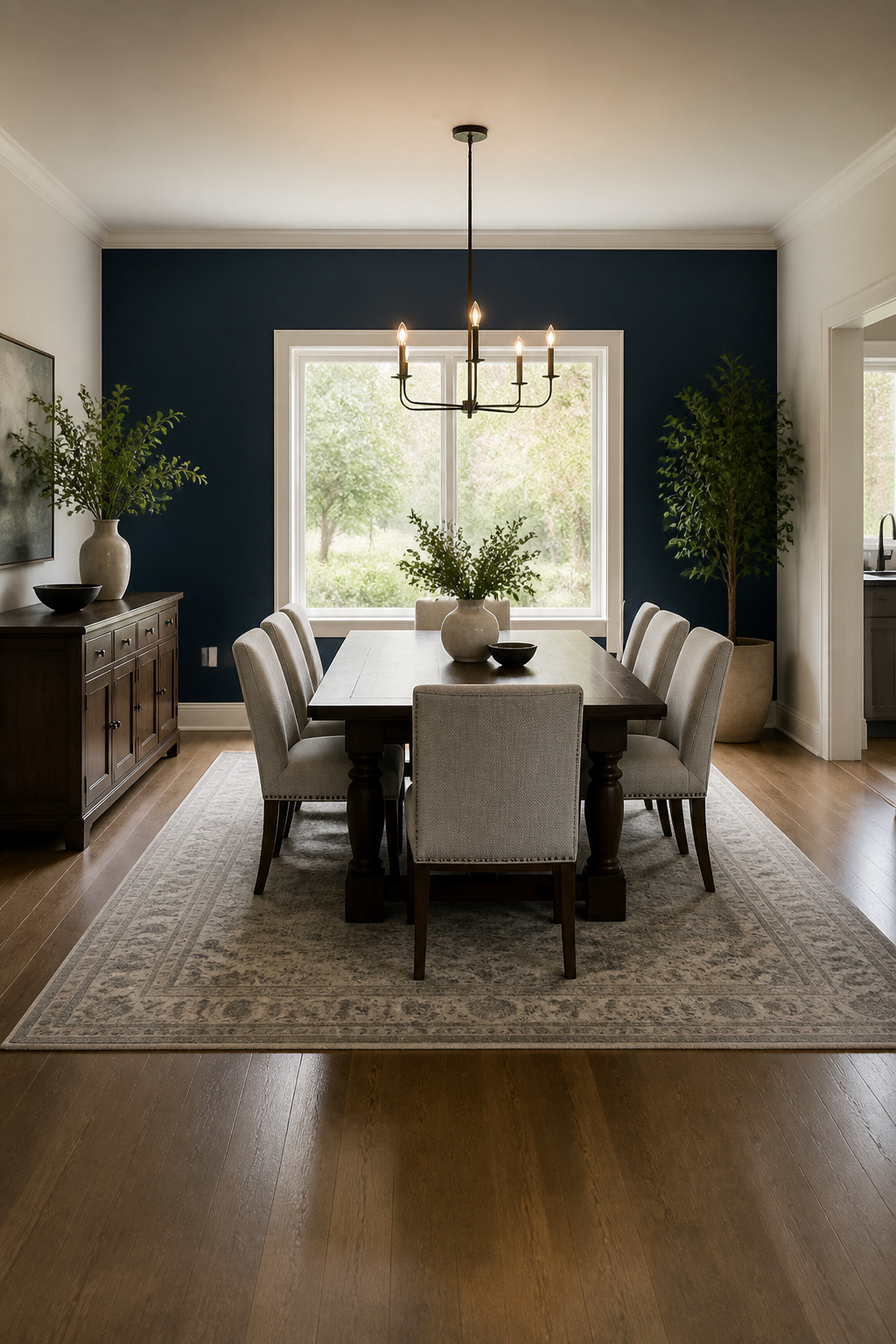
Living rooms and dining rooms carry Indigo Batik best when the ceiling gives it somewhere to go. Double-height walls let the color breathe, and the depth reads as intentional rather than heavy. That same depth makes it a natural for a fireplace wall surrounded by black marble or tile, where the color frames the focal point instead of fighting it.
Kitchens are the surprise. Cabinetry in Indigo Batik on the Stonecreek Signature Series lands somewhere between bold and timeless, a navy that feels modern without chasing trend. The finish has to be right, though: a flat or matte paint on cabinets collects every grease mark, so a satin or semi-gloss cabinet-grade finish is what holds up to actual cooking.
Outside, the color works with white or off-white trim, period. Anything warmer and the blue turns muddy; anything darker and the house disappears into itself. I have seen it paired with grey floors inside to good effect, and the same logic applies to stone or concrete porches: cool neutrals keep the navy crisp.
What the sources skip is small spaces. No one says how a bathroom or a narrow hallway handles this much saturation, and I will not guess. The guidance simply is not there, so test it in your actual square footage before committing to four walls.
Indigo Batik vs Naval
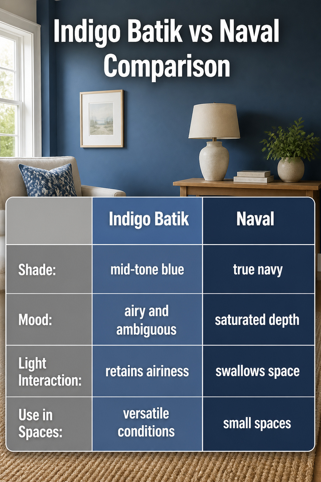
Naval sits one shade darker than Indigo Batik on the same color strip, which sounds like a small step but reads as two different moods on the wall. Indigo Batik hovers in that in-between space, not quite mid-tone blue and not quite true navy. Naval commits fully to navy. The choice comes down to whether you want ambiguity or certainty. In a room with strong natural light, Indigo Batik keeps some airiness; Naval goes full saturated depth and can swallow a small space whole. Both share enough DNA that your trim color and furniture stay the same either way. The mistake is ordering Naval thinking "a little darker" and getting a lot darker. Swatch both at the same spot and check them after sundown, when the gap widens.
Indigo Batik vs Charcoal Blue
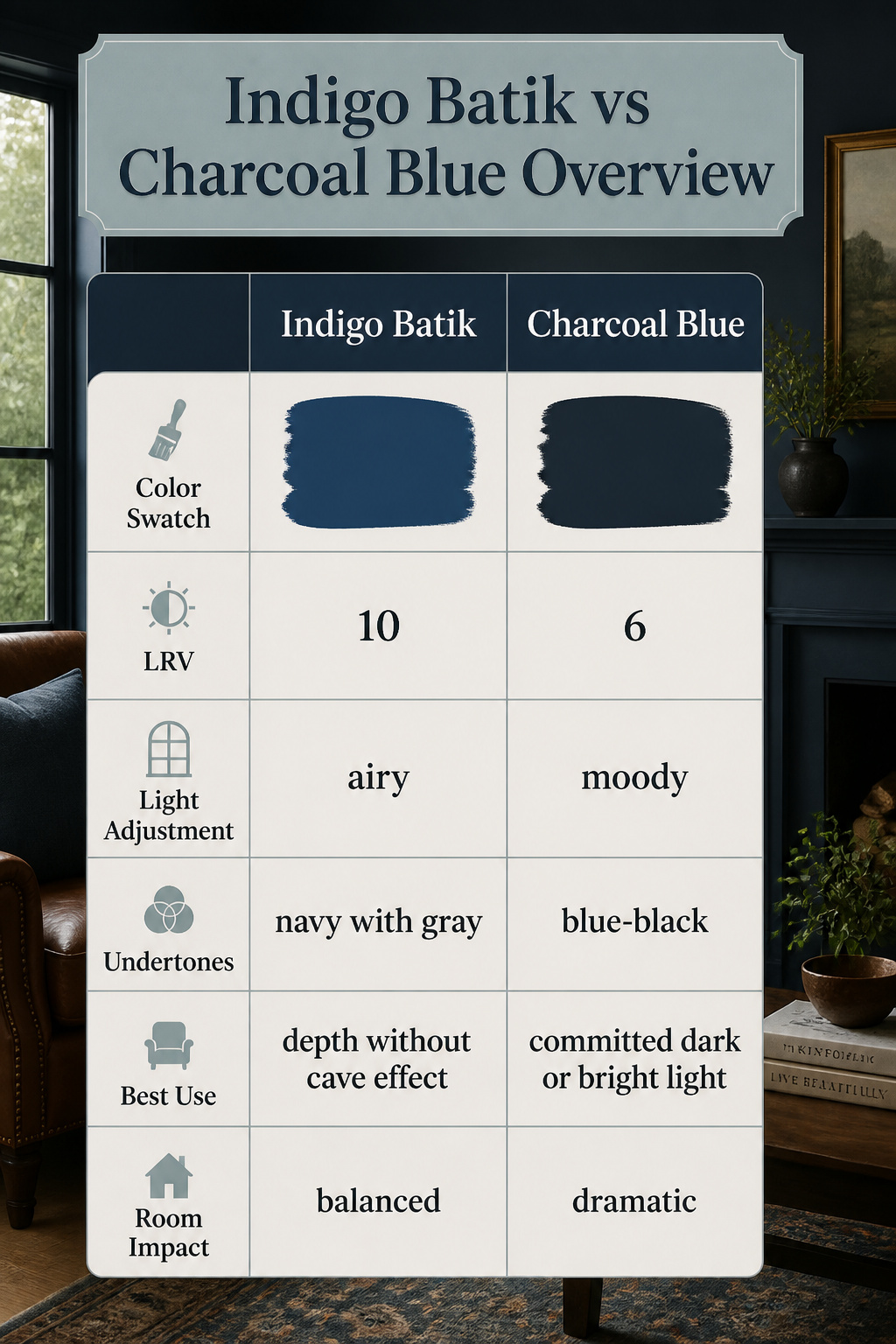
Charcoal Blue sits at an LRV of 6, making it noticeably darker than Indigo Batik, and that gap in lightness changes where each color belongs. The lower number means Charcoal Blue drinks in more light, so a room that handles Indigo Batik comfortably can turn moody or flat with its deeper cousin.
The undertones split them further. Indigo Batik reads as a true navy or royal blue with a faint gray or purple trace, staying predictable in most conditions. Charcoal Blue shifts toward blue-black under dim or harsh light, giving it a heavier, more dramatic edge. That near-black quality works if you want a wall to disappear, but it fights you in a space that needs breathing room.
Both colors share enough DNA to use the same contrasting palette, so the choice comes down to how much weight the room can carry. Indigo Batik gives you the depth without the risk of a cave effect; Charcoal Blue demands either generous natural light or a deliberate commitment to the dark.
Indigo Batik vs Sea Serpent

Sea Serpent sits right next to Indigo Batik on the Sherwin-Williams deck, and the difference is smaller than the swatch makes it look. Both read as deep navy in most light, but Sea Serpent carries a lower LRV of 7, so it drops darker on the wall and grabs more shadow as the day shifts. That navy-blue undertone also runs truer in Sea Serpent, where Indigo Batik loosens up just enough to let gray slip through.
The practical split comes down to how much drama the room can handle. Sea Serpent turns a small powder room into a jewel box, but in a north-facing bedroom it can flatten into near-black by late afternoon. Indigo Batik keeps enough lift to read as color instead of void, which is why it tends to win on kitchen cabinets where you want depth without cave-like corners. Neither choice reads as royal or showy; both stay in the quiet, subtle register. Grab sample stick-ons for both and watch them at the hour you actually use the space, not just under the store’s fluorescents.
Testing Before You Commit
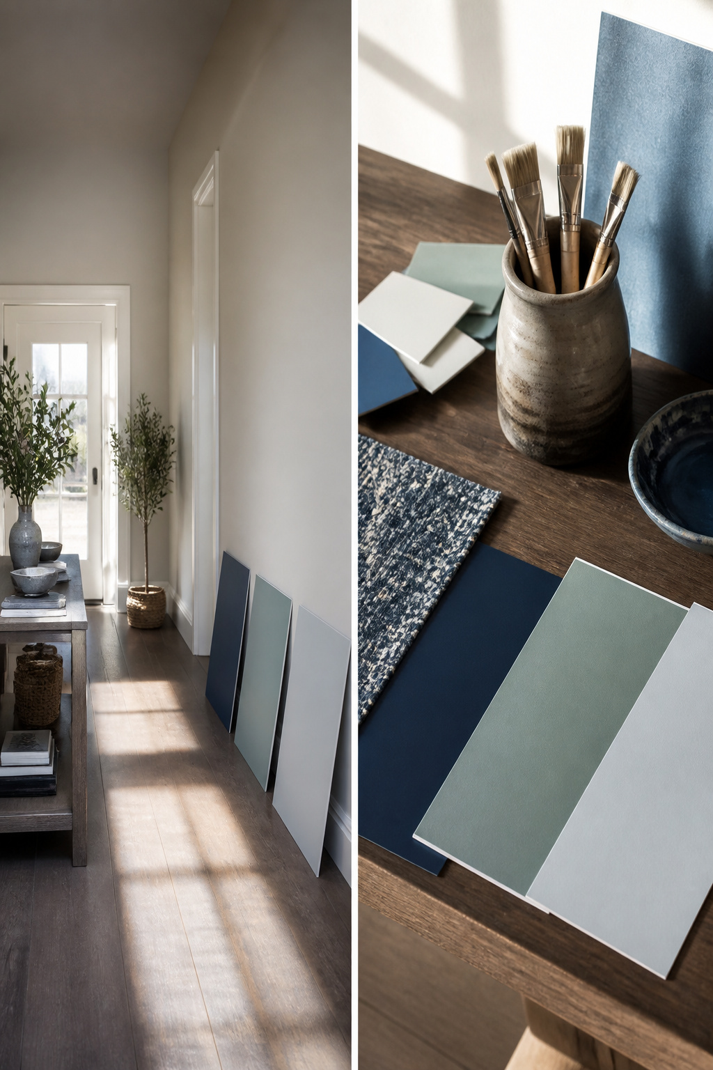
A saturated color like Indigo Batik shifts more than a soft neutral ever will. South-facing morning light keeps it blue, but evening light can pull out a purple note you did not see on the chip. That gap between expectation and wall is exactly why sample boards exist.
- Paint two-foot squares on poster board, not the wall. Move them around the room. What reads dramatic behind the sofa may feel like a cave near the floor.
- Check them at three distinct times: mid-morning, late afternoon, and after dark under your actual bulbs. Artificial light changes Indigo Batik as much as the sun does; a cool LED will push it steely where warm incandescence keeps it navy.
- Live with the samples for two full days before deciding. A color this deep needs time to show its quieter undertone, the one that only appears in shadowed corners. Skip this step and you are gambling on a whole room of regret.
Design Details That Work
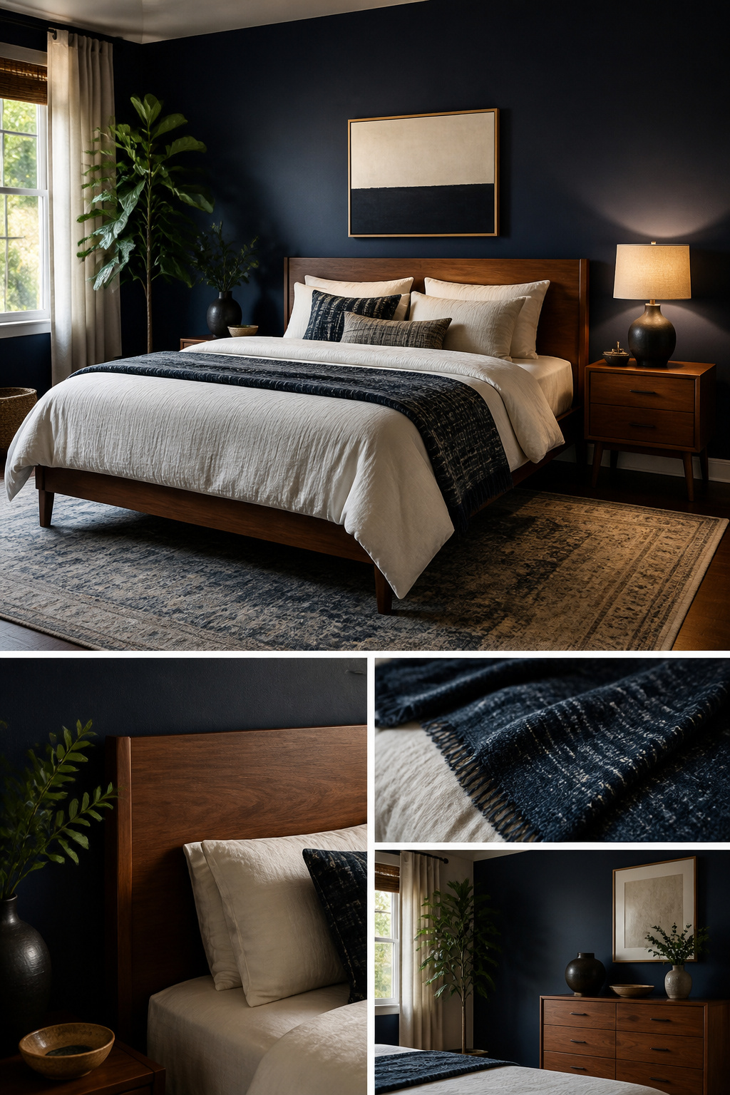
An accent wall in a bedroom painted Indigo Batik reads as navy under lamplight, not black, which is the mistake most dark blues make after sunset. The pigment keeps just enough warmth that oak trim or a walnut headboard still registers as wood rather than silhouette. Flooring matters more than people expect: this color sits flat against cool gray tile or pale maple, but against honey-toned oak or aged pine it gains depth the way velvet gains depth under your hand.
The cabinet lines that carry this shade run to real numbers. A basic 10-by-10 kitchen in the Concord door style lists at $4,199; the Avalon Raised panel adds $440 for the detailing; the Contour Slim Shaker, at $5,549, is the steepest step but also the one that reads most current in a small space where every line shows. I would skip the slim shaker in a kitchen larger than 150 square feet; the narrow rail starts to look fussy when it repeats across too many feet of wall.
Warm Woods and Metals
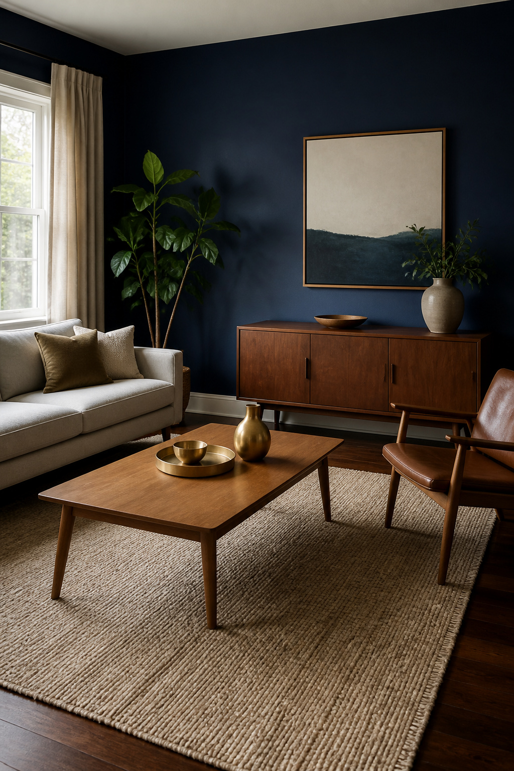
Walnut floors pull something out of Indigo Batik that cooler finishes flatten right down. The color sits deep enough on its own, but set it against that dark, reddish wood and the whole wall seems to gain weight, like a good wool blanket versus a synthetic one. Oak does nearly the same work, especially in the medium-to-darker range; the grain keeps the blue from reading as flat paint on flat drywall.
Lighter floors need more intention. A pale oak floor will bounce too much warmth against SW 7602’s gray undertones unless you break the meeting point with a rug. The rug does not have to match the wall; it just has to keep the eye from jumping straight from bare wood to saturated blue without a pause.
Metal finishes follow the same logic. Brushed brass or aged bronze pick up the warmth walnut introduces; chrome or polished nickel fight it. I learned this the hard way in a bathroom where I swapped original oil-rubbed bronze pulls for satin nickel to "brighten" things. The room went from layered to mismatched overnight. Keep your metals in the warm family if the wood is warm, and let the cool note come from the paint itself, not from every surface competing to deliver it.
When to Use It Outside
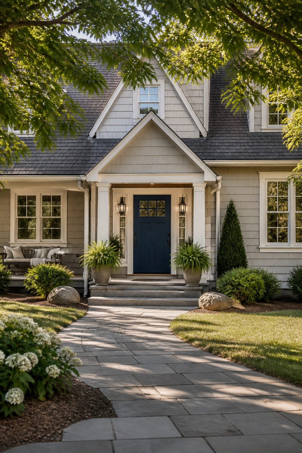
Indigo Batik on a front door or shutters reads as a near-black in shade but flashes that saturated blue in direct sun, which is exactly the split personality that makes it work for curb appeal. The trick is pairing it with whites that know their place. Alabaster (SW 7008) gives a bright, clean contrast that keeps the blue from sinking into gloom. Pacer White leans warmer against the richness, while Icicle stays cool and slightly gray if you want zero creaminess in your trim.
Off-whites on door and window frames, decorative moldings, or the reverse layout with Indigo Batik as the accent against neutral siding, both play well. Stone wainscoting in gray or travertine adds the right third element without competing.
Exterior lighting is where this color can betray you. A warm porch bulb turns Indigo Batik muddy; the undertone that reads sophisticated by day collapses into something closer to dirty navy. If your fixtures run warm, test at dusk before you commit. Clean, dry, primed surfaces matter more here than with lighter colors; this depth catches every brush mark and surface flaw, and unprimed siding goes patchy fast.
What to Skip

Small spaces, finish options, and maintenance routines sit outside what anyone has bothered to document for this color. That is not a gap worth filling with guesswork.
The advice on Indigo Batik currently stops at broad strokes: walls, cabinets, exteriors, what it looks like near cream trim or brass hardware. No one has tested how it behaves in a powder room with no natural light, or whether satin holds up better than eggshell on kitchen cabinets. Measurements vary too much from house to house for me to invent a rule about square footage. Sheen performance depends on the batch, the brush, and what gets cooked in the room next door.
If you are hoping for a cleaning schedule or a promise that scrubbing won’t soften the color, I have nothing solid to offer. The same goes for whether a high-gloss version would read more navy than indigo. These are real questions, and answering them would mean painting the same wall three ways and living with it for two years. I have not done that, and the sources I trust have not either. What is here is what has actually been tried.
Frequently Asked Questions
What are the best coordinating colors for Sherwin Williams Indigo Batik?
Pure White for trim, Stardew for a cool gray-blue pairing, Sparkling Sage or Sea Salt for green-gray contrast, and Accessible Beige or Sands of Time for warm neutrals that keep the navy from reading cold. Icicle and Pacer White work as off-whites with enough color to relate to the wall without stark contrast. The safest rule is pairing blues with blues, warm neutrals with cool ones, and whites that know whether they lean warm or crisp.
How does light affect the appearance of Indigo Batik?
Natural light pulls it toward brighter navy, almost like Bracing Blue, while evening light sinks it toward blue-black. South-facing rooms can flash purple at day’s end, a shift most people do not expect from what looked like straightforward dark blue on the chip. The LRV of 8 means it absorbs most light, so walls advance visually and spaces feel smaller. Test large swatches at morning, noon, and after dark before committing.
What is the difference between Indigo Batik and Naval?
Naval sits one shade darker on the same color strip and commits fully to navy, where Indigo Batik hovers between mid-tone blue and true navy. In strong natural light, Indigo Batik keeps some airiness; Naval goes full saturated depth and can swallow a small space whole. Both share enough DNA that trim and furniture choices stay the same either way. The mistake is ordering Naval thinking ‘a little darker’ and getting significantly darker, so swatch both and check after sundown when the gap widens.