
Sherwin Williams Alabaster is the white most kitchens should start with. Its LRV of 82 lands in the narrow band where warmth and cleanliness balance, and the creamy undertone reads soft rather than sunny even under warm bulbs. Skip it only if you want stark, gallery-wall modernity; Alabaster will never read cold, which is exactly its strength and its limit.
1. Sherwin Williams Alabaster
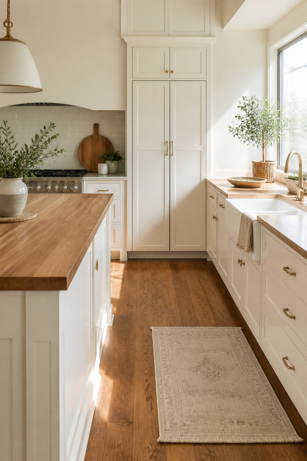
Sherwin Williams Alabaster carries an LRV of 82, which puts it slightly brighter than Shoji White and right in the zone where warmth and cleanliness balance without tipping into either sterile or yellow. The undertone is creamy, drawn from a subtle yellow base that reads soft rather than sunny. In a kitchen with strong natural light, Alabaster stays fresh and open; in a darker room or under warm artificial bulbs, that same cream turns more saturated and you get a cozier, almost enveloping feel.
This shade suits kitchens where the floors, counters, or backsplash already run warm and you want the cabinets to join the conversation rather than shout over it. It plays well with wood tones and aged brass in a way crisper whites simply do not.
Skip it if you are after the stark, gallery-wall modern look. Alabaster will never read cold or clinical, which is exactly its strength and its limit. Those wanting crisp, modern starkness should look elsewhere.
2. Sherwin Williams Pure White
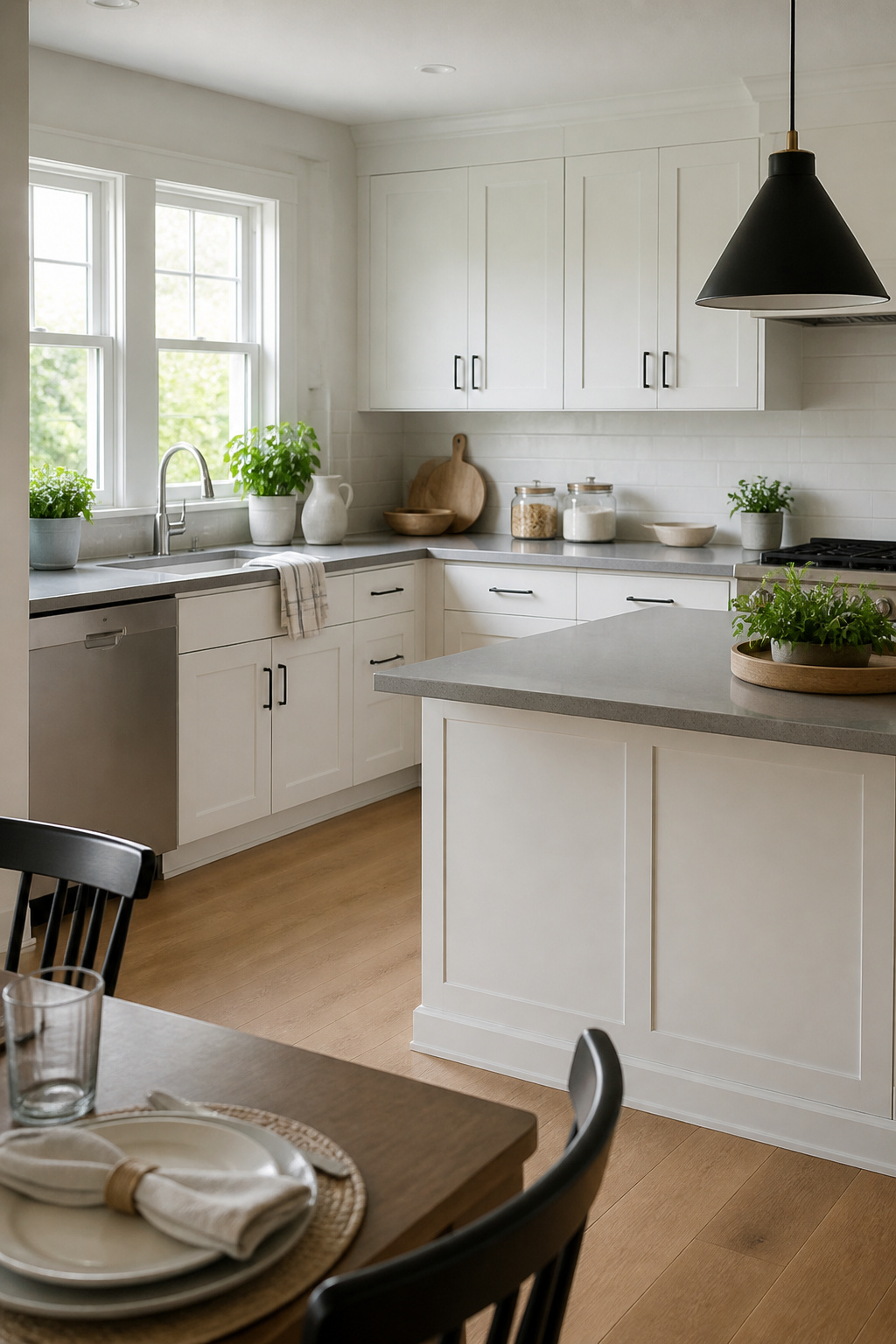
Sherwin Williams Pure White carries an LRV of 84, which lands it short of the blinding whites but bright enough to read clean on cabinets. The name tempted me to expect something closer to a true neutral, and that is where this color gets interesting. Some rooms pull a faint gray from it; others, the barest whisper of warmth. The undertones stay subdued enough that it will not steer hard blue or yellow on you, which is exactly the flexibility that makes it worth considering.
That same flexibility is its limit. Pure White does not commit. If your kitchen needs a white that declares itself warm against oak or crisp against marble, this one hedges. It pairs with both, yes, but it defines neither. I would reach for it when the rest of the room is still in flux, or when you are bridging warm wood tones with cooler countertops and need a middle voice. Skip it if you want the cabinets to set the temperature of the room. In those cases, a white with stronger directional character wins.
3. Sherwin Williams Extra White

Sherwin Williams Extra White carries an LRV of 86, the highest of the whites worth considering for cabinets, which means it throws light back into a room rather than drinking it in. That crisp, cool cast reads modern and intentional, especially when the kitchen already gets plenty of sun through south or west windows.
The catch is the same quality that makes it sharp. North-facing rooms or spaces lit only by fluorescent tubes can push Extra White toward sterile, and both sources note the occasional green undertone that surfaces under certain conditions. One used it twice, once in a dim 1980s kitchen and once in a bright lake house, and found it held up better in the darker space than expected; the other keeps an eye out for that faint green shift regardless of exposure.
Skip this one if your kitchen relies on overhead fluorescents or faces north with no supplemental daylight. It works where the light is already good and you want to amplify it, not create it from scratch.
4. Sherwin Williams Snowbound
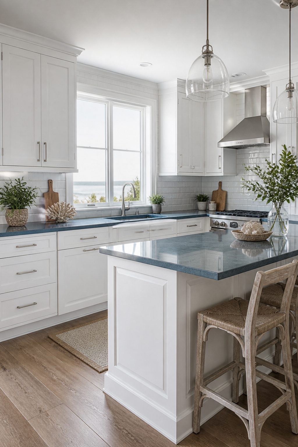
Sherwin Williams Snowbound (SW 7004) reads as a cool white with gray undertones, and that coolness is exactly what makes it work for coastal kitchens or any space already running blue-gray. The sources split on how warm or neutral it sits: one refinisher calls it a "warm, soft white" that plays with wood floors, while another homeowner insists the undertones are neutral and not too cool. The difference is probably the light in the room and what sits next to it.
For readers with blue-gray countertops or stainless fixtures, Snowbound ties those finishes together rather than fighting them. The Grit and Polish used it on uppers against navy lowers for a crisp, airy contrast that still feels cohesive.
Skip it if your floors are warm wood. That is where the gray undertone turns from subtle to sour. The same coolness that flatters slate or brushed nickel will make honey oak or cherry flooring look dated and pink by comparison. If you are committed to both the wood and the white, a warmer cabinet color saves the room.
5. Benjamin Moore White Dove
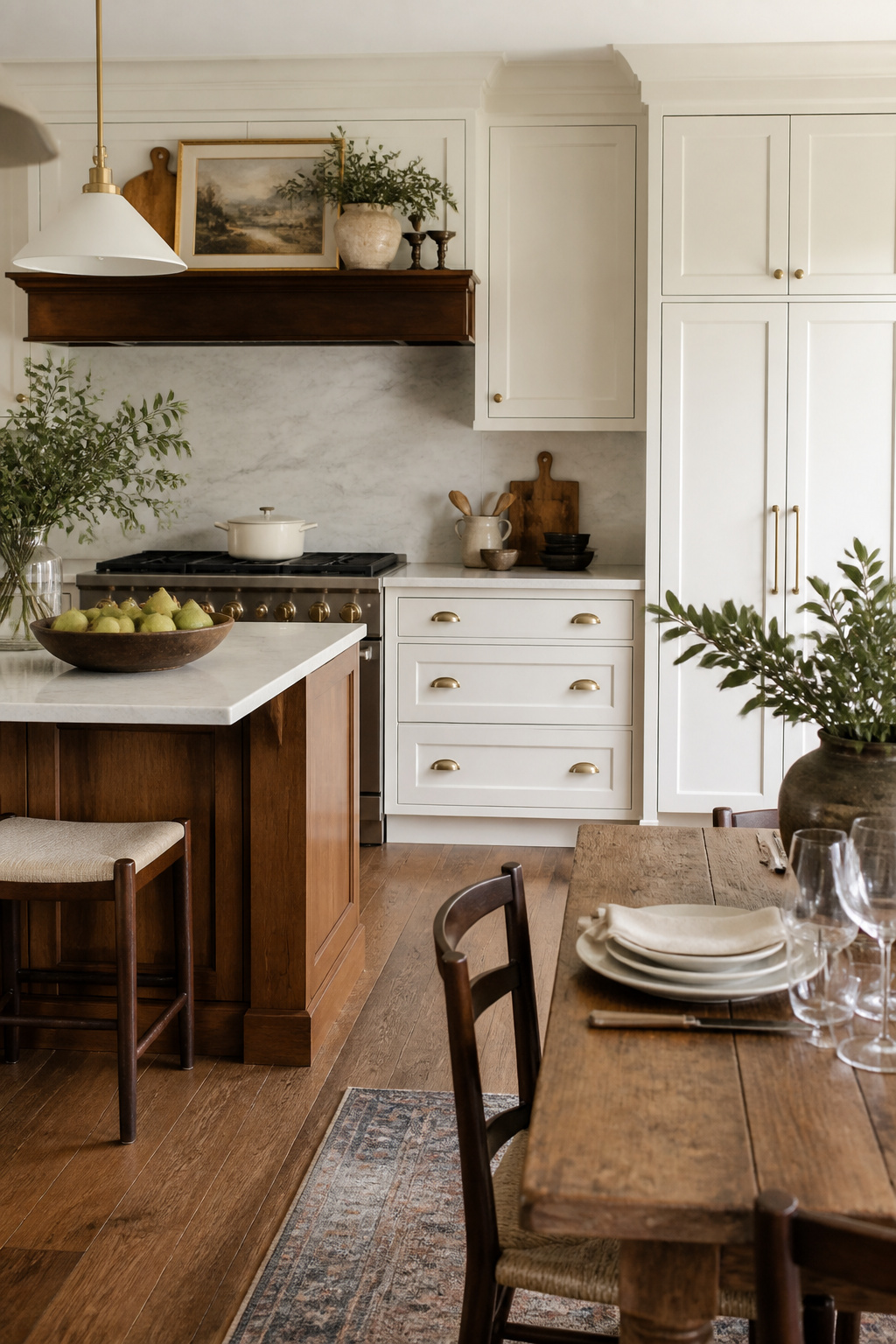
Benjamin Moore White Dove (OC-17) sits at LRV 83.16, bright enough to read clean against marble counters but soft enough that oak floors or walnut open shelving do not look suddenly orange beside it. That warmth is restrained, not yellow; sources put it cooler than Dover White and warmer than Simply White, which makes it the forgiving middle ground when your kitchen already mixes materials you cannot replace.
The catch is exactly that middle temperament. In rooms flooded with natural light, White Dove can flatten toward a balanced, almost classic white and lose the warmth that tames your wood tones. If you want the absolute brightest result or a true neutral with no trace of cream, this is the point to keep looking. It also will not rescue a kitchen already fighting cold gray finishes; the warmth reads subtle, not corrective.
For mixed-material kitchens where you need one paint to bridge warm countertops, existing floors, and maybe a metal island you added last year, White Dove has become the safe choice precisely because it fails so rarely. That safety is its own limitation. You will not remember it as a risk, and you will not get the crispness of a starker white. What you get is a cabinet color that lets the rest of the room argue instead.
6. Benjamin Moore Chantilly Lace
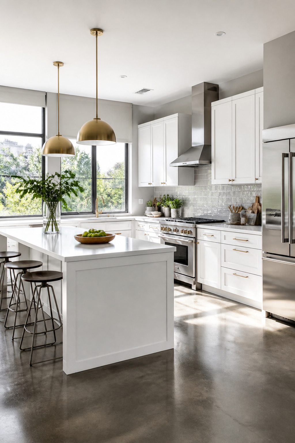
Benjamin Moore Chantilly Lace (OC-65) sits at the true-white pole, the color designers point to when they want a white with the least undertone still in it. That purity makes it the safest harbor for anyone paralyzed by the warm-versus-cool question: it reads clean without tipping yellow, stays livable without going cold, and lets your countertop or hardware do the talking instead.
I have watched this color swing both ways in photos, pairing with warm wood floors one kitchen and brushed nickel the next, never looking like it wandered into the wrong room. The quartz and marble countertops that dominate 2026 kitchens settle right in beside it.
The cost of that neutrality is personality. Chantilly Lace will not age your cabinets into something with story, will not soften a harsh morning light, will not forgive a beat-up hinge the way a creamier white might. If your goal is character or a hand-me-down glow, this is the skip. Cleanness is what it sells, and cleanliness is all it sells.
7. Benjamin Moore Simply White
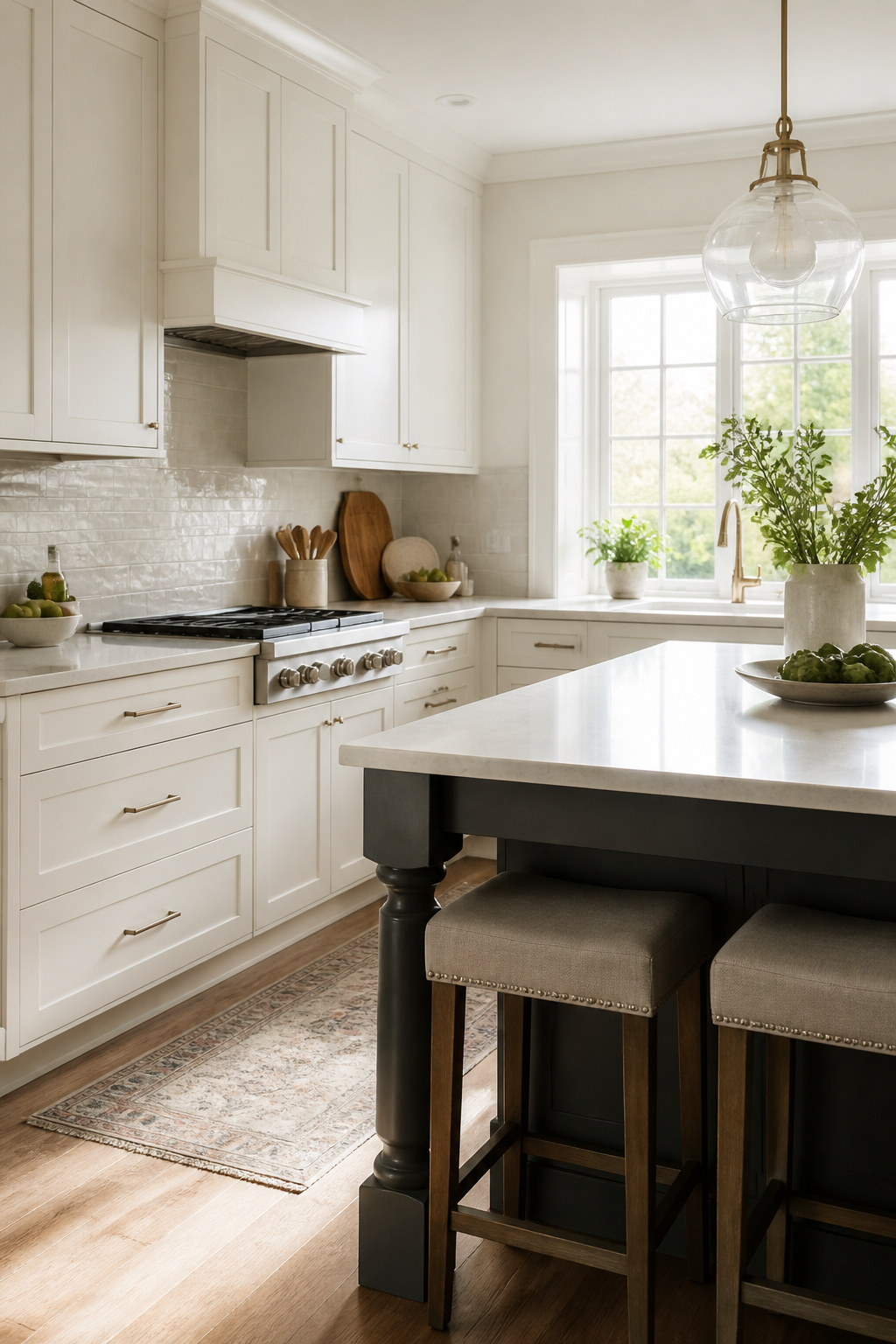
Simply White OC-117 carries just enough colorant to read as a soft, creamy white rather than a stark one, which is why it still turns up on cabinet jobs years after Benjamin Moore named it Color of the Year in 2016. North-facing kitchens or rooms with little natural light get the most from it; the warmth keeps the walls from going cold. Throw it into a space flooded with sun and the same color can swing cooler than expected, something I noticed in a two-toned kitchen where the island was Chelsea Gray and the cabinets read almost bluish against it by mid-afternoon.
That shift is the tradeoff. If you need a white that behaves the same way at 7 a.m., noon, and 6 p.m. without testing, this is not your color. Benjamin Moore itself groups Simply White with warm off-whites like White Dove, and the company’s own advice is to view samples throughout the day before deciding. For readers who want predictable results without that step, skip it. For everyone else, the adaptability is the point, not the problem; just budget the time to confirm it in your actual light.
8. Sherwin Williams High Reflective White
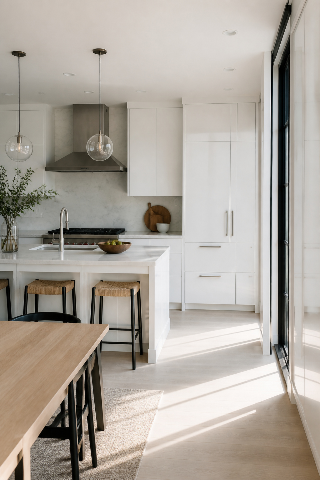
Sherwin Williams High Reflective White is the brightest white in this lineup at LRV 93, a number so close to pure reflection that the color barely registers as color at all. It reads stark, gallery-wall crisp, and absolutely unforgiving. I keep this one in mind for spaces where the goal is maximum bounce and a near-clinical cleanliness, not the lived-in warmth most family kitchens need.
The absence of undertones, both cool and warm, makes it technically neutral. That same flatness means any nearby surface with even a hint of cream, beige, or warm gray turns muddy by comparison. A warm backsplash or countertop does not coexist with this white; it sinks next to it. Sampling is non-negotiable here, and I would argue the sample needs to sit for a full day under the kitchen’s actual light before the decision holds.
Marks, fingerprints, and the slight shadow of an imperfect brushstroke show immediately on a surface this reflective. For a household with small children or a cook who actually cooks, the maintenance load is real. I would skip this one for everyday family kitchens and point it instead toward a butler’s pantry, a display hutch, or any cabinet run treated more as visual architecture than working storage.
9. Benjamin Moore Cloud White
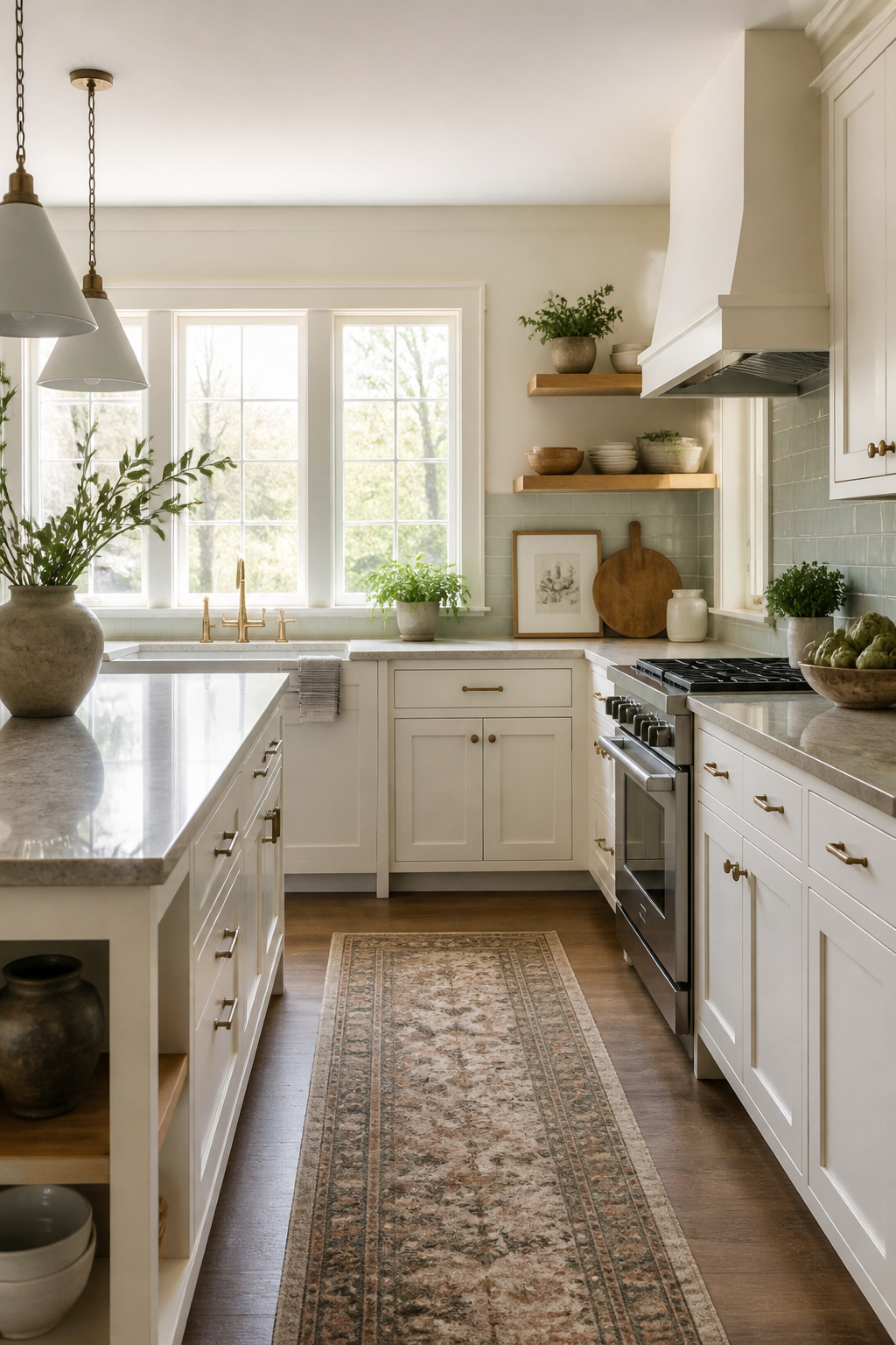
Benjamin Moore Cloud White, OC-130, carries two stock numbers because it earned them: 967 was the one everybody memorized back when this color topped every list. The paint reads creamy against a purer white, yet it stops short of yellowing once it dries. That balance matters in a kitchen where cream tile or a warm stone counter already sets the tone.
Traditional and transitional kitchens suit it best. The warmth flatters wood grains and antique brass hardware in ways a cleaner white would chill. For modern schemes with gray dominant accents, or anywhere you want sharp contrast, Cloud White will look too soft. The same quality that keeps a cream palette coherent is what makes it feel off in a minimalist space.
I keep it off my short list for rentals or quick flips aimed at a broad buyer pool. The person who loves it, loves it. The person who wanted a true white will notice the cream immediately.
10. Sherwin Williams Shoji White
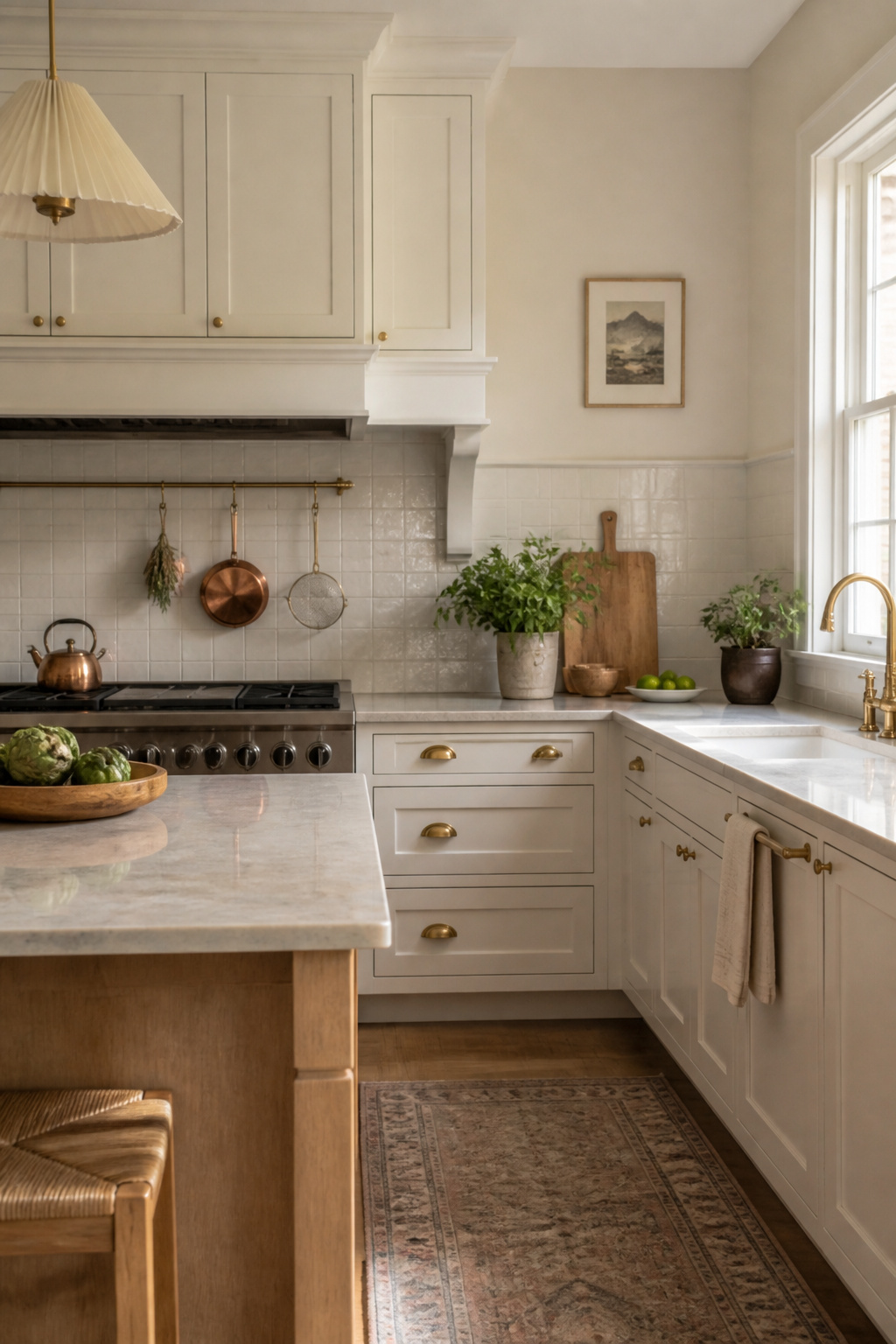
Sherwin Williams Shoji White (SW 7042) sits at an LRV of 74, which is low enough for a warm off-white but high enough to fool the eye in bright rooms. Without a true white parked right beside it, the color reads almost crisp, a bright white that is not one. The tan undertones surface in dim corners; gray ones steal in under north light. Creamy warmth keeps it from going cold, though the exact balance shifts by the hour.
This is the choice for someone who likes a little risk. The personality of a Shoji White kitchen changes from morning to afternoon, from season to season, and two houses with the same cabinets will tell different stories. If you need your white paint kitchen cabinets to look identical in every Instagram you take, skip this one. Consistency is not its strength. What you gain is a color that keeps the room alive, that rewards patience and punishes the urge to control.
How Light Changes Every White

Light hits a white cabinet differently at 7 a.m. than it does at 7 p.m., and that shift is what makes or breaks a color choice. North-facing windows pull the cool blue out of a paint; southern exposure can push the same can toward yellow by noon. The LRV, or light reflective value, tells part of the story. Most cabinet whites fall between 80 and 95, with the sweet spot landing around 85–90. Go lower and the shade turns creamy or muddy; go higher and it reads sterile, almost clinical.
Artificial light changes the rules again. A bulb with a warm color temperature will amplify any yellow or cream hiding in the formula, while cooler LEDs can flatten a warm white into something flat and hospital-like. Test samples under both your morning light and your evening fixtures, not just the light you happen to have on when you open the can.
Countertops and floors act like mirrors. A gray quartz throws cool undertones up onto the cabinet face; warm wood flooring bounces amber back. The paint that looked perfect on the sample card can shift dramatically once it is surrounded by your actual surfaces. Watch it through a full day, and trust what you see at dusk. That is the version you will live with most.
Reading Undertones Before You Buy
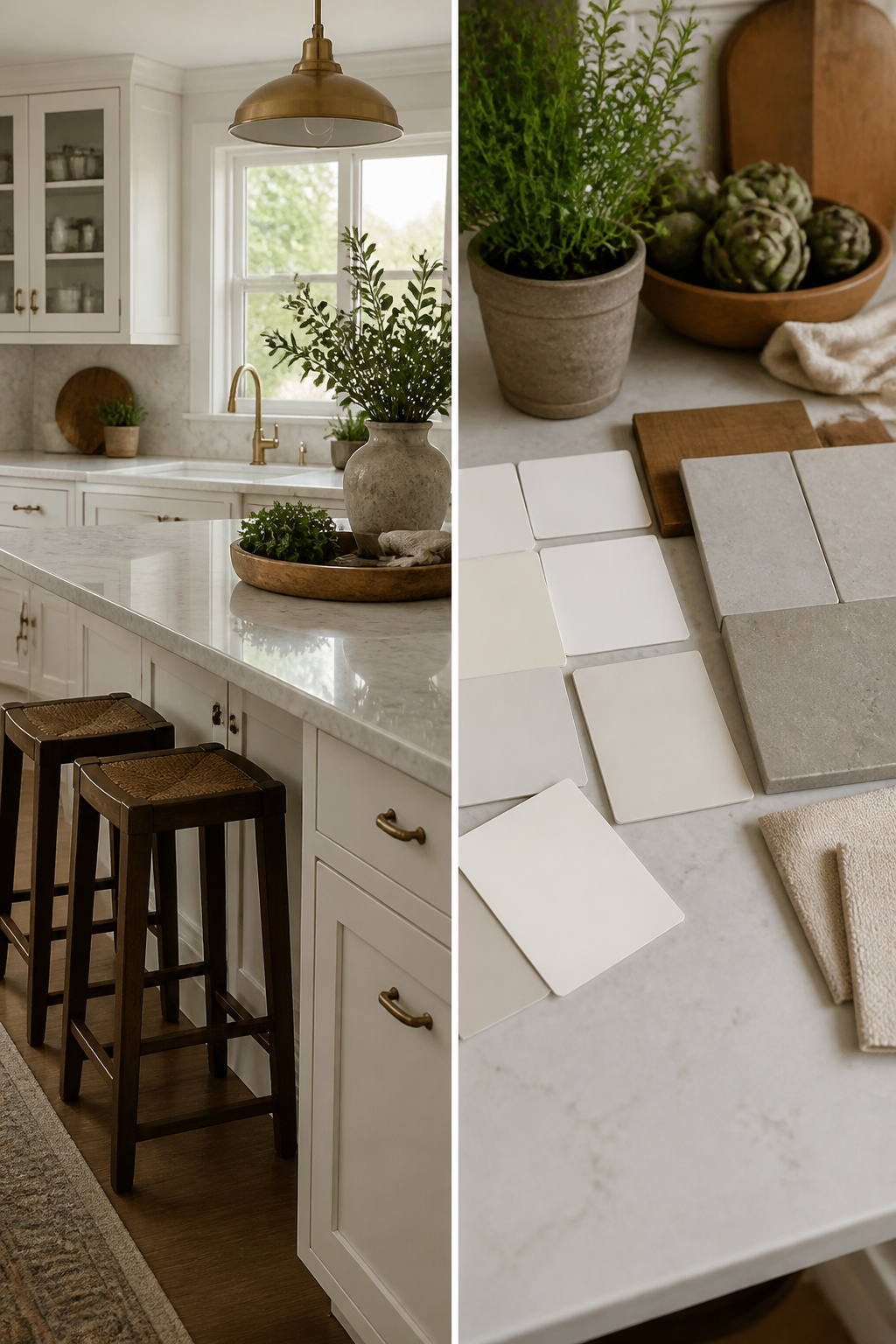
Warm whites carry yellow or beige undertones that read creamy against brass hardware and oak floors, while cool whites lean gray or blue and sit better with nickel finishes and marble counters. The distinction matters because the wrong undertone sticks out like a sore thumb against finishes you are not replacing.
Decorator’s White OC-149 and White Heron OC-57 run cooler, useful when a space makes every white read orange. White Dove OC-17 and Simply White OC-117 move the other direction, softening under fluorescent light or against gray quartz that would turn a crisp white sterile. Origami White SW 7636 splits the difference with its greige mix, enough warmth to avoid coldness without tipping into cream.
Sampling across the day is the only way to catch how your particular light shifts the same swatch. A white that looks clean at ten in the morning can throw green by evening, or the reverse. The sample board belongs beside your countertop edge, not in isolation, because the relationship between the two colors is what you will live with, not the white alone.
Paint That Survives Cabinet Life

Standard wall paint on cabinets starts to show the abuse within weeks. Grease settles into the film, scrubbing leaves a dull trail, and the corners chip where fingers pull doors open every morning. Kitchen cabinets need a coating that cures to something harder than the soft vinyl acrylic meant for living room walls.
Urethane-based and hybrid formulas are built for exactly this. Benjamin Moore Advance sits in that second camp: a waterborne alkyd that dries to a furniture-quality finish hard enough to take daily wiping without turning chalky. The hybrid chemistry gives it the toughness once reserved for oil-based enamels, but without the solvents that linger for days.
Oil-based whites carry a real risk the hybrids do not. The resins oxidize and yellow as they age, especially anywhere light does not reach, so a cabinet bank that looked crisp in April can read cream by the next winter. Advance specifically avoids this; cabinets painted with it have held their color past the two-and-a-half-year mark.
A durable, high-end paint is a must for kitchen cabinets. Advance® Interior paint provides a hard, furniture-quality finish.
That hardness translates to fewer touch-ups and a surface you can actually clean without fear.
Satin, Eggshell, or Semi-Gloss

Satin or eggshell finish hits the balance most kitchens actually need. The sheen is low enough to hide brush marks and the odd dent your cabinets already carry, but it still carries enough gloss to wipe clean after cooking. Semi-gloss makes that cleaning easier still, though the tradeoff is real: every flaw in the surface catches light, and on white paint kitchen cabinets that reflectivity can read harsh under overhead fixtures.
The sheen also shifts how white reads in the room. A satin finish softens Alabaster or White Dove into something that absorbs light rather than throwing it back, which tends to suit farmhouse or casual modern spaces. Semi-gloss pushes the same color brighter, sometimes crisper than you bargained for.
What convinced me, reading through a dozen of these projects, is that cabinet-grade paint in satin or eggshell beats semi-gloss on anything but the most traditional kitchen. The product is formulated for the wear; the sheen does not have to do all the work.
Testing Colors the Honest Way
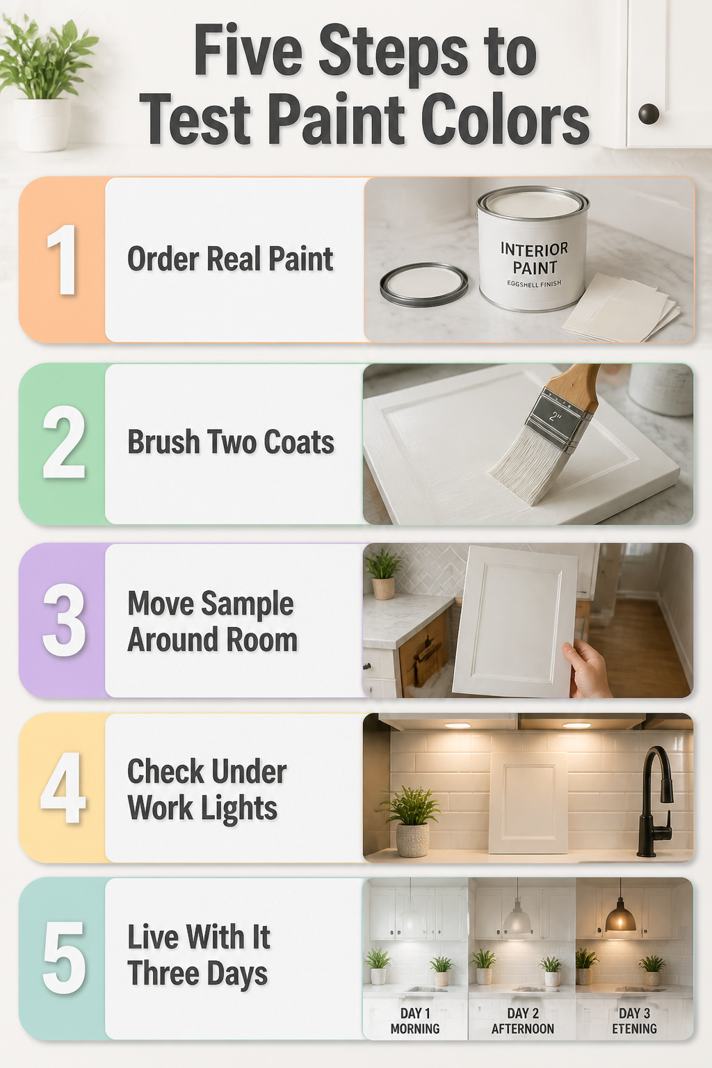
- Order the real paint, not the chip. A paper square lies flat and even; cabinet doors catch light at angles a wall never sees, and the same white can read blue at breakfast and dingy by dinner once it has hinges and shadow lines.
- Brush two coats on a spare door or a board large enough to stand in for one. The sources that land on Snowbound or Pure White got there by living with the color through a morning, noon, and lamp-lit evening, not by holding a strip under the fixture at the paint store.
- Move the sample around the room. Hold it against the countertop, the backsplash, the floor. Whites pick up what sits beside them; Swiss Coffee turns cream against warm wood and can flatten to nothing near cool gray tile.
- Look with the work lights you already own. The under-cabinet LEDs or the pendant over the island are what you will actually see by. A color that opens up in north light can feel sterile once those switch on.
- Live with it three days before you commit. The first glance favors the clean, bright hit of Extra White. The third morning, you notice whether it stays clean or starts to feel like a clinic. That is the test the chips cannot run.
Frequently Asked Questions
What is the most popular white paint color for kitchen cabinets?
Chantilly Lace and Super White rank among the most popular choices because of their brightness and versatility. Chantilly Lace reads as a true white with minimal undertone, which lets countertops and hardware take center stage. Super White offers similar crispness and appears on Benjamin Moore’s recommended list for cabinet projects.
How do I find the best white kitchen cabinet paint colors for my project?
Test real paint samples in your kitchen under both natural and artificial light across a full day. Move the sample against your countertop, backsplash, and flooring to see how surrounding surfaces shift the color. Live with it for three days before committing, since first impressions favor brightness while repeated exposure reveals whether the tone stays livable.
Should I use a specific type of paint for kitchen cabinets?
A durable, high-end cabinet paint is essential because standard wall paint chips and stains within weeks. Benjamin Moore Advance, a waterborne alkyd hybrid, cures to a furniture-quality finish that withstands daily wiping without turning chalky. It also avoids the yellowing that plagues oil-based whites over time.
Do white painted cabinets yellow over time?
Oil-based whites carry real risk of yellowing as their resins oxidize, especially in shadowed areas. Hybrid formulas like Benjamin Moore Advance specifically avoid this problem; cabinets painted with it have held their color past the two-and-a-half-year mark with no yellowing reported.
What sheen should I use for kitchen cabinets?
Satin or eggshell hits the balance most kitchens need. The sheen hides brush marks and minor dents while still allowing wipeable cleanup after cooking. Semi-gloss makes cleaning easier but reflects every surface flaw harshly under overhead fixtures; reserve it for traditional kitchens rather than casual modern or farmhouse spaces.